

Dashboards in the left sidebar, then select Energy. The page header reads Energy with the subtitle Energy Use, Efficiency, and Performance Overview.
Monthly Reports opens by default. A secondary menu lists other report types such as Annual Reports, Comparison, and Interval Trends. See Portfolio and building navigation for the full menu.
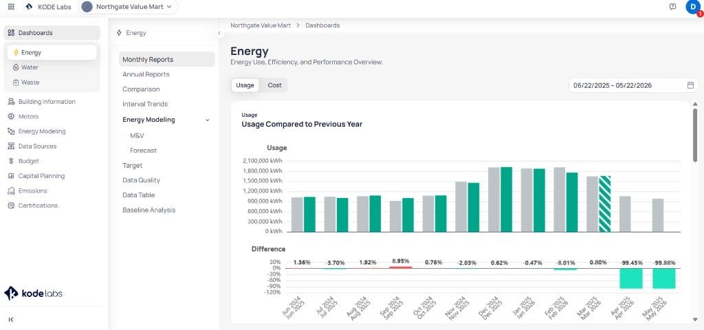
Building Energy Monthly Reports with Usage selected and year-over-year comparison
Energy report menu
After you selectEnergy under Dashboards, use the secondary menu to switch report types.
Monthly Reports controls
The control row at the top of Monthly Reports sets the metric lens and reporting window.Usage lens
Select Usage on the toggle to view consumption charts in kWh (or the unit configured for each service type).Usage Compared to Previous Year
The top chart compares current-period usage to the same months in the prior year.- Teal bars — current reporting period
- Light gray bars — previous year
- Striped bars — accrued or estimated months without final bills
Usage per Service Type
The Usage per Service Type chart groups consumption by utility category each month.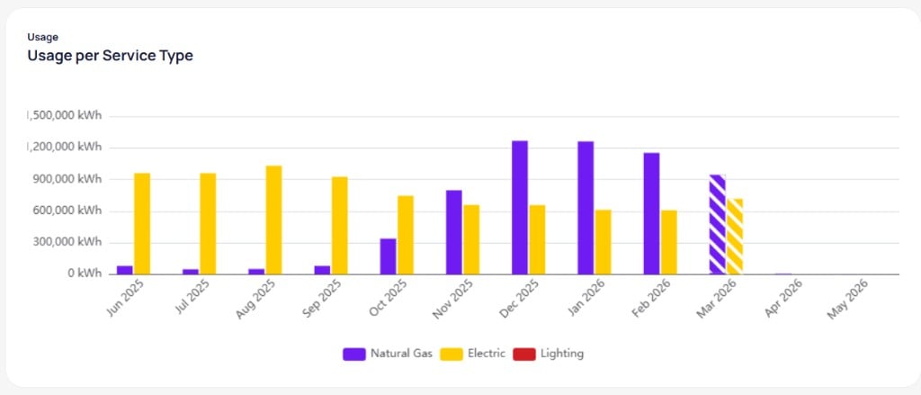
Usage per Service Type grouped bar chart by month
Usage per Meter
The Usage per Meter chart breaks monthly consumption down by individual meter or account.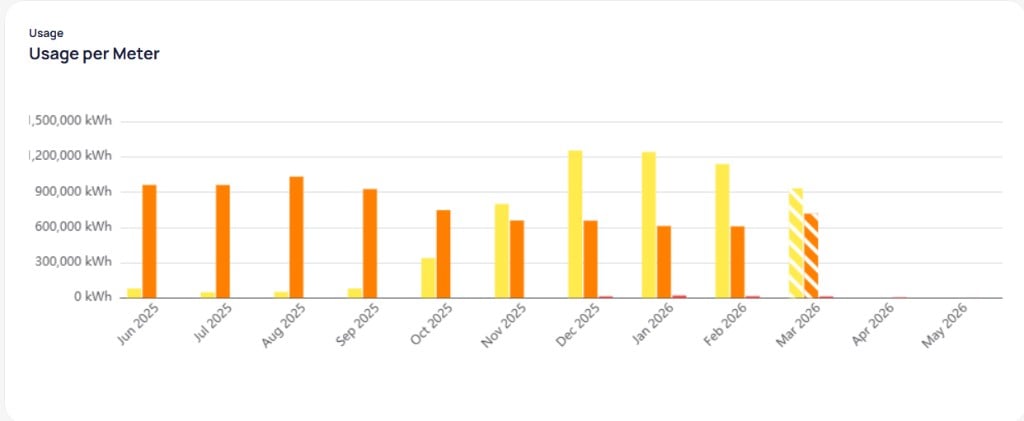
Usage per Meter grouped bar chart by month
Usage Compared to Baseline
The Usage Compared to Baseline chart compares actual consumption to the baseline you configured for the building.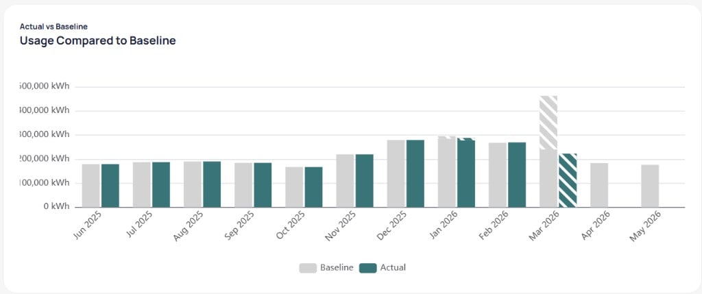
Usage Compared to Baseline with Actual and Baseline bars by month
- Baseline — light gray bars
- Actual — dark teal bars
- Striped segments — projected or incomplete actuals for the month
Cost lens
Select Cost on the toggle to view billed charges in your configured currency.Cost Compared to Previous Year
The layout matches the usage view. Cost Compared to Previous Year shows current and prior-year spend by month. The Difference chart below reports percentage change in cost.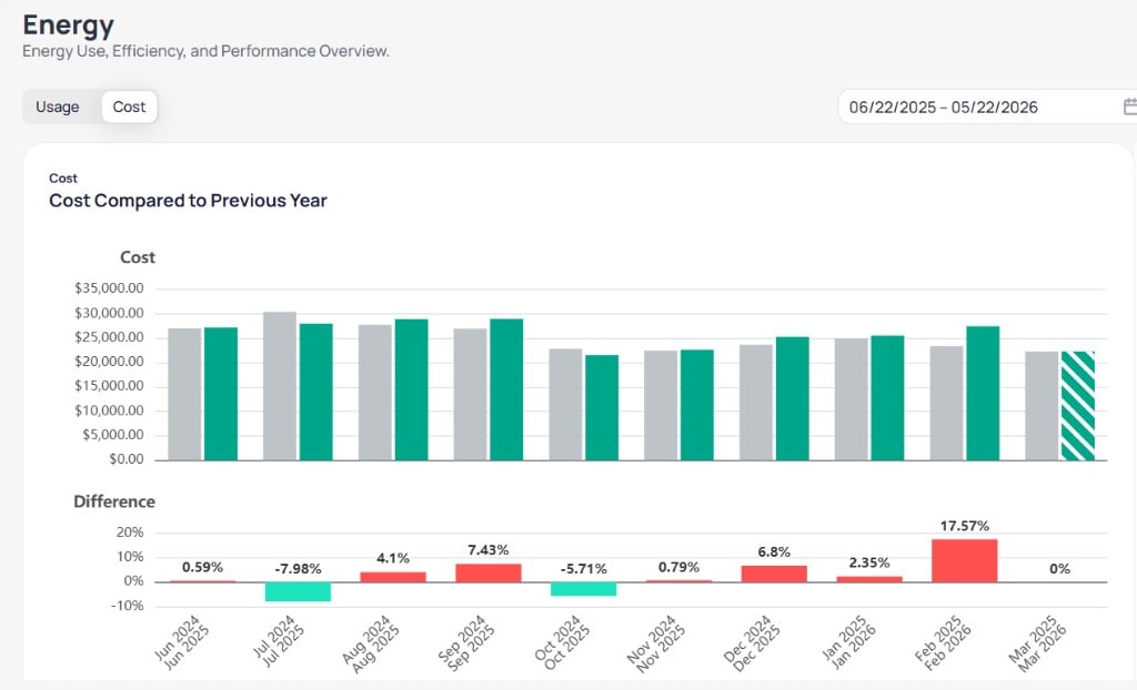
Cost Compared to Previous Year with current and prior year bars and variance chart
Cost per Service Type
The Cost per Service Type chart groups spend by utility category.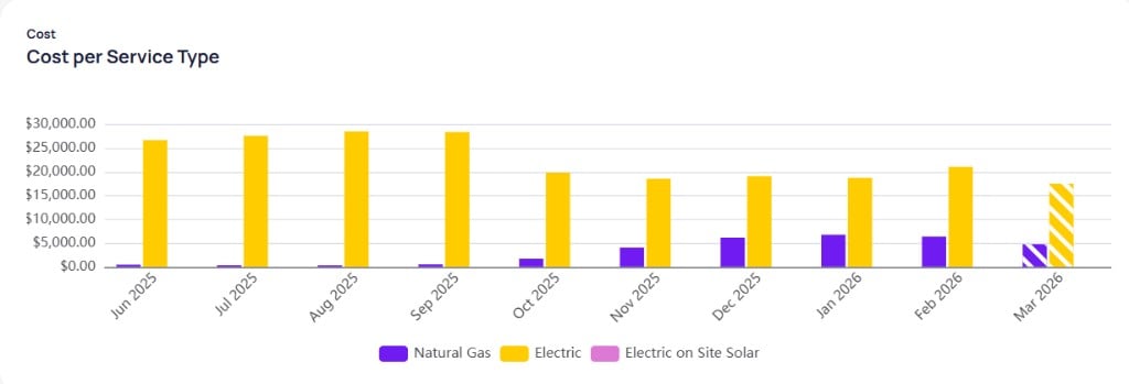
Cost per Service Type grouped bar chart by month
Cost per Meter
The Cost per Meter chart shows monthly spend by meter or account.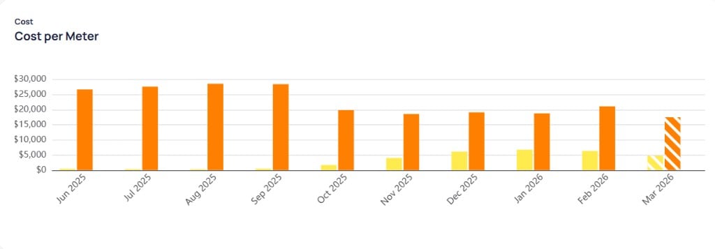
Cost per Meter grouped bar chart by month
Cost Compared to Baseline
The Cost Compared to Baseline chart compares actual spend to your configured cost baseline.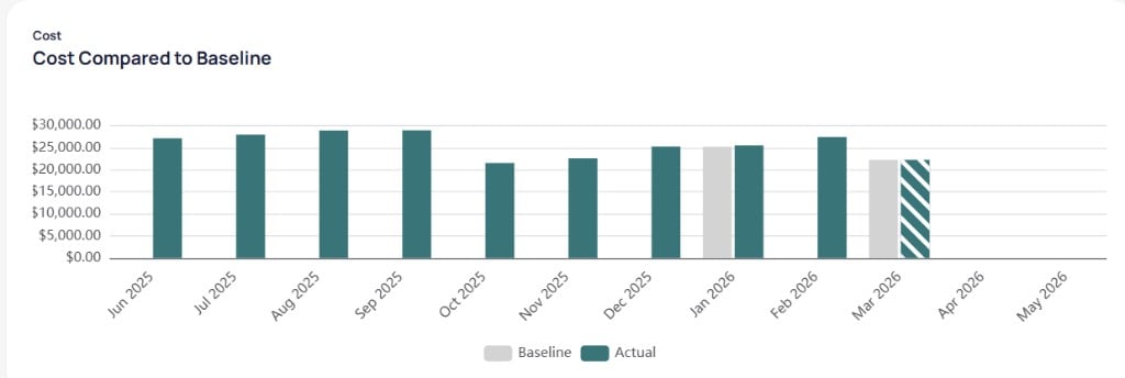
Cost Compared to Baseline with Actual and Baseline bars by month
Blended Rate
The Blended Rate view shows utility rate trends by service type. Select Electric, Natural Gas, District Steam, or another configured service type to update the chart and table.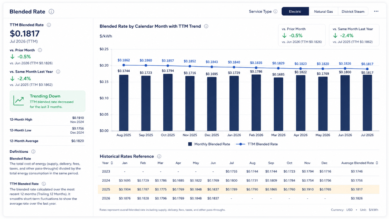
Blended Rate view with TTM metrics and monthly rate chart
Annual Reports
SelectAnnual Reports from the Energy secondary menu to compare years for the selected building. The page header and Usage / Cost toggle behave the same as Monthly Reports. The date control uses a year range (for example, 2021 to 2025) instead of month-by-month selection.
Usage lens
With Usage selected, the main card is Usage and Usage per Area. It contains two bar charts that share the same year axis.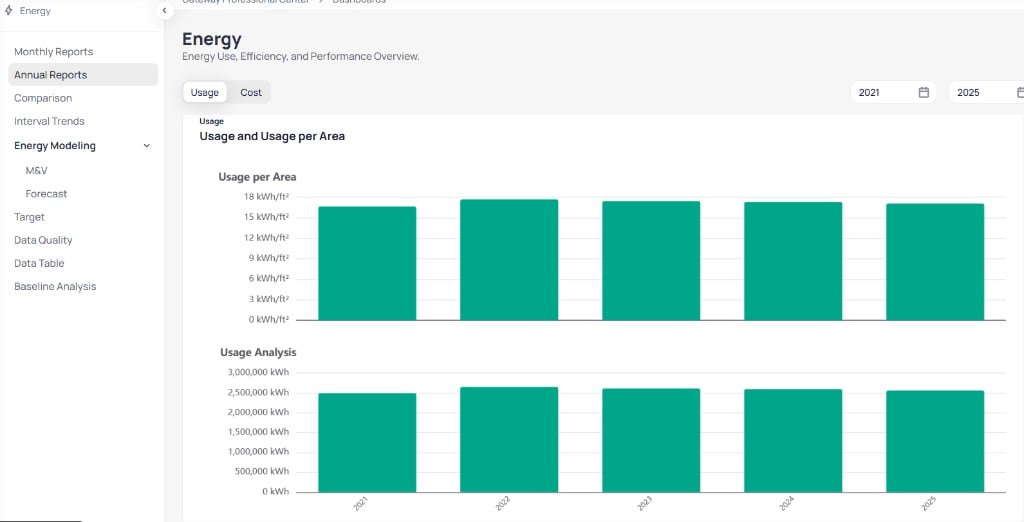
Annual Reports Usage view with Usage per Area and Usage Analysis by year
Usage per Service Type and Usage per Meter
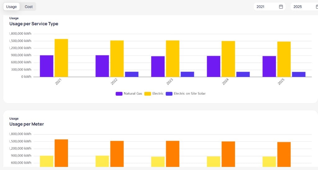
Annual Usage per Service Type and Usage per Meter by year
- Usage per Service Type — grouped bars by year for Natural Gas, Electric, Electric on Site Solar, and other configured categories
- Usage per Meter — grouped bars by year for each meter or account tied to the building
Cost lens
Select Cost on the toggle to open Cost and Cost per Area with the same paired-bar layout.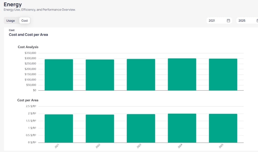
Annual Reports Cost view with Cost Analysis and Cost per Area by year
Cost per Service Type
The Cost per Service Type chart groups annual spend by utility category.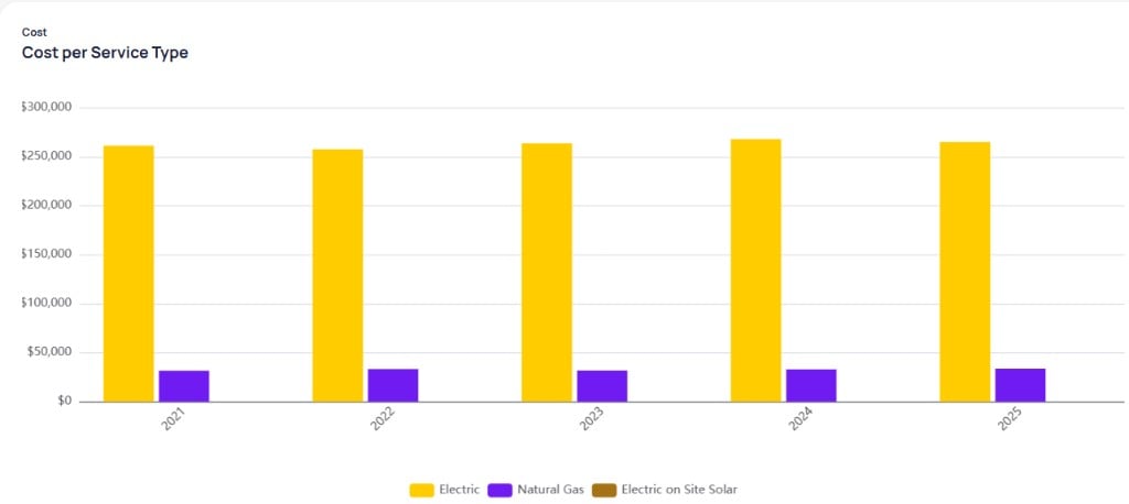
Annual Cost per Service Type grouped bar chart by year
Comparison
SelectComparison from the Energy secondary menu to align utility bill totals with interval meter readings for the same building. The page title reads Comparison with the subtitle Utility vs Interval & Variance.
Controls
Usage Comparison
The top chart, Usage Comparison, plots monthly Utility and Interval consumption on one axis in kWh.- Solid blue bars — utility bill totals
- Blue striped bars — utility totals marked as accrued when final bills are not yet posted
- Solid teal bars — interval meter totals for the same months
Variance %
The Variance % chart below reports the percentage gap between utility and interval totals for each billing period. Red bars extend downward from the zero line when variance is large. Striped bars match accrued utility months in the chart above.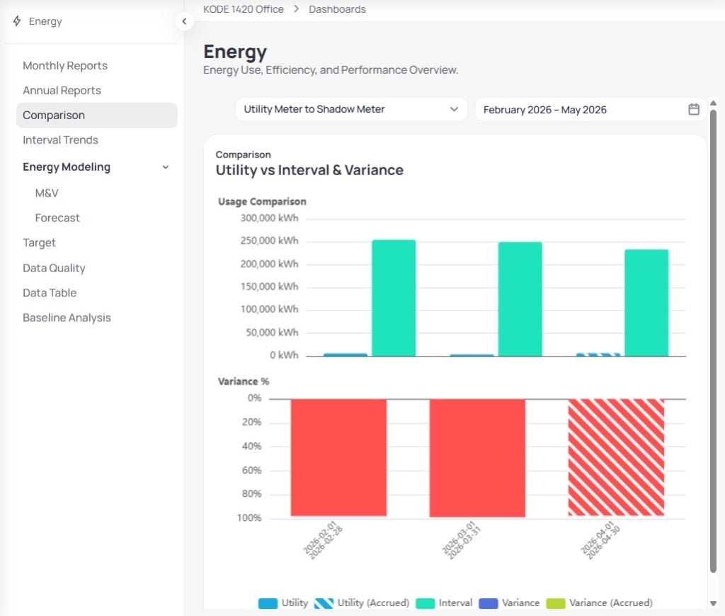
Comparison view with Usage Comparison and Variance % charts
Data Quality first when alerts show missing bills for the selected period.
Interval Trends
Interval trends turn high-frequency meter reads into daily charts, overlays, and heat maps. Open this report from the Energy secondary menu when you need sub-daily patterns that monthly or annual charts cannot show.Open Interval Trends
Confirm interval data
Select meter and range
Daily Energy Usage
The Daily Energy Usage card plots interval consumption as teal bars by day. An orange Temperature line uses the secondary axis in °F so you can relate load spikes to weather.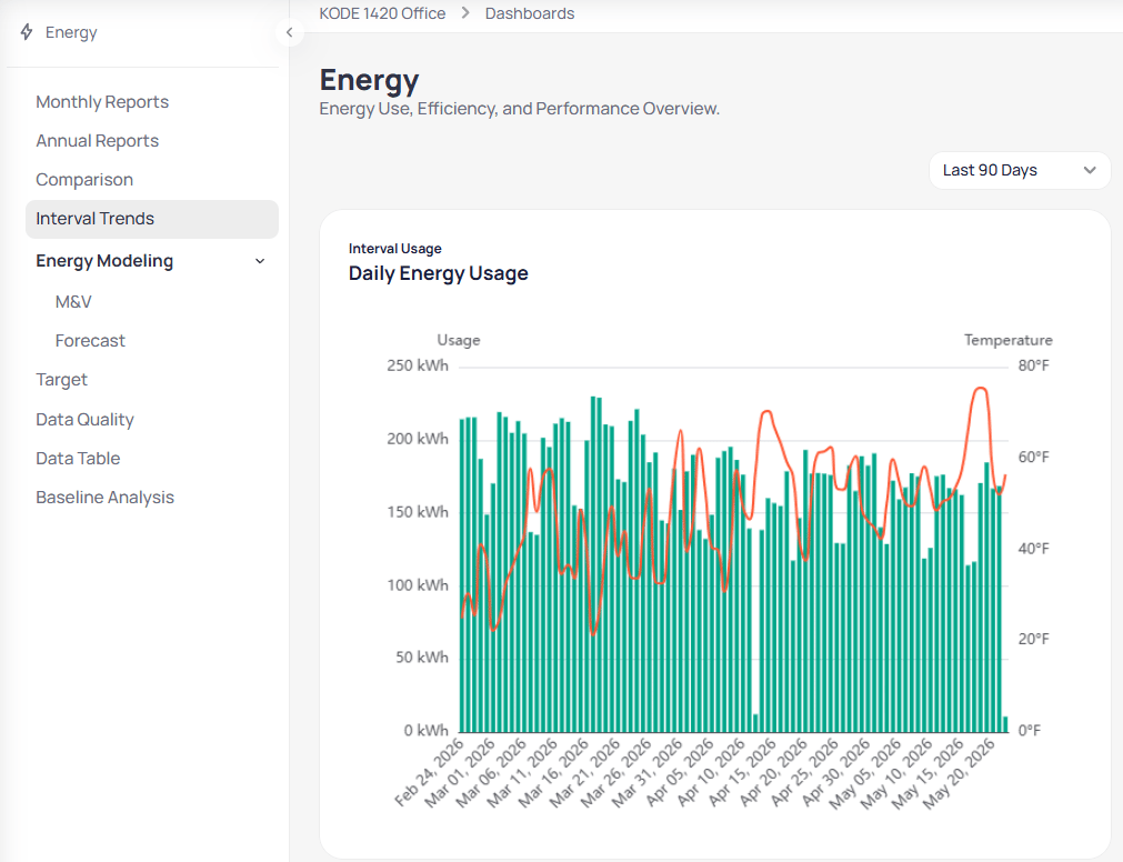
Interval Trends Daily Energy Usage with temperature overlay
Open vs closed hours
Daily Energy Usage: Open vs Closed Hours splits each day into Opened Hours (blue) and Closed Hours (gray) so you can see how much load runs outside the building schedule.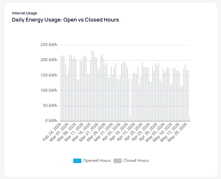
Daily interval usage grouped by opened and closed hours
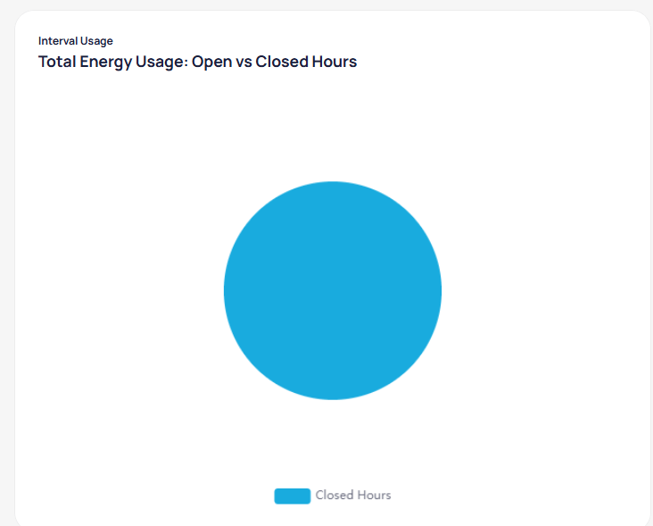
Total interval usage share for opened and closed hours
Hourly Energy Usage
Hourly Energy Usage is a heat map with one row per day and columns for each hour of the day. Color intensity reflects kWh, from low usage in teal to high usage in red. A Degree Days chart on the right shares the same date axis. Red bars extend to the right for heating degree days; blue bars extend to the left for cooling degree days. Use it to separate weather-driven load from operational patterns.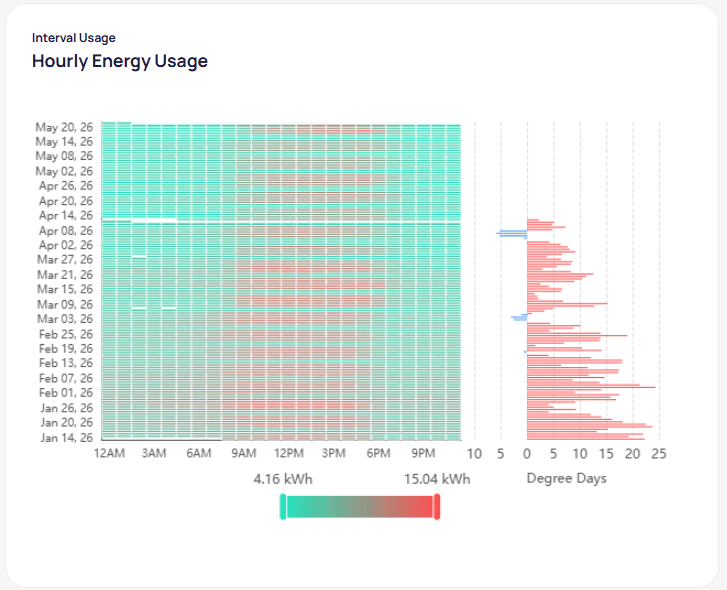
Hourly usage heat map with degree-day correlation
- Spot after-hours usage when bright cells appear during nights or weekends
- Identify holiday patterns as cooler-colored rows
- Compare weekday versus weekend profiles against your occupancy schedule
Common diagnostic workflows
Energy Modeling
ExpandEnergy Modeling in the Energy secondary menu to open M&V or Forecast without leaving the dashboard. You need a trained M&V model before results appear. See Create an M&V model to configure baselines and training runs.
M&V
SelectM&V under Energy Modeling to review Measurement and Verification results for the building. The page keeps the Energy header and adds model-specific controls above the savings summary.
Controls
Savings summary and metrics
The left column shows portfolio-style totals for the selected model and date range.- Total Energy Savings — net kWh difference between actual and adjusted baseline across the period. Red values mean actual use exceeded the baseline.
- Total Energy Savings Percentage — percent change for the same window
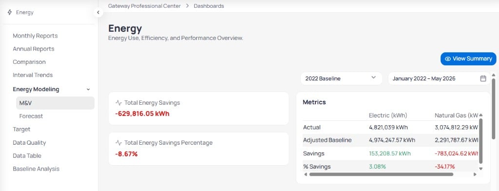
M&V overview with savings totals and service-type metrics
Consumption and savings charts
Two stacked charts share the same month axis. Consumption plots Actual (teal) and Adjusted Baseline (gray) in kWh. Before the Operation Date, only actual bars appear. After that date, paired bars show how measured use compares to the weather- and operations-adjusted baseline each month. Savings reports the percent gap between actual and adjusted baseline. Teal bars above zero indicate months where actual use fell below baseline. Red bars below zero indicate months where actual use exceeded baseline. A vertical dashed Operation Date line marks when the measure or retrofit took effect.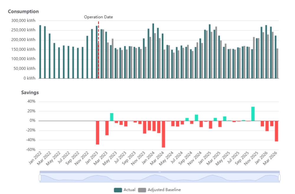
M&V Consumption and Savings charts with Operation Date marker
Monthly expected vs actual consumption
The Monthly Expected vs Actual Consumption table lists each month in the selected range with sortable columns.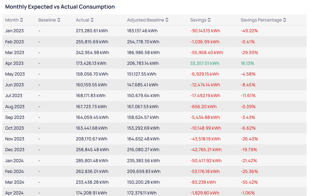
Monthly Expected vs Actual Consumption table with savings by month
Forecast
SelectForecast under Energy Modeling to project future consumption from a trained model. See Forecasting for setup and chart interpretation.
Target
Review how one building performs against active reduction targets. Create and edit goals on Portfolio targets. EnerG applies assigned targets to this building when you open the report here.Select a building
Open Target
Controls
Charts
Three charts stack on the Target page.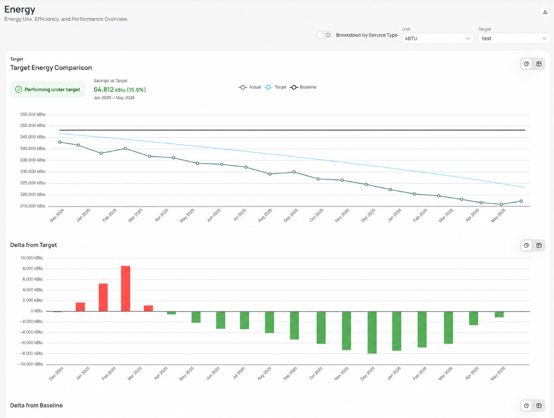
Energy Use, Efficiency, and Performance Overview with target comparison and delta charts
Data Quality
SelectData Quality from the Energy secondary menu to review billing coverage for every meter assigned to the building. Use this view before you share monthly or target charts when gaps might skew the story.
Controls
Bills Data Quality chart
The Bills Data Quality chart is a horizontal timeline with one row per meter. Color segments classify each billing period by coverage. For what each legend color means, see data quality legend. Solid green bars across a meter row mean every month in range has complete coverage.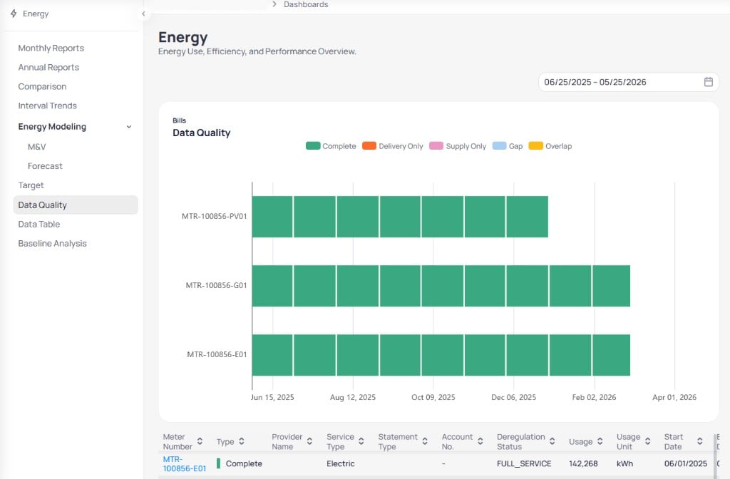
Data Quality timeline and billing detail table
Billing detail table
The table below the chart lists individual billing records for meters in the selected period. Sort any column to find gaps or outliers. Columns include meter number, coverage type, provider, service type, account, deregulation status, usage, and billing dates. A Complete row with matching start and end dates confirms that period counts toward completeness scoring. See Data completeness for how scores roll up to the building, and Data quality overview for alerts and portfolio workflows.Data Table
SelectData Table from the Energy secondary menu to audit line-level billing and calendarized records for the selected building. Use this view when you need to verify a specific meter, charge, or billing period behind a chart.
Controls
Billing Period and Calendarized tabs
Switch between two views of the same underlying data.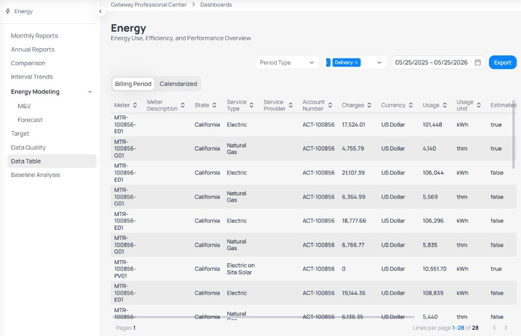
Data Table Billing Period tab with meter and usage columns
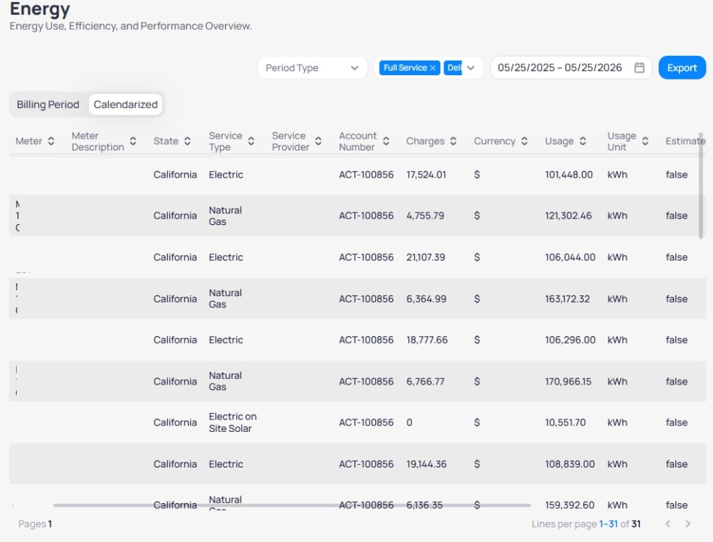
Data Table Calendarized tab with month-aligned billing rows
Table columns
Sort any column with the header arrows. Scroll horizontally to reach all fields, including meter, service type, charges, usage,Estimated, and Data Origin. For every column definition, see data table columns.
System Accrual fill gaps until a final provider bill arrives. Check Estimated and the billing dates before you use accrual rows in compliance or year-end reporting, even when Estimated is false.Pagination
The footer shows page numbers and Lines per page (for example, 1–31 of 31 on Calendarized). Use the arrows when the building has more rows than fit on one page. Compare building rows to the Portfolio Energy dashboard Data Table when you audit the same meters across multiple properties.Baseline Analysis
Select Baseline Analysis from the Energy secondary menu to compare actual energy use against configured baselines, expected use, and values. For how these comparisons work, see Baselines and weather normalization. Before you rely on these charts in targets or M&V, set baseline windows on Configure building baseline windows. Click Edit Configuration on this report to open the energy, water, and waste baseline editor.Controls
Summary KPIs
Four cards at the top roll up performance for the selected range.Monthly Analytics chart
The Monthly Analytics chart combines usage bars with degree-day lines.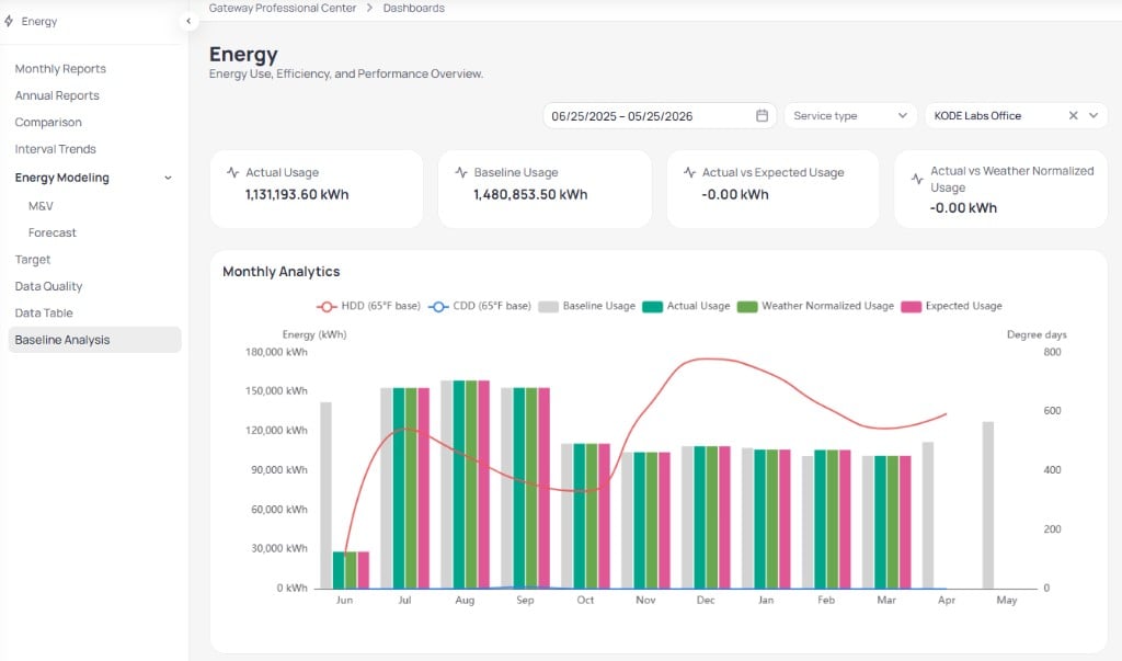
Baseline Analysis KPIs and Monthly Analytics chart
Monthly detail tables
Scroll below the chart for month-by-month tables. Each table uses the same month columns across the selected range. Actual Usage lists Baseline Usage, Actual Usage, Expected Usage, and Weather Normalization Usage in kWh. Dashes indicate months still open or not yet calendarized. Weather Data compares 15Y Average Temperature and Actual Temperature in °F. Heating Degree Days (HDD) and Cooling Degree Days (CDD) tables include long-term averages, 65°F base values, and Delta columns so you can see how current weather diverges from the norm.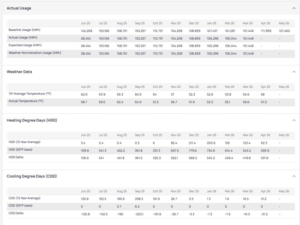
Baseline Analysis monthly usage and weather tables
Export Energy dashboard data
Export spreadsheet-ready data from dashboard charts and pages. The file reflects the filters, date range, and site scope active on screen.Set the view
Download