

Why normalize by area
Total usage favors small buildings and penalizes large ones. A tower always uses more energy than a branch office, even when the tower runs more efficiently. Intensity metrics divide usage by floor area. A small site can use less total energy and still rank worse per square foot. Normalization is what makes cross-building comparison meaningful.The three intensity lenses
Portfolio Home ranks buildings through three metric lenses.
All three lenses share the same layout. Only the metric labels and ranking logic change.
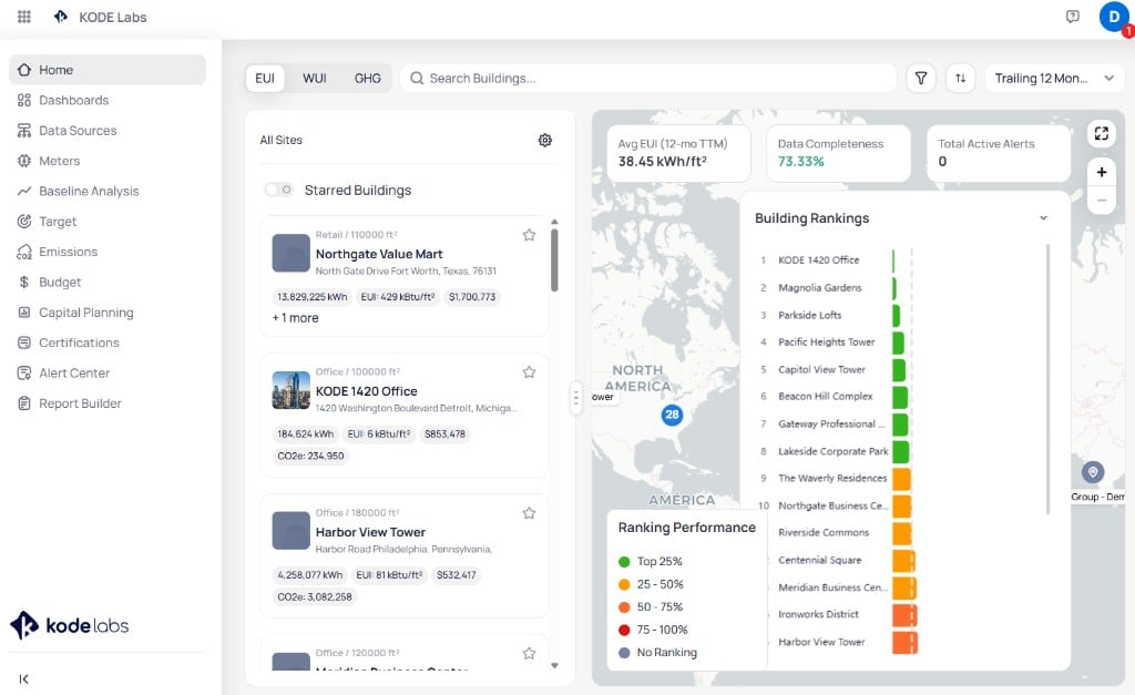
Portfolio Home ranking buildings by EUI with a performance-colored bar chart
How rankings and percentiles work
EnerG ranks every qualifying building by the active metric, then colors it by percentile band.
Lower intensity is better, so top performers sit in the green band. The same colors appear on the map, the ranking chart, and building cards.
Completeness sets who qualifies
Benchmarking only scores buildings that meet your completeness threshold. Buildings below it show No Ranking until coverage recovers. This prevents a building with missing bills from posting a misleading intensity. See Data completeness for how the gate works.Next steps
Portfolio Home
Rank buildings and filter by EUI, WUI, and GHG.
Data completeness
Understand the coverage gate that decides which buildings rank.
Emissions accounting
See how GHG intensity ties to scopes and emission factors.
Baselines and weather
Compare intensity against a weather-normalized reference.