

Dashboards in the left sidebar, then select Energy.
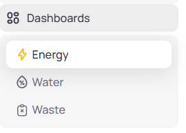
Portfolio Dashboards menu with Energy, Water, and Waste
Energy loads by default when you first open Dashboards. A secondary menu lists portfolio report types. Monthly Reports opens first.
Energy report menu
After you selectEnergy, use the secondary menu to switch report types.
Comparison, Interval Trends, or Data Quality. Open a building to access those reports on the Building Energy dashboard.Monthly Reports
Monthly Reports is the default Energy view at portfolio level. The page header reads Energy with the subtitle Energy Use, Efficiency, and Performance Overview.
Controls
The control area has two rows. The top row sets scope and the metric lens. The second row adds portfolio filters. Top row- Usage / Cost — switches every chart on Monthly Reports between consumption and billed cost (
Emissionappears when your deployment includes it) - Starred Buildings — limit results to favorited sites
- Buildings — select or deselect individual buildings
- Date range — pick the start and end months for the reporting window
- Filter — open advanced filters; an indicator appears when filters are active
- Building Type, Countries, States, Brands, and Regions — narrow the portfolio
- Currency — appears when
Costis selected so you view charges in one currency

Monthly Reports filters with Usage selected

Monthly Reports filters with Cost selected and Currency dropdown
Usage lens
SelectUsage on the toggle to view consumption charts.
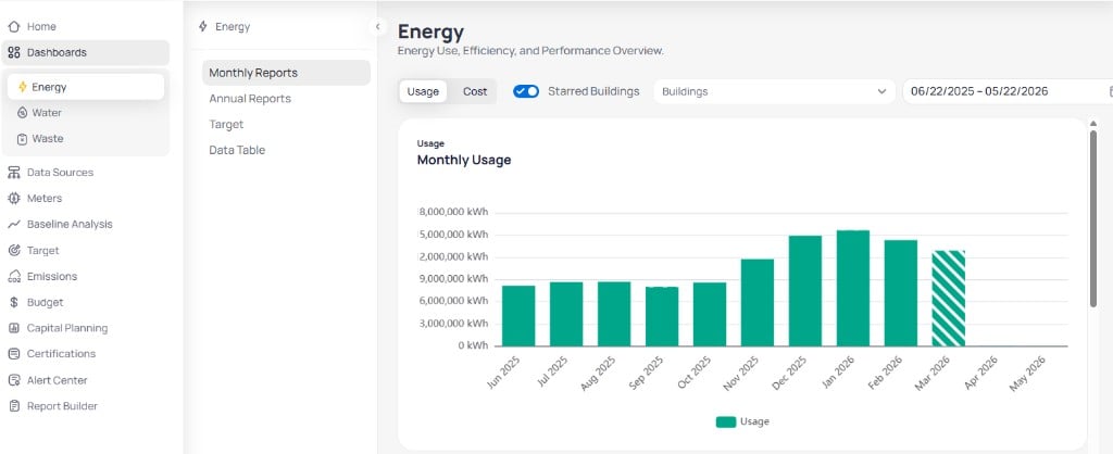
Portfolio Energy Monthly Reports with Monthly Usage chart and report menu
Monthly Usage
The Monthly Usage chart totals portfolio consumption by calendar month for the selected period.- Teal bars show billed or calendarized usage in kWh
- Striped bars indicate accrued or estimated months that lack final bills
- Empty months mean no data posted for that period under your active filters
Usage per Service Type
The Usage per Service Type chart stacks consumption by utility category across the same months.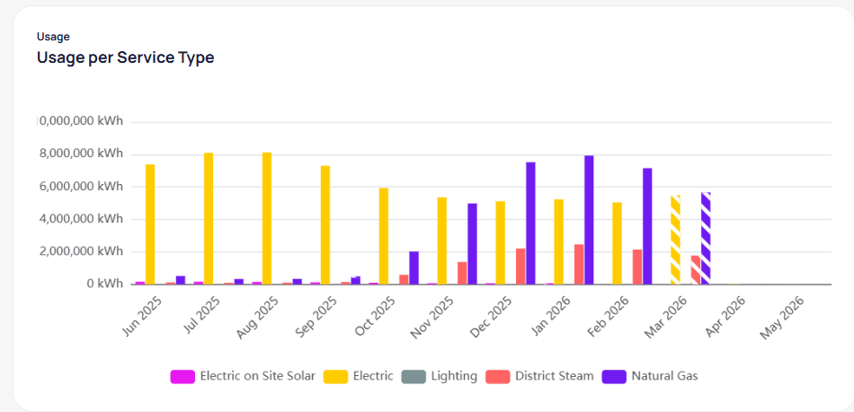
Usage per Service Type grouped bar chart by month
Usage per Building
The Usage per Building chart shows a heatmap-style view of each building’s monthly usage.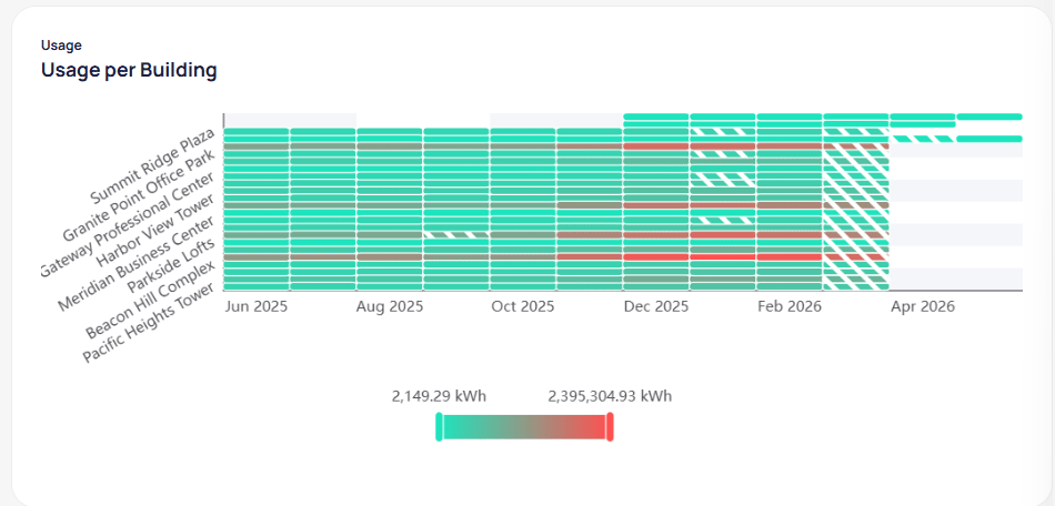
Usage per Building heatmap with color scale by kWh
Cost lens
SelectCost on the toggle to view billed charges. Chart titles change to Monthly Cost, Cost per Service Type, and related cost views.
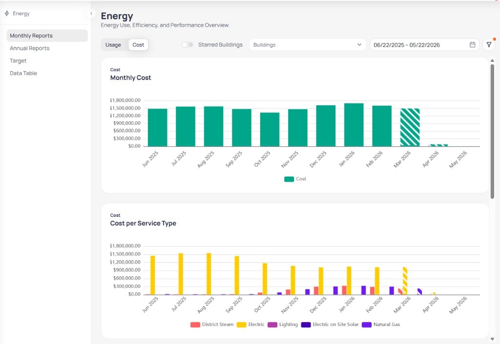
Portfolio Energy Monthly Reports with Monthly Cost and Cost per Service Type
Monthly Cost
The Monthly Cost chart totals portfolio utility spend by calendar month. Teal bars show billed cost. Striped bars indicate accrued or estimated months.Cost per Service Type
The Cost per Service Type chart groups spend by utility category across the same months. Use it to see which fuels drive cost spikes in winter or summer peaks.Cost per Building and Top 10 Buildings Movers
Scroll below the service-type chart to compare buildings.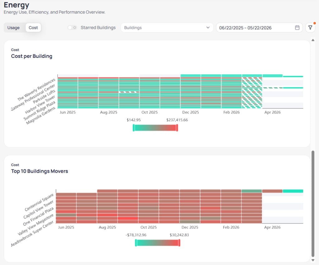
Cost per Building heatmap and Top 10 Buildings Movers chart
- Cost per Building — heatmap of monthly cost by property; color intensity reflects spend for that month
- Top 10 Buildings Movers — buildings with the largest cost shifts over the selected period; legend shows decrease in red and increase in teal
Emission lens
When your deployment includesEmission on the toggle, the same Monthly Reports layout shows carbon totals instead of usage or cost. Filters and building scope behave the same way.
Annual Reports
SelectAnnual Reports from the Energy secondary menu to compare buildings and years across the portfolio. The same filter rows as Monthly Reports apply, but the date control uses a year range (for example, 2021 to 2025) instead of month-by-month selection.
Usage lens
WithUsage selected, the main card is Connected Usage and EUI Analysis. It pairs two bar charts that share the same building axis.
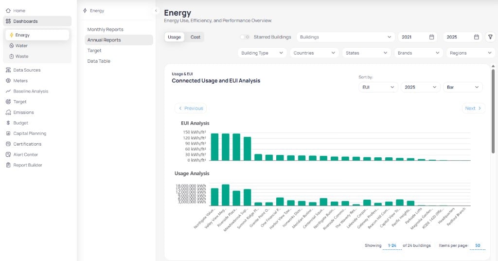
Annual Reports Usage view with Connected Usage and EUI Analysis
- Sort by — order buildings by EUI, usage, or other metrics
- Year — focus bars on a single calendar year such as 2025
- Chart type — switch between bar and other supported layouts
- Previous / Next — page through buildings when the portfolio exceeds one page
Usage per Service Type and Usage per Building
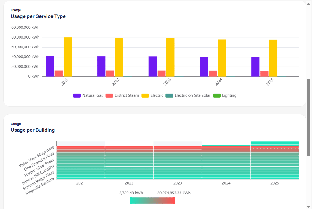
Annual Usage per Service Type and Usage per Building by year
- Usage per Service Type — grouped bars by year for Electric, Natural Gas, District Steam, and other categories
- Usage per Building — heatmap of each property’s annual usage; striped cells indicate accrued or incomplete data
Energy Usage Intensity
The Energy Usage Intensity heatmap compares EUI by building and year on a single color scale.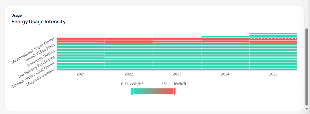
Energy Usage Intensity heatmap by building and year
Cost lens
SelectCost to open Annual Cost and Intensity Analysis with the same paired-bar layout, sorted and filtered for spend.
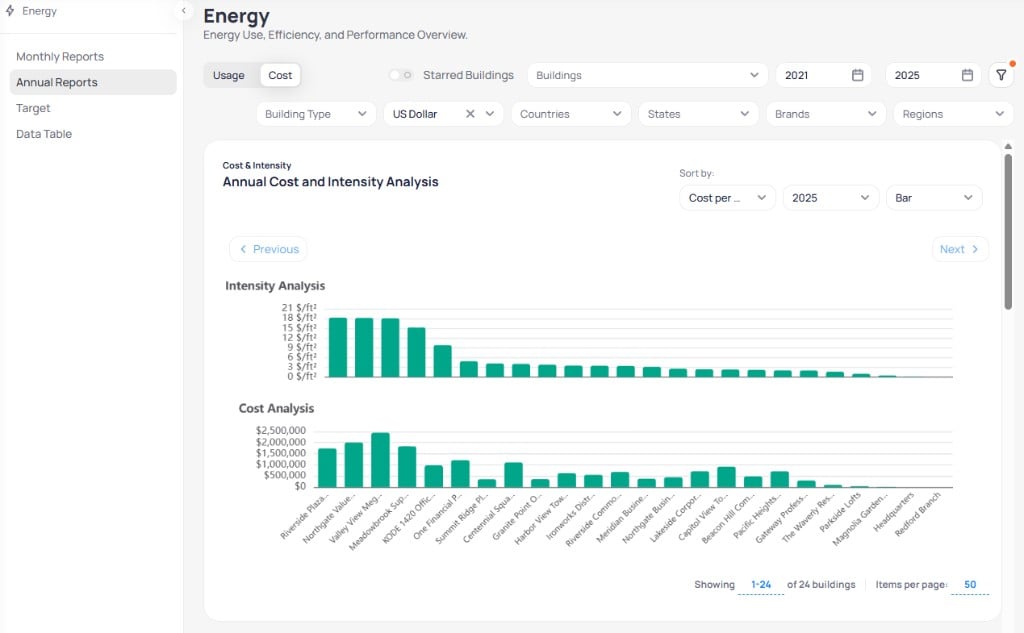
Annual Reports Cost view with Annual Cost and Intensity Analysis
Cost is active.
Annual Cost per Service Type and Annual Cost per Building
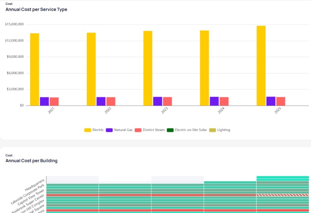
Annual Cost per Service Type and Annual Cost per Building by year
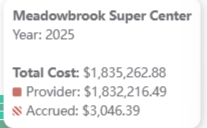
Annual cost tooltip showing Provider and Accrued split for a building
Rolling Cost
The Rolling Cost heatmap shows cost intensity in $/ft² by building and year.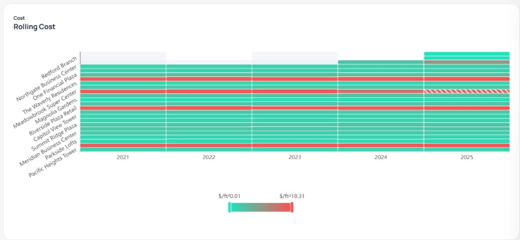
Rolling Cost heatmap by building and year
Target
SelectTarget from the Energy secondary menu to compare portfolio actual performance against a reduction target and baseline. Create and manage targets from the portfolio Target sidebar item or on Portfolio targets.
Controls
- Breakdown by Service Type — split charts by utility category when enabled
- Unit — choose the energy unit for charts, such as kBTU
- Target — select which portfolio target to display, such as a named 2050 reduction goal
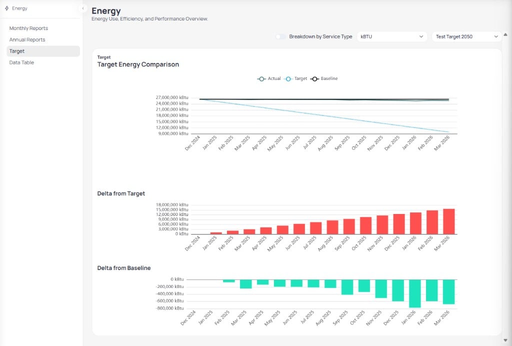
Portfolio Energy Target view with comparison and delta charts
Charts
Three charts stack on the Target page.Data Table
SelectData Table from the Energy secondary menu to audit line-level billing and calendarized records across the portfolio.
Filters and export
The Data Table uses a filter layout similar to Monthly Reports, with a few additions.- Starred Buildings and Buildings — limit rows to favorites or selected properties
- Building Type, Countries, States, Brands, and Regions — portfolio scope filters
- Period Type — control how periods are grouped in the grid
- Service tags — active chips such as
Full ServiceandDeliveryfilter service categories - Date range — restrict rows to a start and end date, such as 05/22/2025 – 05/22/2026
- Export — download the filtered table for offline analysis
Billing Period and Calendarized tabs
Switch between two views of the same underlying data.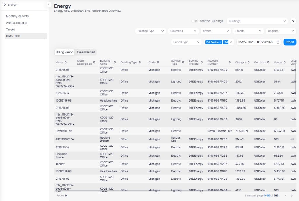
Data Table Billing Period tab with meter and building columns
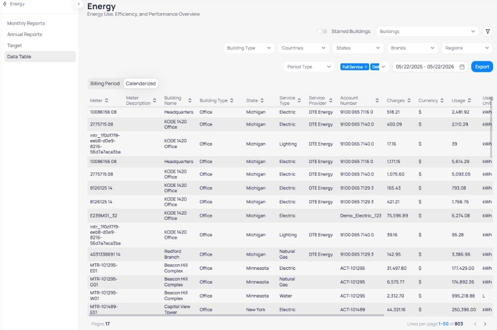
Data Table Calendarized tab with calendarized usage rows
Table columns
Sort any column with the header arrows. Scroll horizontally to reach all fields, including meter, building, service type, charges, usage,Estimated, and Data Origin. For every column definition, see data table columns.
true and Data Origin of System Accrual closes a gap until a final bill arrives. Confirm accrual rows before you use them in compliance or year-end reporting.Pagination
The footer shows page numbers and Lines per page (for example, 1–50 of 682 on Billing Period). Use the arrows to move through large portfolios without loading every row at once.Export Energy dashboard data
Export spreadsheet-ready data from any Energy dashboard chart or page. The file matches the building filter, date range, and metric toggle active when you download.Finalize filters
Run the export