

Home in the left sidebar to reach this page.
Benchmarking normalizes usage by area so you can compare buildings of different sizes fairly. To learn how intensity metrics and percentile rankings work, see Benchmarking and intensity.
The workspace has three areas: an All Sites building list on the left, an interactive map in the center, and a Building Rankings chart on the right.
Open Portfolio Home
ClickHome in the portfolio left sidebar. The page loads with EUI selected by default.
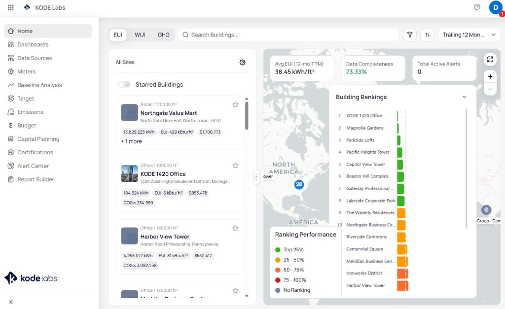
Portfolio Home with EUI selected, building list, map, KPI cards, and Building Rankings
Select a metric lens
ClickEUI, NEUI, WUI, or GHG at the top to set which metric drives the building list, KPI cards, map pins, and rankings. For what each intensity metric measures, see the three intensity lenses.
When you select NEUI, building cards and rankings show weather-normalized intensity. Indicators show whether each site is weather-normalized or on default consumption.
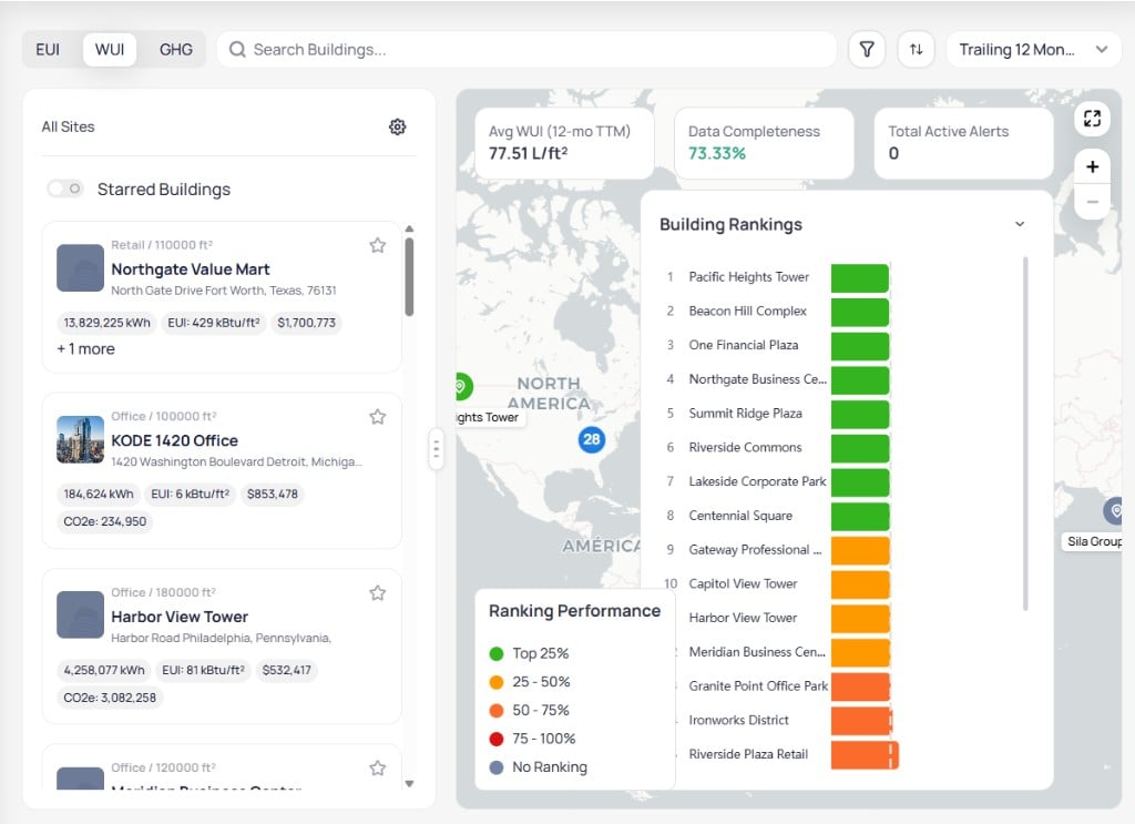
Portfolio Home with WUI selected and average WUI KPI card
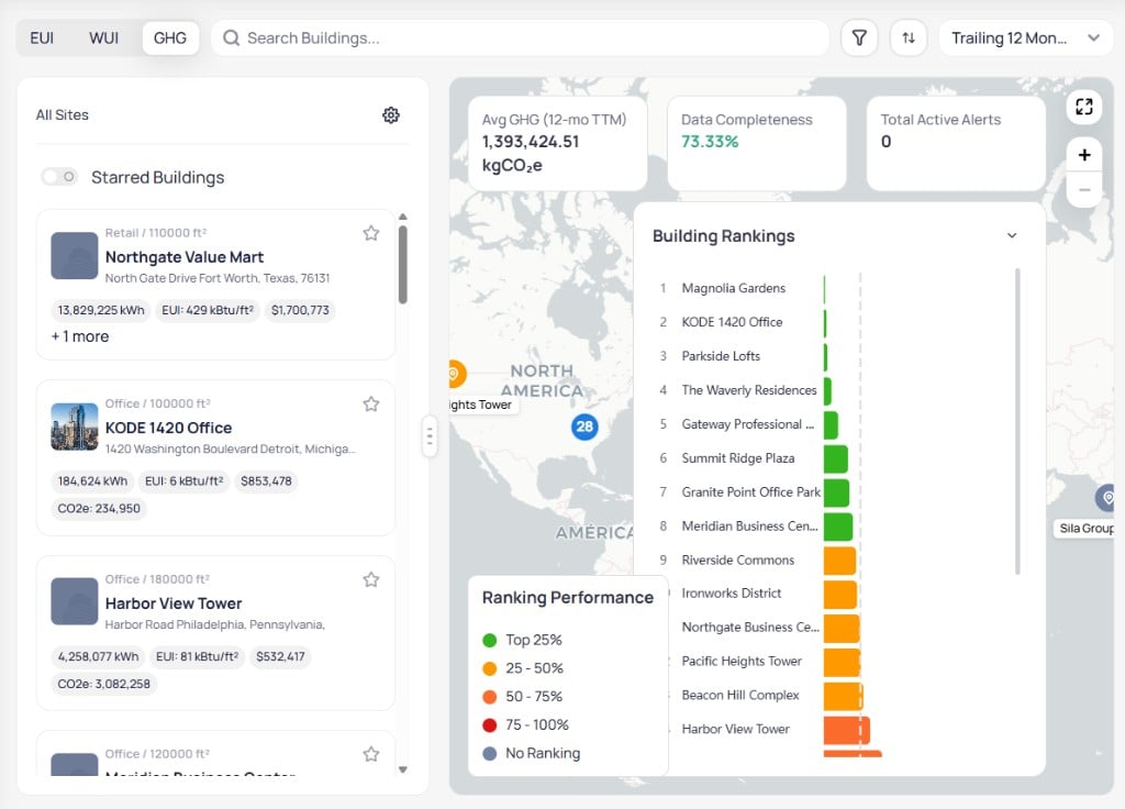
Portfolio Home with GHG selected and average GHG KPI card
Set the time period
Click theTrailing 12 Month dropdown to change the reporting window.
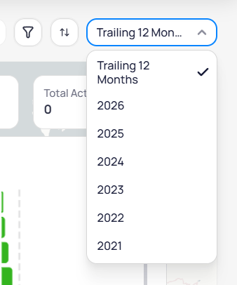
Time period dropdown with Trailing 12 Month and calendar year options
- Trailing 12 Month — rolling 12-month trailing total (default)
- Calendar years — fixed annual periods such as 2025 or 2024
Read summary KPI cards
Three KPI cards appear above the map. Labels change with the active metric toggle.- Average metric — portfolio average for EUI, WUI, or GHG over the selected period
- Data Completeness — percentage of expected billing data received across all buildings
- Total Active Alerts — count of open data quality alerts portfolio-wide
Browse building cards
TheAll Sites list shows every building in the portfolio. Each card includes property type, area, name, address, and metric pills for the active lens.
A collapsed card shows the primary metrics in the card body. Click + 1 more to reveal additional metrics such as CO2e when EUI is active.
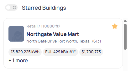
Building card with all metric pills visible including CO2e
- 184,623.99 kWh — total energy for the period
- CO2e: 234,949.62 — emissions total
- Charges: $853,478.09 — utility cost
- EUI: 6.30 kBtu/ft² — energy use intensity
Search Buildings... field to find a site by name. Click any card to open its detail panel on the left.
Star buildings and filter favorites
Click the star icon on a building card to mark it as a favorite. ToggleStarred Buildings at the top of the list to show only starred sites.
Sort the building list
Click the sort icon (two arrows) next to the search field.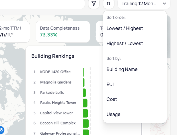
Sort menu with order and sort-by options
- Sort order —
Lowest to HighestorHighest to Lowest - Sort by —
Building Name,EUI,Cost, orUsage
Filter the portfolio
Click the filter icon (funnel) to narrow the building list, map, KPI cards, and rankings together.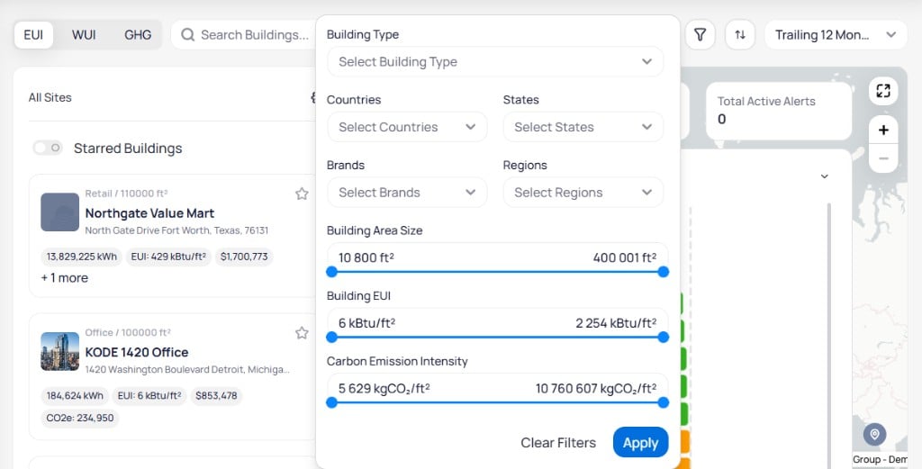
Filter modal with building type, geography, brand, and range sliders
Benchmarking scores only buildings that meet your data completeness threshold. Buildings below it appear with No Ranking until data improves.
Configure detail panel sections
Click the gear icon above the building list to openConfigure Sections. Drag sections to reorder them. Use checkboxes to show or hide sections. Turn on Keep Open to leave accordions expanded for every building.
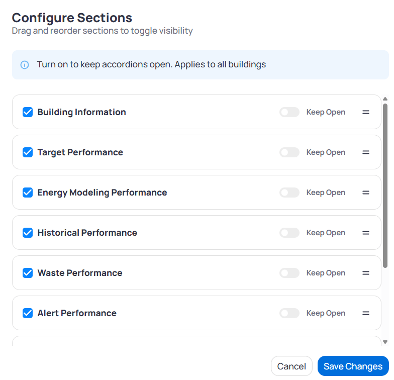
Configure Sections dialog with core performance sections
Open a building detail panel
Click a building card to replace the list with a detail panel. You stay on Portfolio Home—you do not enter the building view until you clickGo to Building. The panel shows summary metrics, map context, ranking widgets, and expandable sections so you can triage a site before you open building-level dashboards.
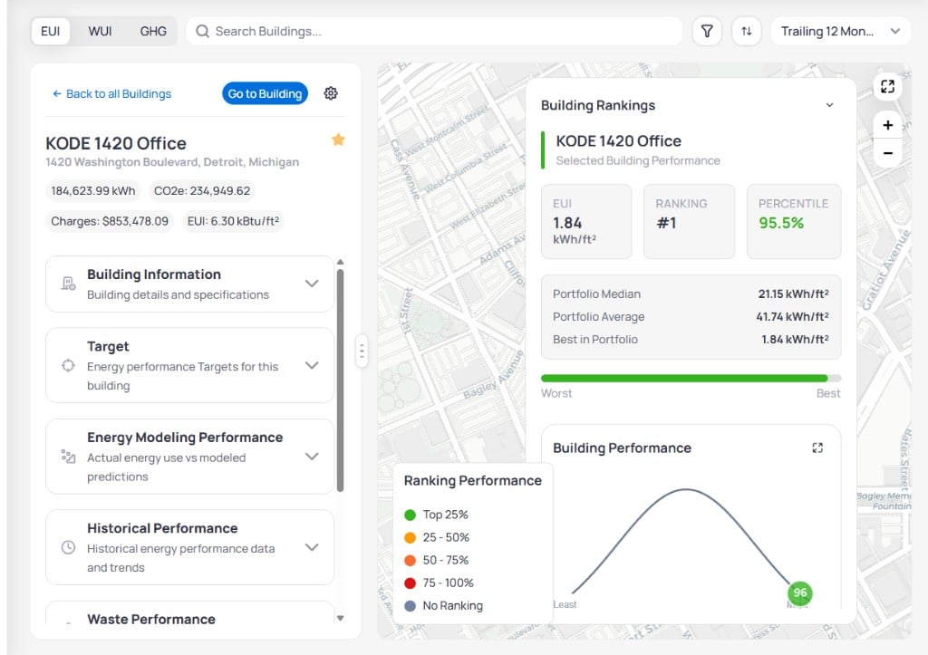
KODE 1420 Office detail panel with ranking cards and performance chart
Go to Building to open the building view. Click Back to all Buildings to return to the full list.
Detail panel sections
Expand each section to review building-specific data without leaving Portfolio Home.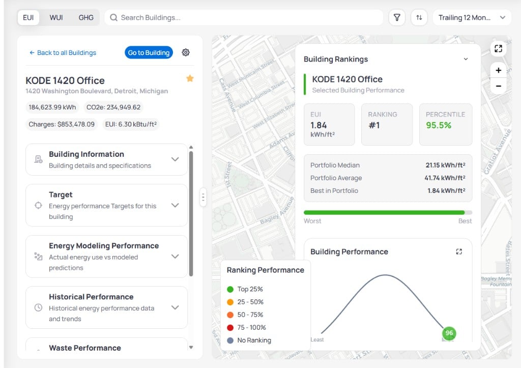
KODE 1420 Office detail panel with expandable performance sections
Scroll the panel to reach Alert Performance and Certifications Performance when those sections are enabled in
Configure Sections.
Use the Building Rankings widget
TheBuilding Rankings bar chart on the right ranks every building by the active metric and colors each bar by percentile band. For what each band color means, see how rankings and percentiles work.
Click the expand icon in the top-right corner of the widget for a larger view with readable axes and labels.
Use expanded chart mode when you present rankings to stakeholders who need larger labels.
Next steps
Portfolio Energy dashboard
Review portfolio energy usage, cost, and emissions charts.
Building Energy dashboard
Analyze usage, cost, and emissions for a single building with shared date ranges.
Alert Center
Triage billing anomalies surfaced in Alert Performance and portfolio alerts.
Portfolio data sources
Connect feeds that raise completeness so more buildings qualify for benchmarking.