

Trends is a building-level module. Select a building from the sites list to access its trends.
Access trends
You can access trends from two locations:- Device details — open a device’s details page and click the
Trendstab to see historical data for that device’s points. From the summary bar, clickFaultsto open the FDD Faults panel for that device. - Trends module — click
Trendsin the left sidebar menu to access the standalone multi-point trending interface
Add points to a trend chart
1
Open the trends module
Click
Trends in the left navigation bar to open the multi-point trending interface.2
Select points
Use the left panel to filter points by Area, Type, Point Field, and Device. Search for specific points by name. Check the points you want to plot — selected points appear on the chart immediately.Click
Show Selected to view only the checked points grouped by device, or Clear Selection to reset.3
Set the time range
Use the date picker at the top right of the chart to select the analysis period. Available presets include Last 2 Days, Last 7 Days, and custom ranges. The granularity indicator (for example,
at 1 minute) shows the current data resolution.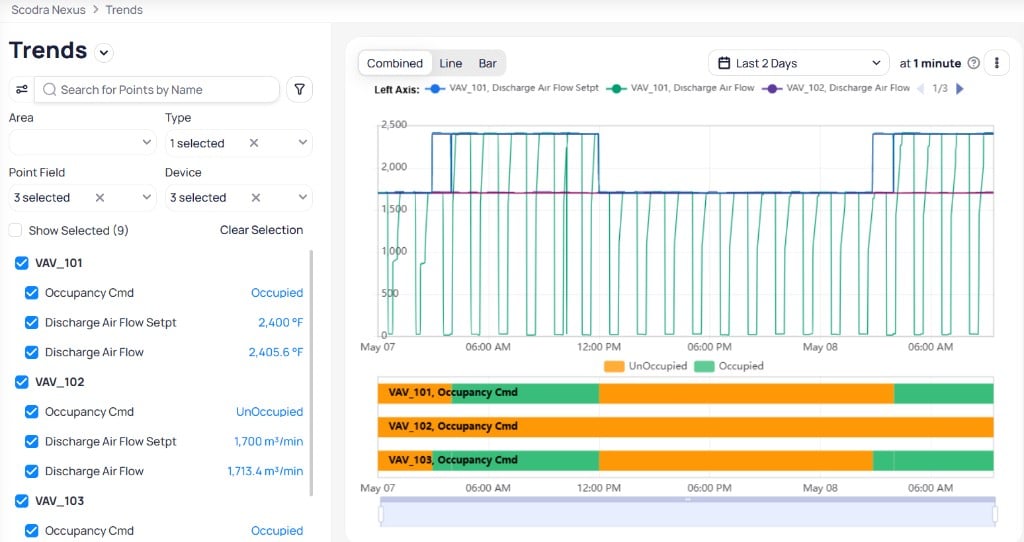
The Trends interface with point filters on the left, line and bar charts in the center, and time range controls at the top
Chart layout
The trend chart divides data into two visual sections:- Upper section displays numeric data (temperature, pressure, flow rate, valve position) as line charts. Switch between Combined, Line, and Bar tabs to change chart style.
- Lower section displays binary or enumerated data (on/off status, mode selections) as colored bar charts
Interact with the chart
Zoom
Use the zoom bar or your mouse scroll wheel to zoom into a specific time period. As you zoom in, the data resolution increases and more detailed readings become visible.Hover for values
Hover over any point on the chart to see the exact data value and timestamp for all plotted points at that moment.Customize the Y-axis
Configure two Y-axes to display different measurement types simultaneously. For example, show temperature on the left axis and flow rate on the right axis.Clickable legend
Click any point name in the chart legend to hide or show that data series. This helps you focus on specific points without removing them from the chart.Data granularity
Granularity adjusts automatically based on the selected time range:Granularity applies only to the line chart and adjusts based on the selected date range.
Chart configurations
Open the Configurations panel from the right side of the chart to adjust display settings, aggregate functions, and Y-axis assignments.Settings
- Show tooltip — toggle the tooltip that appears when you hover over data points on the chart
- Interpolation — toggle interpolation to smooth the trend line between data points
Aggregate functions
When viewing trend data at lower resolutions, you can set the aggregate function per point field. Available options:- Average calculates the mean value over each interval
- Sum totals the values within each interval
- Max shows the highest value in each interval
- Min shows the lowest value in each interval
- Count shows the number of readings in each interval
Y-axis assignment
Assign each point field to the Left or Right Y-axis. Use separate axes when plotting different measurement types (for example, temperature on the left and flow rate on the right) so each series scales independently.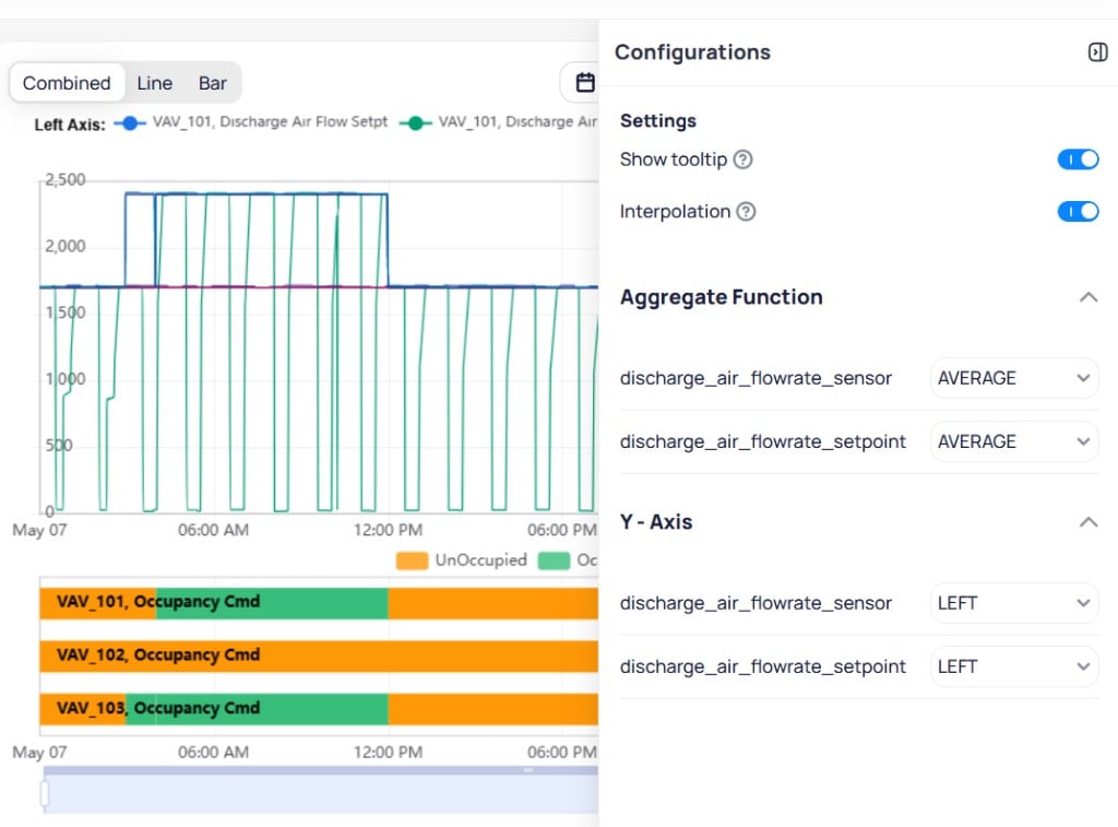
The Configurations panel controls tooltip, interpolation, aggregate functions, and Y-axis assignment per point field
Save and share trend views
Click the three-dot menu at the top right of the chart to access Save View, Copy link to Trends, and Export Point Timeseries.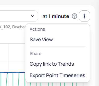
The three-dot menu provides Save View, Copy link to Trends, and Export Point Timeseries
Save a view
SelectSave View from the menu. Enter a Name for the view and check Public if you want to share it with other users. Click Save to store the configuration.
Saved views can be accessed by everyone assigned on the building if they are public.
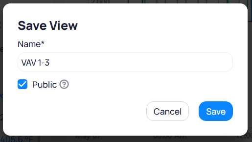
Name the saved view and set it to Public for building-wide access
- Dynamic (for example, “Last 7 Days”) always shows recent data relative to the current date
- Static preserves a specific date range for consistent review
Share a view
SelectCopy link to Trends from the menu to copy a shareable URL. Recipients see the same chart configuration and data.
Export trend data
SelectExport Point Timeseries from the menu to download trend data as a CSV file. The export includes all plotted points with their timestamps and values for the selected time range.
Use cases for multi-point trending
The following scenarios demonstrate how building operators use multi-point trending to diagnose issues and optimize performance.Chilled water system optimization
Scenario: The chilled water system comprises chillers, chilled water pumps, and sensors monitoring temperature and flow at key points. The building’s energy manager wants to optimize chiller efficiency but notices inconsistent cooling throughout the building. What to trend: Plot the chilled water supply temperature (primary loop leaving temp), return temperature (primary loop entering temp), and run status for each chiller module. Include the AHU discharge air temperature and outside air temperature to see how efficiently cold water is distributed across zones. What to look for: Compare supply and return temperature differential against chiller run status. A narrowing delta-T while chillers are running indicates reduced heat transfer efficiency. Correlate AHU discharge temperatures with chilled water supply to identify distribution imbalances.Condenser water system monitoring
Scenario: A large commercial building has a condenser water system with a cooling tower, condenser pumps, and temperature and pressure sensors. The operators notice the cooling tower is not maintaining the required condenser water temperature, leading to cooling inefficiencies. What to trend: Plot the condenser water return temperature, supply temperature, and condenser pump speed alongside outside air temperature and cooling tower fan percentage. What to look for: A rising return temperature despite adequate fan speed and favorable outdoor conditions suggests fouling or mechanical issues. By plotting these variables on a single chart, you can see how the return temperature fluctuates relative to outside air temperature and pump operation without switching between multiple views.Fan and AHU coordination
Scenario: The building has multiple AHUs and fans providing ventilation across different floors. Energy usage spikes during peak occupancy hours, and the operations team wants to determine if fans and AHUs are operating efficiently. What to trend: Plot fan speeds, building static pressure, AHU discharge air temperatures, VAV discharge damper commands, discharge airflow, and zone temperatures. Include effective occupancy status for VAVs and FCUs to correlate with load patterns. What to look for: Compare fan speed and static pressure against zone temperatures and damper positions. If static pressure drops while dampers are fully open, the AHU may be undersized for the current load. Correlate occupancy status with energy patterns to identify over-conditioning of unoccupied zones.Next steps
Schedules
Use trend data to evaluate and optimize equipment schedules.
Devices
Access device details and view trends for specific equipment.