

Dashboard views
The portfolio dashboard includes four views. Select a tab at the top of the page to change the analysis:- Operations — Work order volume, status, compliance, and distribution by maintenance type
- Time analysis — Logged hours, estimated versus actual time, and hours by work type
- Forecast — Forward-looking workload projections
- Historical trends — Longer-term performance over time
Filter the dashboard
Use the filter bar below the view tabs to narrow results. Filters apply across Operations, Time analysis, Forecast, and Historical trends so KPIs and charts stay aligned. The same Region filter logic is available on portfolio work orders and portfolio schedules. Available filters include:- Created date — Date range for work included in the charts (for example, last 30 days)
- Building — One or more buildings in the portfolio
- Region — Geographic or organizational grouping that scopes every metric and list to that part of the portfolio
- Property type — Building classification
- Work type — Maintenance program (preventive maintenance, inspections, corrective maintenance, service requests)
- Category — Portfolio category assigned to work orders
- Status — Open, completed, and other workflow statuses
Overdue Only
Enable Overdue Only on the Operations dashboard to recalculate every KPI and chart for overdue work only. Overdue is a work state based on the due date, not a single lifecycle status. The toggle includes overdue work that is still in progress and completed work that was overdue. Use Overdue Only with Region (and other filters) when you need overdue backlog by geography.Operations view
The Operations view summarizes portfolio health with KPI cards, completion rates, work distribution over time, creation patterns, category breakdowns, and SLA and priority charts.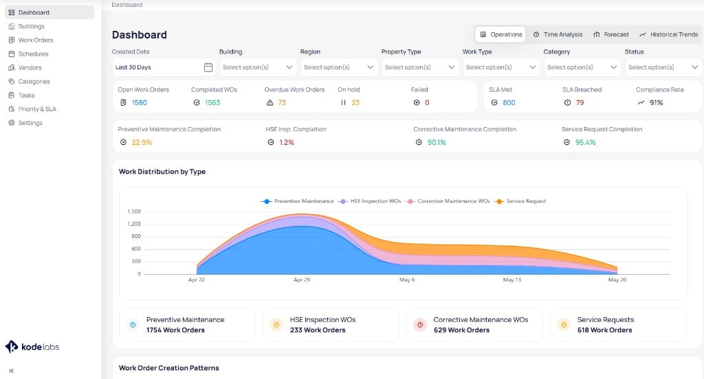
The Operations view shows KPI cards, completion rates, and work distribution by maintenance type
KPI summary
The top row of cards highlights current work order status and SLA outcomes:Completion rates
Below the KPI row, completion rate tiles show progress by maintenance program, such as preventive maintenance, inspections, corrective maintenance, and service requests. Use these tiles to compare planned versus reactive workload completion across the portfolio.Work distribution by type
The Work distribution by type chart displays how work order volume changes over the selected date range. Stacked areas represent preventive maintenance, inspection work orders, corrective maintenance work orders, and service requests. Summary boxes below the chart list total work order counts for each type in the filtered period. Use this section to see which programs drive the most volume portfolio-wide.Work order creation patterns
The Work order creation patterns heatmap shows when work orders are created across days of the week and time of day. Darker cells indicate higher volume.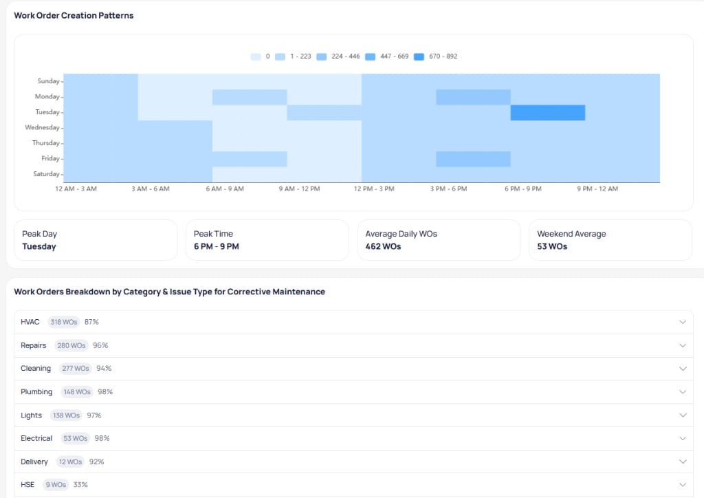
The creation patterns heatmap shows peak days and times, with a corrective maintenance breakdown by category below
- Peak day — The day of the week with the highest creation volume
- Peak time — The time block with the highest creation volume
- Average daily work orders — Mean creations per day in the filtered period
- Weekend average — Mean creations on weekends
Breakdown by category and issue type
The Work orders breakdown by category and issue type for corrective maintenance section lists corrective maintenance volume by category. Each row shows the category name, work order count, and share of corrective maintenance work. Expand a category to view issue types within that category. Use this breakdown to identify recurring problem areas across the portfolio.SLA and priority
The SLA and priority section shows how work orders in the filtered set align with SLA targets and assigned priority levels.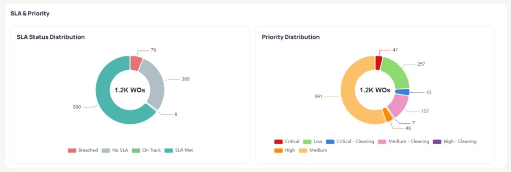
Donut charts compare SLA status and priority distribution for the filtered work order set
SLA status distribution
The SLA status chart groups work orders by SLA outcome, such as:- SLA met — Completed within the defined SLA window
- On track — Open work still within SLA
- Breached — Open or closed work that missed SLA
- No SLA — Work without an assigned SLA target
Priority distribution
The priority distribution chart shows how work is spread across priority levels, including standard priorities and specialized priorities such as cleaning. Use this chart with the SLA chart to see whether high-priority work is meeting targets.Time analysis view
The Time analysis view tracks labor hours logged against work orders across the portfolio.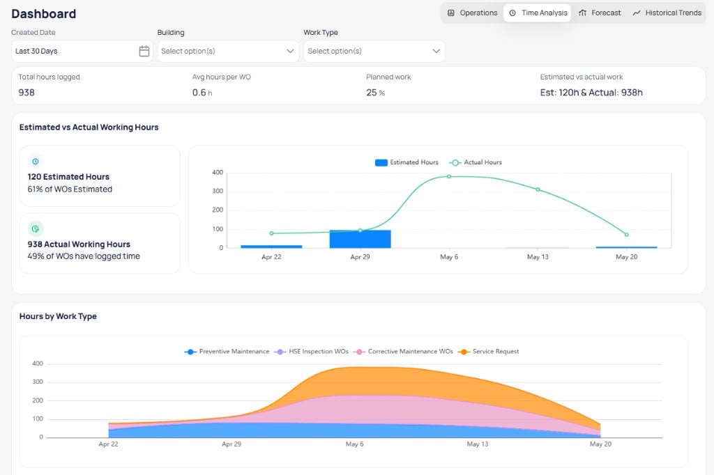
Time analysis shows logged hours, estimated versus actual time, and hours by work type portfolio-wide
Summary metrics
The top row typically includes:- Total hours logged — Sum of time entries in the filtered period across all buildings
- Average hours per work order — Mean logged time per work order
- Planned work — Share of hours tied to planned maintenance programs
- Estimated versus actual work — Comparison of estimated hours to logged hours
Estimated versus actual working hours
This section compares estimated hours on work orders to actual hours logged over time. Summary cards show how many work orders include estimates and how many have logged time portfolio-wide. Use this chart to spot periods where actual labor significantly exceeds estimates.Hours by work type
The Hours by work type chart shows how logged hours distribute across preventive maintenance, inspections, corrective maintenance, and service requests over the selected period. Use it to see which programs consume the most labor across the portfolio.Forecast view
The Forecast view projects upcoming scheduled work across buildings in the portfolio.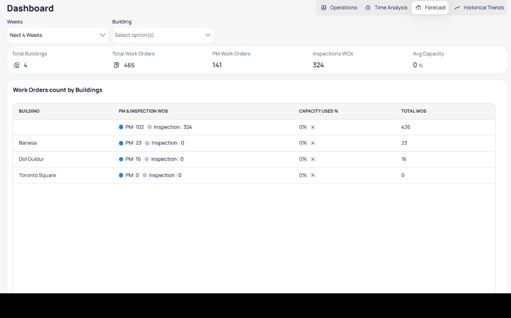
Forecast aggregates upcoming preventive maintenance and inspection work orders by building
Summary metrics
The top row typically includes:- Total buildings — Buildings included in the forecast
- Total work orders — Upcoming scheduled work across the portfolio
- PM work orders — Upcoming preventive maintenance count
- Inspection work orders — Upcoming inspection count
- Average capacity — Average capacity used across buildings in the period
Work orders count by buildings
The Work orders count by buildings table lists each building with:- PM and inspection work orders — Breakdown of upcoming preventive maintenance versus inspections
- Capacity used % — Share of available capacity consumed by scheduled work
- Total work orders — Combined upcoming count for the building
Historical trends view
The Historical trends view shows longer-term patterns for work volume and completion across the portfolio.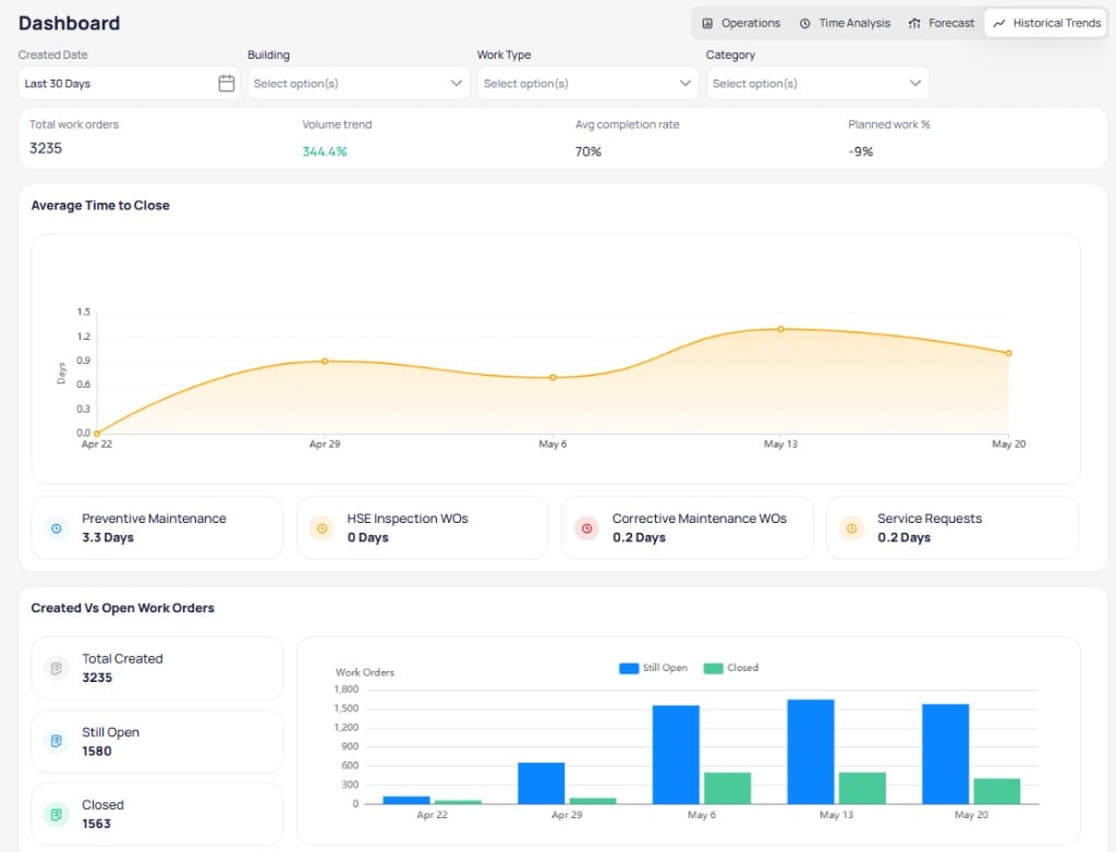
Historical trends show time to close and created versus open work orders portfolio-wide
Summary metrics
The top row typically includes total work orders, volume trend, average completion rate, and planned work percentage for the filtered period.Average time to close
The Average time to close chart tracks how long work takes to close over time across the portfolio. Summary cards below break out average days to close by work type, such as preventive maintenance, inspections, corrective maintenance, and service requests.Created versus open work orders
The Created versus open work orders section compares work created in the period to work still open versus closed. Summary cards list total created, still open, and closed counts. The chart shows open and closed volumes over time so you can see backlog growth or reduction portfolio-wide.When to use the portfolio dashboard
Use the portfolio dashboard when you oversee multiple buildings and need cross-site visibility. Select a building from Buildings when you need site-specific detail in the building dashboard.Related modules
Buildings
Open a building to manage assets, work orders, and teams at the building level.
Work orders
Review and filter work orders across the entire portfolio.
Schedules
Monitor recurring maintenance portfolio-wide.
Priority & SLA
Configure priority levels and SLA targets applied on the dashboard.