

Bar
Vertical bars comparing values between categories.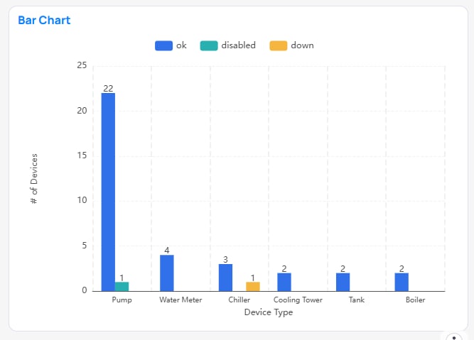
Bar chart
Horizontal Bar
Horizontal bars comparing values between categories.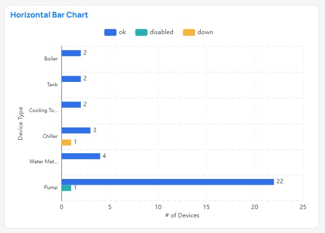
Horizontal Bar chart
Stacked Bar
Vertical bars comparing values between categories. Legend categories stack values rather than creating new bars.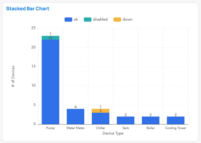
Stacked Bar chart
Horizontal Stacked Bar
Horizontal bars comparing values between categories. Legend categories stack values rather than creating new bars.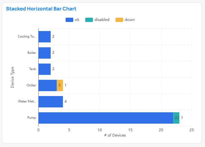
Horizontal Stacked Bar chart
Combo
Line(s) and Bar(s) over a shared axis. Bar(s) uses Primary Y-Axis and Line(s) Secondary Y-Axis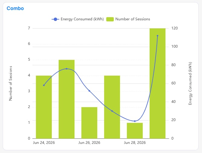
Combo chart
Line
Line(s) over a continuous axis. Multiple lines will overlay on Y-Axis.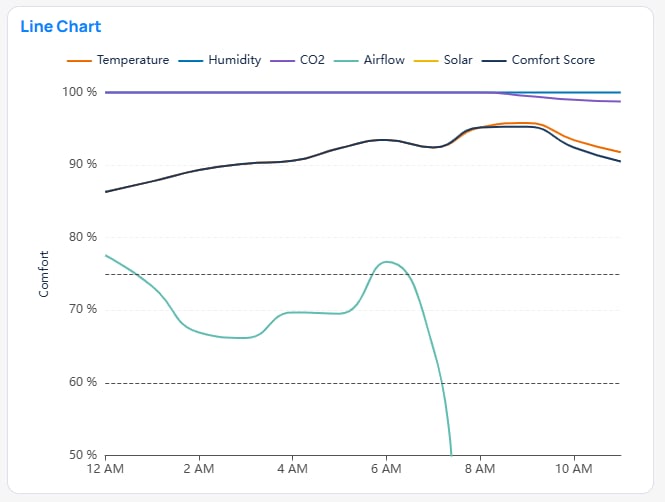
Line chart
Line Area
Line(s) over a continuous axis. Multiple lines will overlay on Y-Axis with the area under the line being shaded.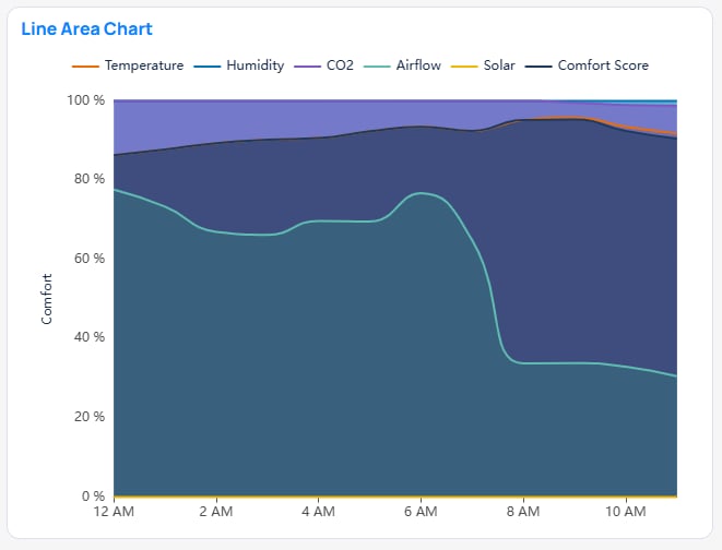
Line Area chart
Stacked Line
Line(s) over a continuous axis. Multiple lines will sum on Y-Axis.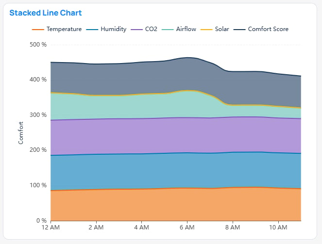
Stacked Line chart
Pie
Proportional Categorical slices of total value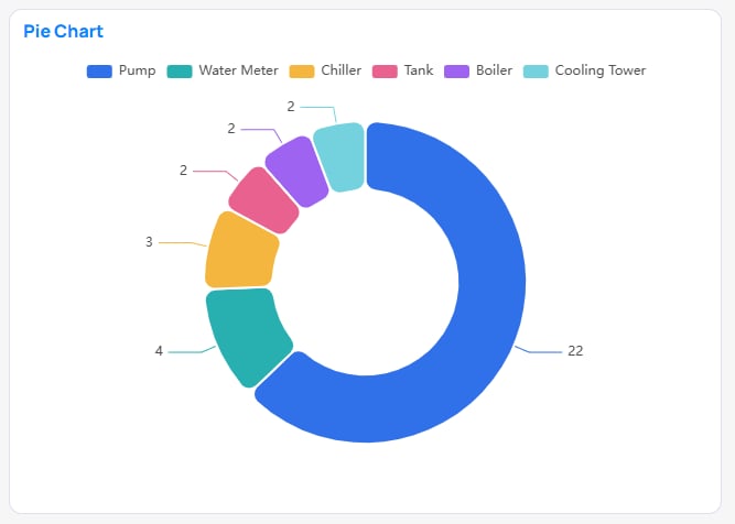
Pie chart
Sunburst
Nested proportional Categorical slices of total value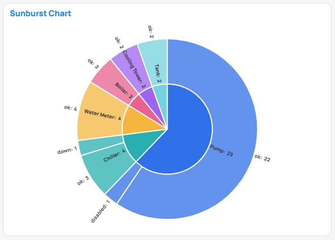
Sunburst chart
Multi-row Card
A compact display of many value(s) or label(s) across a dimension. Similar to a Table.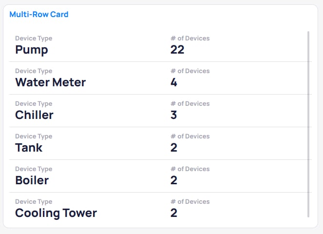
Multi-row Card chart
Card
A compact display of one value or label.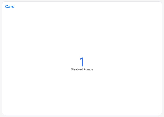
Card chart
Number (Period)
A compact display of one metric value compared to the same metric value from a previous time period.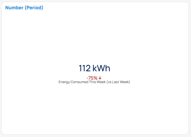
Number (Period) chart
Number (Target)
A compact display of one metric value being compared to a target metric value. Values are concatenated with a ’/’.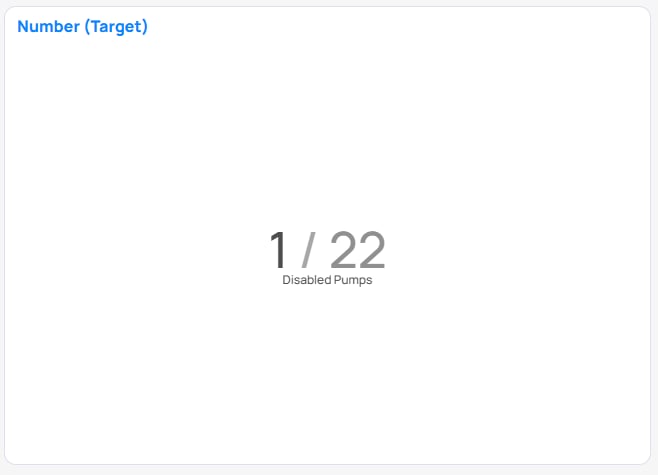
Number (Target) chart
Number with Trend-line
A compact display of one metric value with a miniature visualization of that metric value trend across a time period.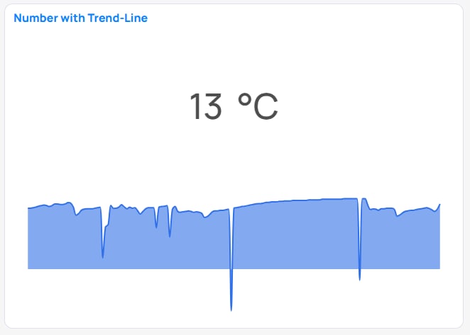
Number with Trend-line chart
Heatmap
A grid that encodes a value as cell color across two axes (X and Y) — the color is the “third axis.”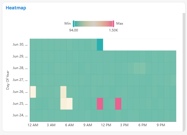
Heatmap chart
Treemap
Nested rectangles sized by value; click an area to break it into smaller divisions.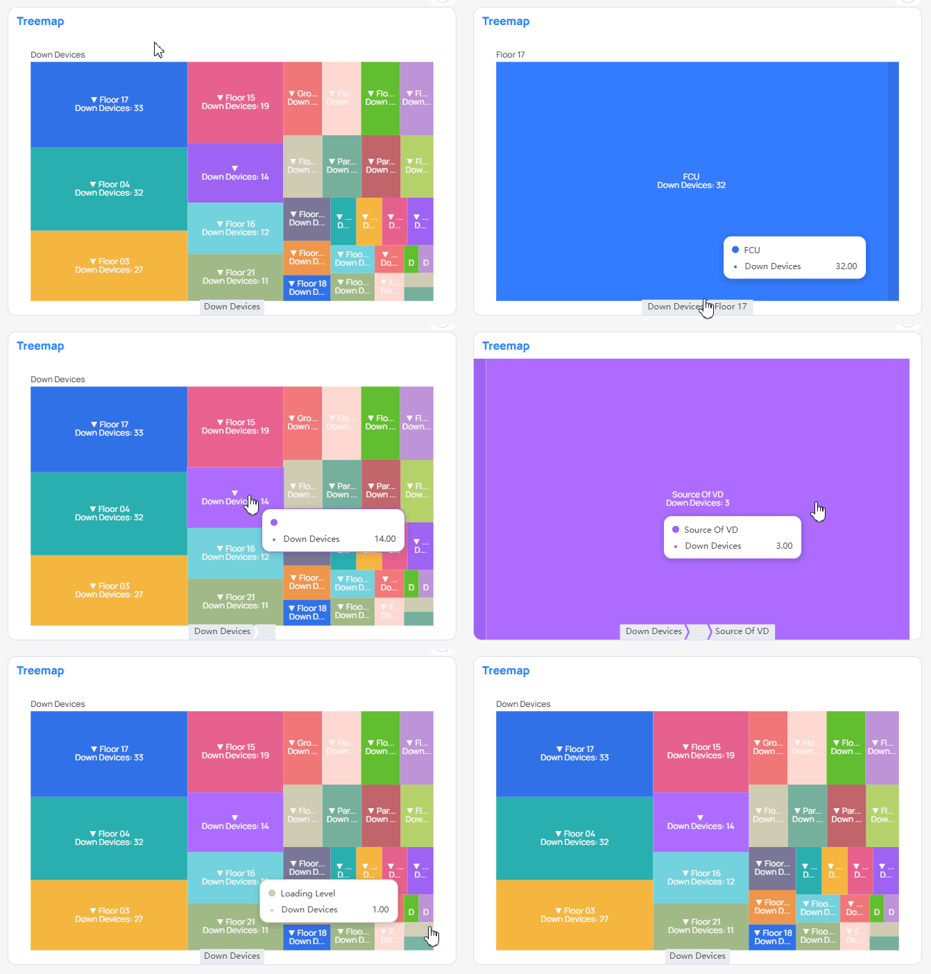
Treemap chart
Scatter
Data points plotted against two metric axes — used to reveal correlation or clustering between two measures.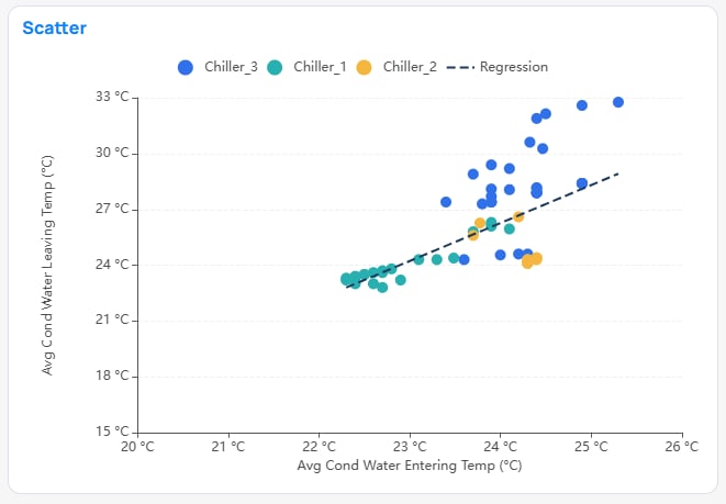
Scatter chart
Scatter vs Advanced Scatter Standard Scatter plots two metrics. Advanced Scatter plots two dimensions and sizes each symbol by a metric.
Advanced Scatter
Array of data points whose axes are dimensions (not metrics, which is what distinguishes it from the standard Scatter), with each symbol sized by a metric value. Useful for visualizing distribution across categorical breakdowns.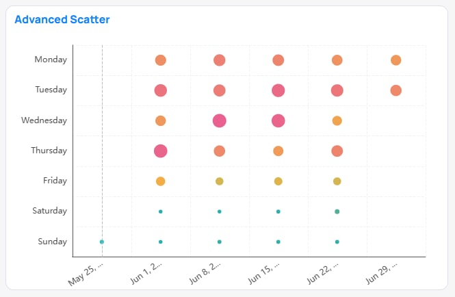
Advanced Scatter chart
Boxplot
Visualizes the distribution (median, quartiles, and outliers) of numerical values on the Y-Axis across categorical X-Axis values.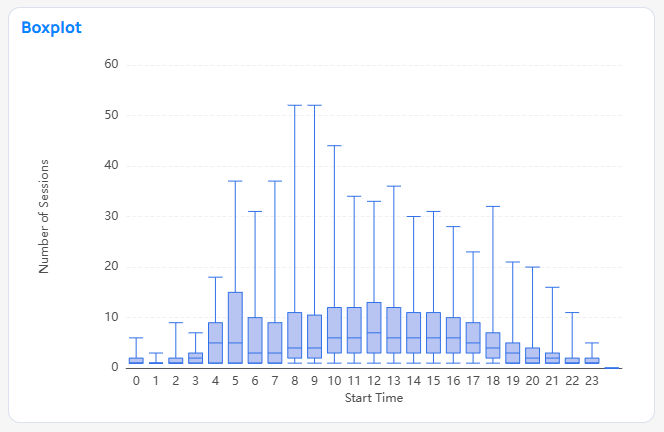
Boxplot chart
Horizontal Boxplot
Horizontally visualizes the distribution of numerical values on a X-Axis along some categorical Y-Axis Values.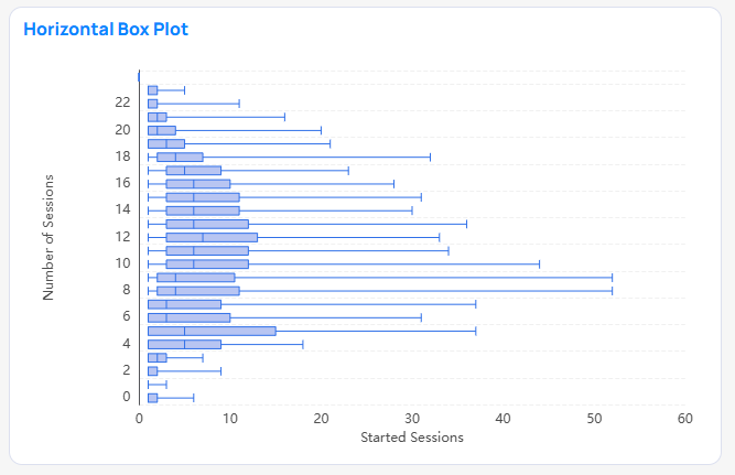
Horizontal Boxplot chart
Gauge
A compact display of one metric value being compared to a target metric value. The proportion between the value and target value is visualized by a curved progress bar.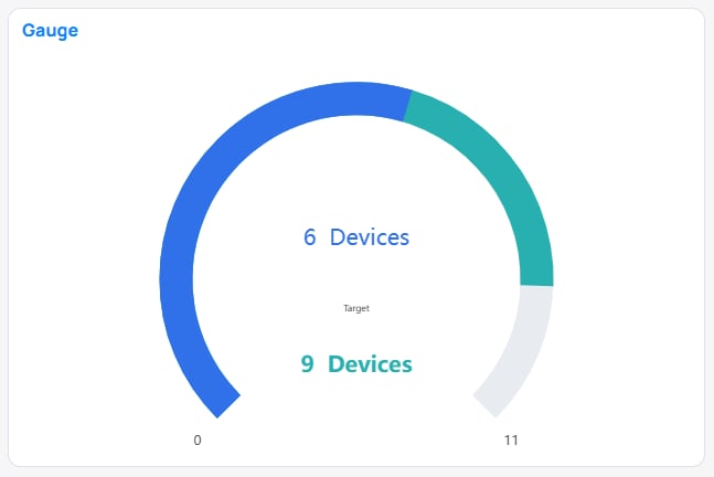
Gauge chart
Table Raw
Rows and columns of raw values from the selected Building BIData Source. See Table types.
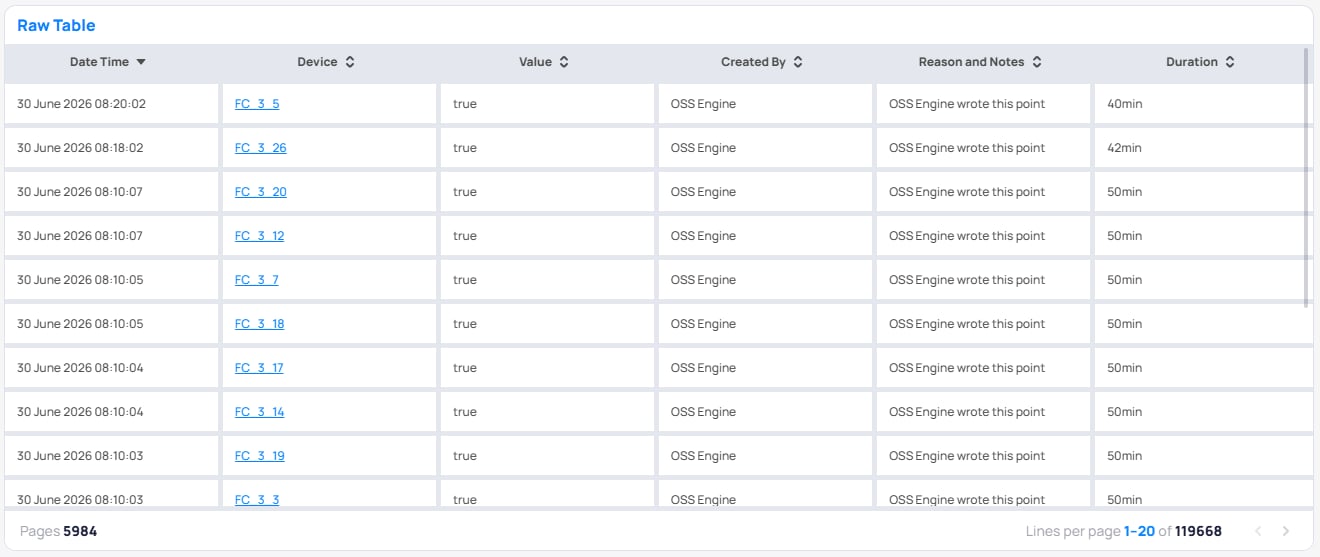
Table Raw chart
Table Pivot
A cross-tab table: rows come from a hierarchy, columns are pivoted from a dimension’s distinct values, and each cell holds an aggregated value. See Table types.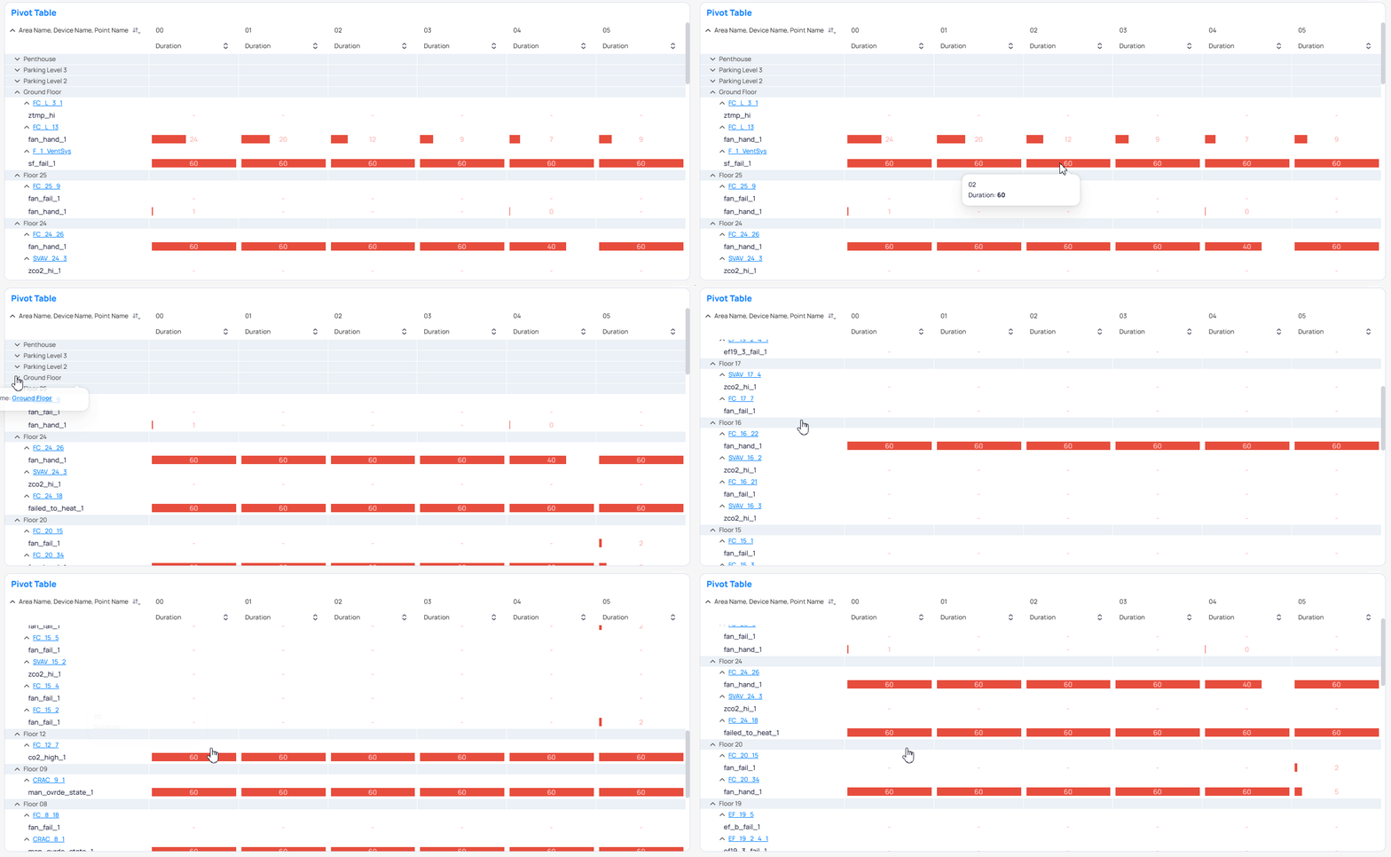
Table Pivot chart
Table Aggregated
Columns and values aggregated to those points. See Table types.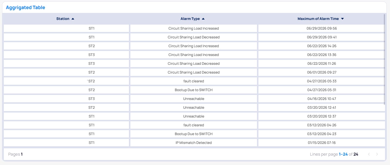
Table Aggregated chart
Text
A widget that holds stylized text — titles, notes, commentary, or section dividers. It has no Setup parameters; you type directly into the widget and style it from the side panel. The Text widget supports: Font Family, Font Size, Line Height, text/background Color, Insert Picture (images auto-fit the widget), Background styling (color or transparent), and Padding & Alignment. A bubble menu appears on text selection for quick inline formatting (font size/family, bold, italic, underline, alignment, bulleted/numbered lists). Insert options such as pictures are only in the side panel, not the bubble menu. See Chart Styling Options.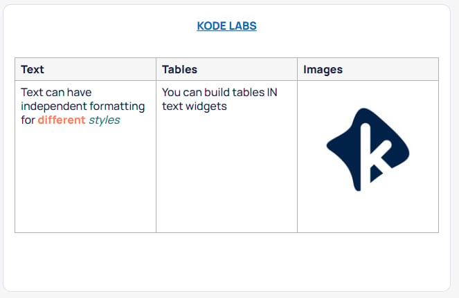
Text chart
IFrame
Embeds an external web page (an iframe) by URL.Weather
Shows the current and forecasted weather at a specific building. In portfolio view you must select a building. Editing this widget is done through styling options. See Chart Styling Options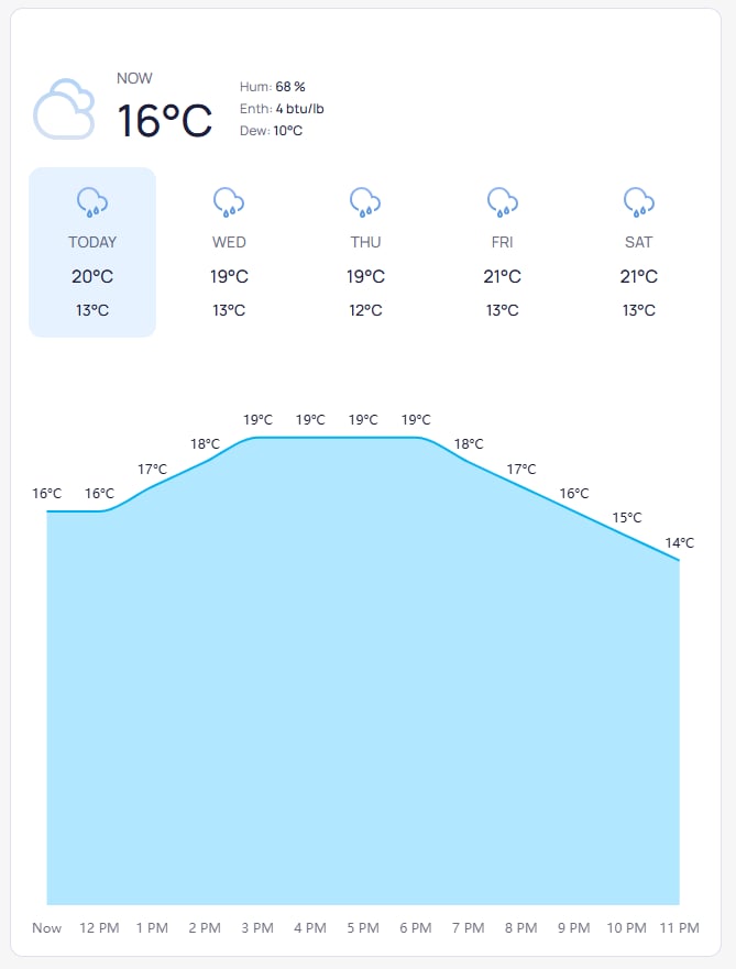
Weather chart
Sankey
A flow diagram where the width of each link is proportional to the quantity flowing between stages.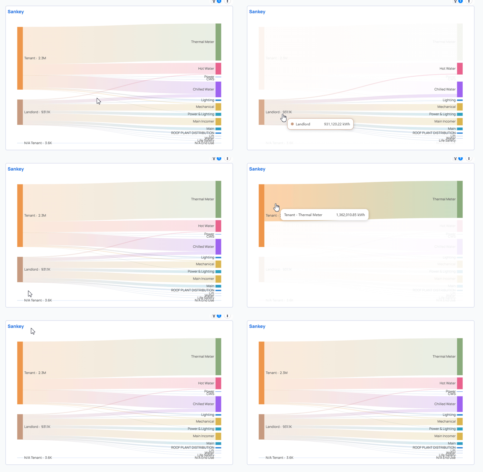
Sankey chart
Slicer
An on-canvas, interactive filter control bound to a single column. Viewers change the selection to filter the widgets in its scope. The display adapts to the column’s data type (dropdown/flat for strings and booleans, a min/max slider for numbers, and date-range pickers for dates). For the full configuration (data types, selection modes, display options) see Slicer Widget; for how slicer filters interact with other filters see Filter Options and Filter scopes.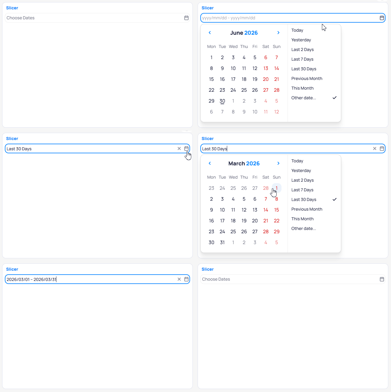
Slicer chart
Polar Bar
Radial or Polar bars comparing values between categories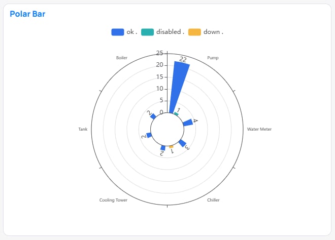
Polar Bar chart
Stacked Polar Bar
Radial or Polar bars comparing values between categories. Legend categories stack values rather than creating new bars.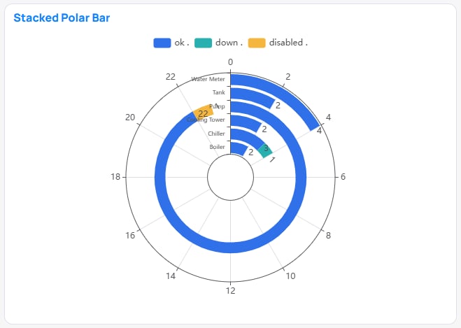
Stacked Polar Bar chart
Navigation
A button widget that navigates the viewer to another page. Clicking anywhere inside the widget (except the title) triggers navigation.
Style options: button Text (defaults to the page name), Font, Alignment, and Wrap text (up to 3 rows). If the page name is longer than the button, it is truncated with
… and shown in full on hover. The Navigation widget cannot be exported or shared. If its target page is removed, it reverts to the no-page-selected state.
Time Series
Visualizes how a value or state changes over time — when each change occurred and how long it held — drawn as colored spans, one row per category. Works best on raw Point Time Series (Real-Time) data.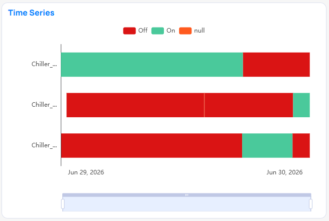
Time Series chart
Graphics
Embeds a KODE Graphics layout (floor plan / device / system graphic) inside a dashboard, with the advantage that BI filters drive what the graphic shows. For example, adevice_name page filter automatically focuses the graphic on that device.
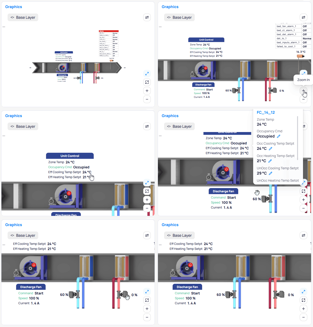
Graphics chart
Graphic Type and Building form a required group: the other filters stay disabled until both are set. Once rendered, the graphic’s markers and data points are filtered by all active dashboard, page, widget, slicer, drill-through, and cross filters (only
EQUALS / IN string filters on mapped columns such as device_name, device_id, point_name, point_id, and ontology fields are applied).
Timeline
A Gantt-style chart that draws each row as a horizontal bar spanning a start and end date — useful for visualizing when a state, task, or event was active and for how long.Tree
Branching nodes for nested hierarchies. You can change the orientation and the layout (Radial vs Orthogonal) in the style tab.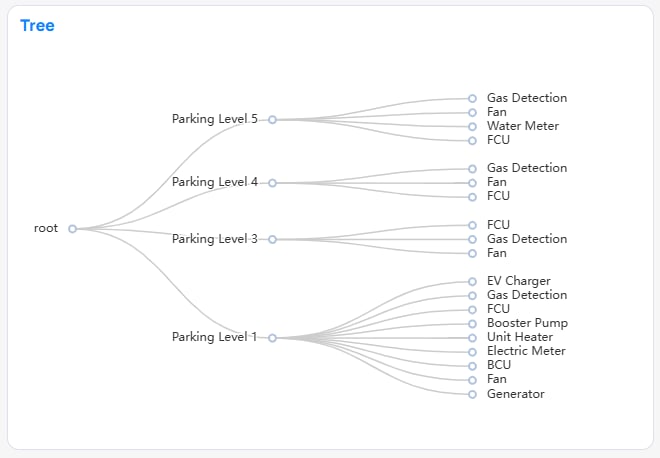
Tree chart
Picture
Show a picture from a file or external URLBuilding Date Time
Shows the local building time. You can adjust the visuals in the Style tab.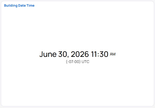
Building Date Time chart
Feature support by type
Not every interaction or style feature is available on every chart type. For the full list of Style sections by chart type, see Chart Styling Options.See also
- Set up data for a chart: Chart Setup Parameters
- Style a chart: Chart Styling Options · Color Tools
- The interactive filter widget: Slicer Widget
- Drilling from a chart into a filtered view: Drill-Through Filters
- The concept behind choosing a chart: Choosing the Right Visualization
- Task guide: Dashboards
Next steps
Building BI overview
Browse concept guides and reference pages for Building BI.
Dashboards
Create and configure interactive dashboards with charts and widgets.