

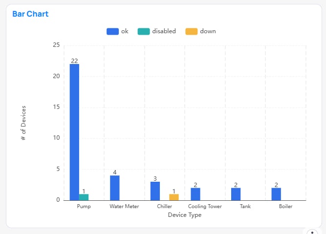
Bar chart comparing categories
Match the question
Table types
A pivot table folds a hierarchy down the rows and spreads a dimension across the columns — useful when exact values and a two-way breakdown both matter.
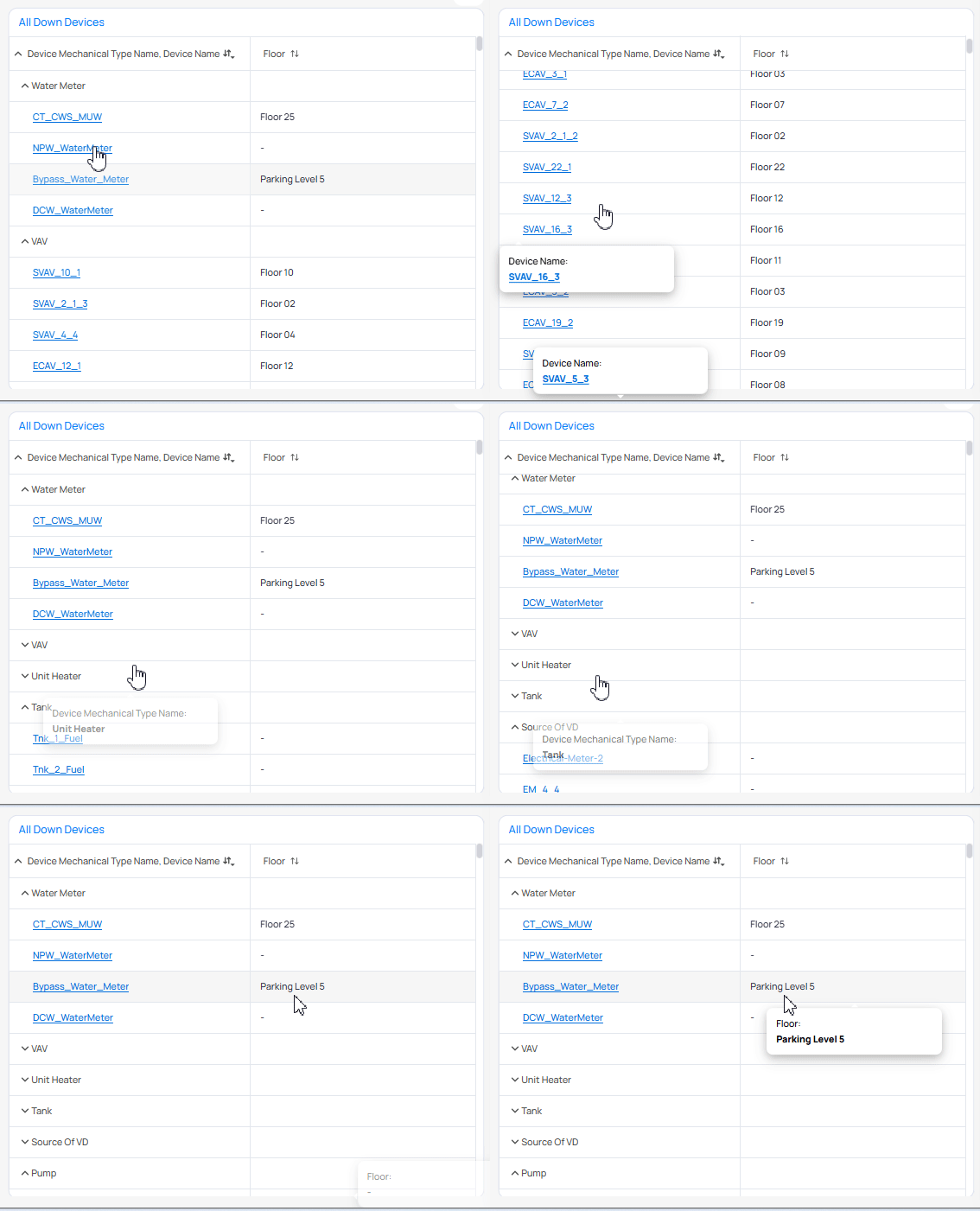
Pivot table with expandable device hierarchy
Top N vs scrolling
Label Top N cuts so viewers know data is hidden. For interactive ops dashboards, a soft top (about 20) with a scrollbar often beats a hard cut. See Filter options and Zoom and scroll.
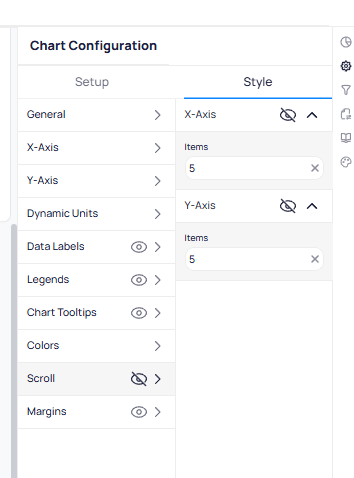
Scroll settings limit how many axis items show before scrolling
Audience and consistency
- A chart should be valuable before you add drill-through or cross-filtering. See Drill-through filters.
- Match the visual to the audience. An operator on a wall display needs a different chart than an analyst exploring data. See Philosophy.
- When two types both fit, prefer the one your dashboards already use for that question.
Next steps
Chart types
Look up Setup fields for every widget type.
Widget customization
Style widgets and apply defaults.