

The guiding question is never “what data can I show?” but “what does this user need to do their job?”
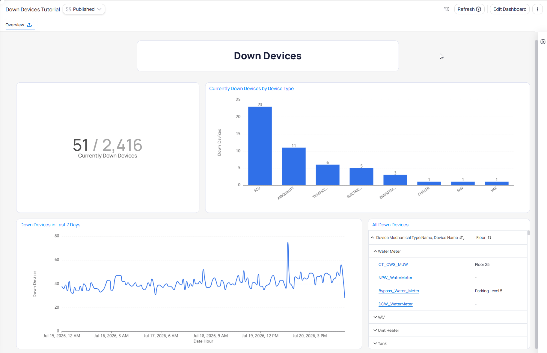
Example dashboard built around one operational workflow
A portal for a workflow, not a data catalogue
That single pane of glass can pull from across KODE OS — including FDD, FTT, Graphics, AssetOps, energy data, and custom sensor metrics. “Can combine everything” is not “should.” Treat Building BI as a portal tailored to a workflow:- A dashboard serves an audience, not a data catalogue. Design for how a specific person works day to day.
- For executives and analysts, the dashboard may be most of their building-information solution and can justify a comprehensive build-out.
- For building operators, the bigger risk is overload. Prefer one workflow per dashboard: surface issues, then hand the user off to the right module to act.
Editorial restraint is the hard part
Nothing stops you from adding another chart. The limiting skill is editorial restraint, not technical capability. The same tension shows up in Top N vs scrolling, drill-through, and styling best practices. One giant dashboard that shows everything to everyone is what Building BI makes possible — and what good practice avoids.- Value depends on configuration quality upstream (ontology, point modeling, integrations). A single pane of glass over messy data is still messy.
- “Tailor to the user” assumes you know the user. When you do not, treat early dashboards as drafts.
- Some organizations restrict roles so a user only ever sees one building. Do not assume everyone can reach a portfolio-level view. See Portfolio and building scope.
Next steps
Building BI overview
Return to the product overview and documentation map.
Build your first dashboard
Walk through creating and publishing your first dashboard.