

In this guide
Choose a source
Inspect schema
Add calculations
Optimize and validate
Building BI and select Data Sources in the left navigation panel.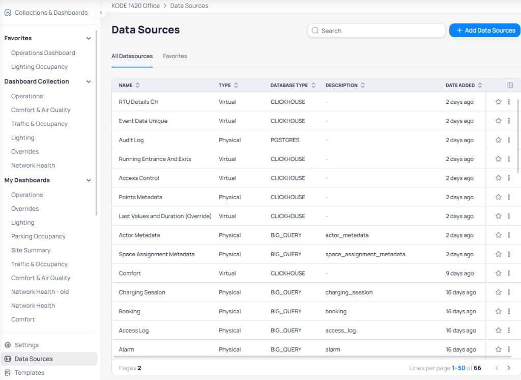
Data Sources page showing all available data sources with their type, database type, and description
Data source types
Building BI supports two data source types:- Physical — Maps directly to a database table managed by the backend. Physical data sources reflect the raw data stored in your connected database.
- Virtual — Built from SQL queries (views) on top of physical tables. Virtual data sources give you flexibility to create custom datasets without modifying the underlying database. You can edit a virtual table’s SQL by clicking the three-dot menu on its row.
Chart Configuration panel lets you pick a data source and drag its metrics into the X-Axis, Y-Axis, and Legend fields.
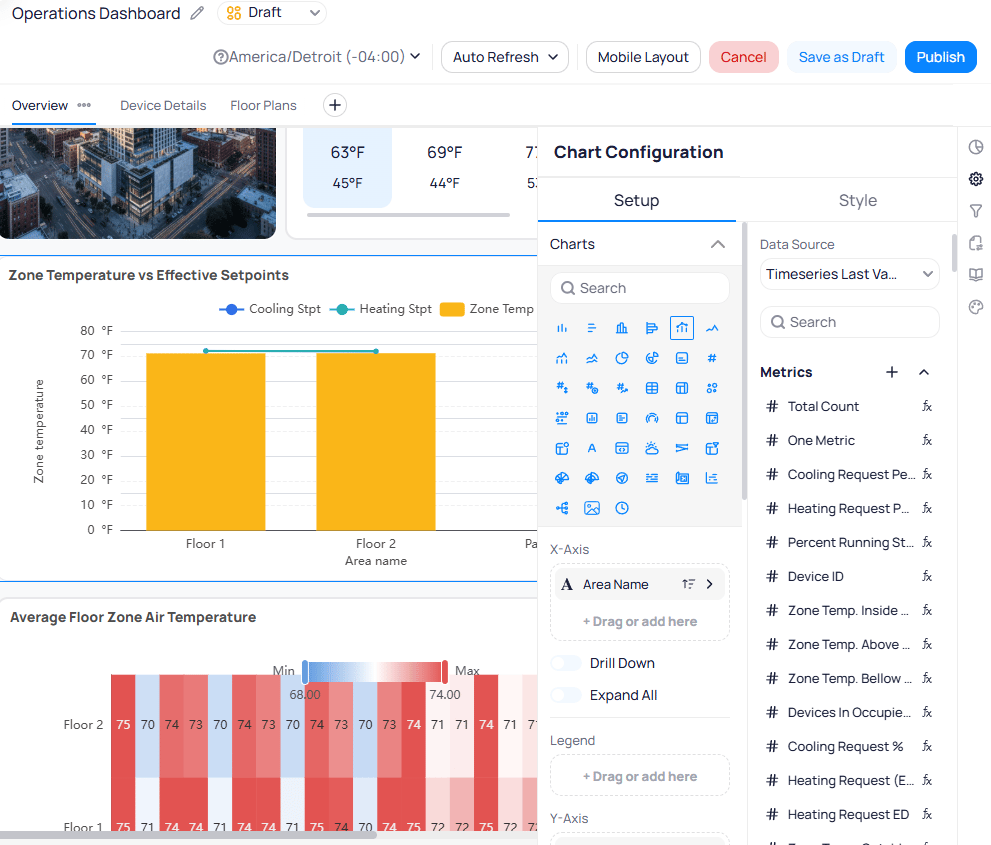
Chart Configuration panel showing a selected data source and its available metrics
All Datasources lists every data source in your portfolio, and Favorites shows only data sources you have starred. Select the star icon on any row to add it to your favorites.
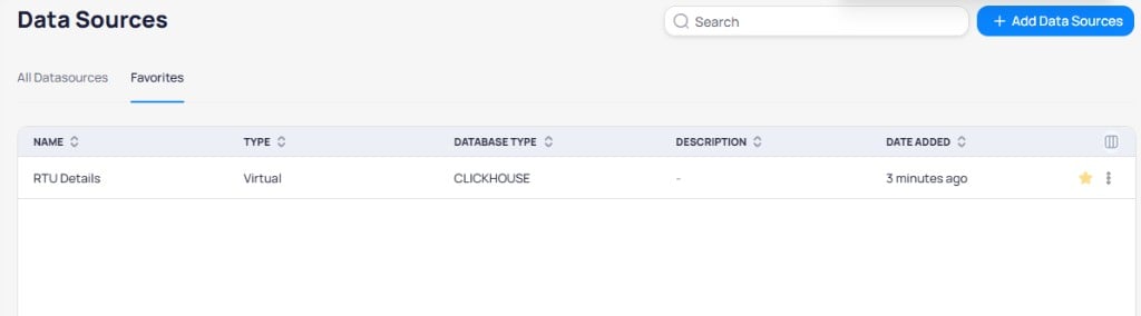
Favorites tab showing starred data sources for quick access
Edit Details or Delete.
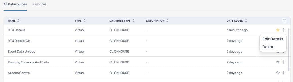
Row-level three-dot menu with Edit Details and Delete options
Virtual table considerations
Virtual tables recompute on every query. Use them for light, real-time reshapes. Prefer physical tables when historical trending or heavy aggregation must stay fast.- You can create virtual tables on ClickHouse and PostgreSQL data sources.
- You cannot create virtual tables on BigQuery.
Database types
Building BI connects to three database engines. Each stores a specific category of data, and each requires its own SQL dialect for calculated columns and metrics.Key data sources
While many tables exist, two primary sources cover the majority of sensor-related use cases:Point Time Series Real-Time
The core sensor table where every reading creates a new row. This is the source of truth for building sensor data. Slight variants exist that poll less frequently — use those only when loading time is a concern. Point Time Series Real-Time runs on ClickHouse, so all calculated columns and metrics on this table must use ClickHouse SQL syntax.Point Time Series Last Value
Returns only the most recent recorded value per sensor. SearchLast Value in the data sources list to find this table.
Aggregated tables
Some data sources aggregate readings at fixed intervals (15-minute, hourly, daily, or monthly). Aggregated tables return summary values (average, sum, maximum, minimum, count, or delta) for each point during the polling period. Aggregation is valuable for some sensor types. Hourly average air temperature shows how a space generally felt, while an hourly average of elevator floor level is less meaningful.Polling and data structure
Each point time series table contains one row per data point at a given time period, along with context columns identifying the device, area, and building. You may see multiple rows from the same device at the same timestamp if they come from different points. Prefer ID columns over name columns for filters and calculations. Names are editable and not guaranteed unique. Each row carries nested layers of context around the data point, from the building level down to the individual sensor value: Two common polling patterns exist:- Change of value (COV) — A new row is created only when the value changes beyond the COV threshold, with a maximum interval of one hour between rows.
- Structured polling — A new row is created at every polling interval (every 1, 2, 5, 10, or 15 minutes) regardless of whether the value changed.
Data source schema
Selecting any data source name opens its schema view. The schema reveals the building blocks available for your dashboards across five tabs:Columns, Calculated, Metrics, URLs, and Actions.
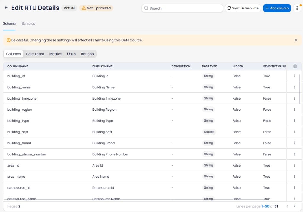
Data source schema view showing columns with their display names, data types, and visibility settings
Schema toolbar actions
From the top of the schema view, you can:Sync Datasource— Pull in the latest columns if the underlying KODE table was updated.+ Add Column— Create a new calculated column, metric, or URL.- Three-dot menu — Access
Check Column Usageto see which dashboards reference specific columns,Check Optimizationto review virtual table performance, orEdit Detailsto change basic parameters.
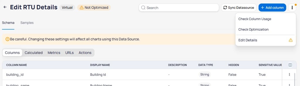
Three-dot menu showing Check Column Usage, Check Optimization, and Edit Details options
Samples tab
TheSamples tab previews a subset of records from the data source before you build charts. Use it to validate fields, confirm virtual table SQL, and inspect example values without creating a report first.
Open a data source
Building BI > Data Sources and select a data source name.Open Samples
Schema tab, select Samples.Review the preview
i icon in the column header. Select the icon to open the column’s query. Use that when you are writing other calculated columns or metrics from the same source.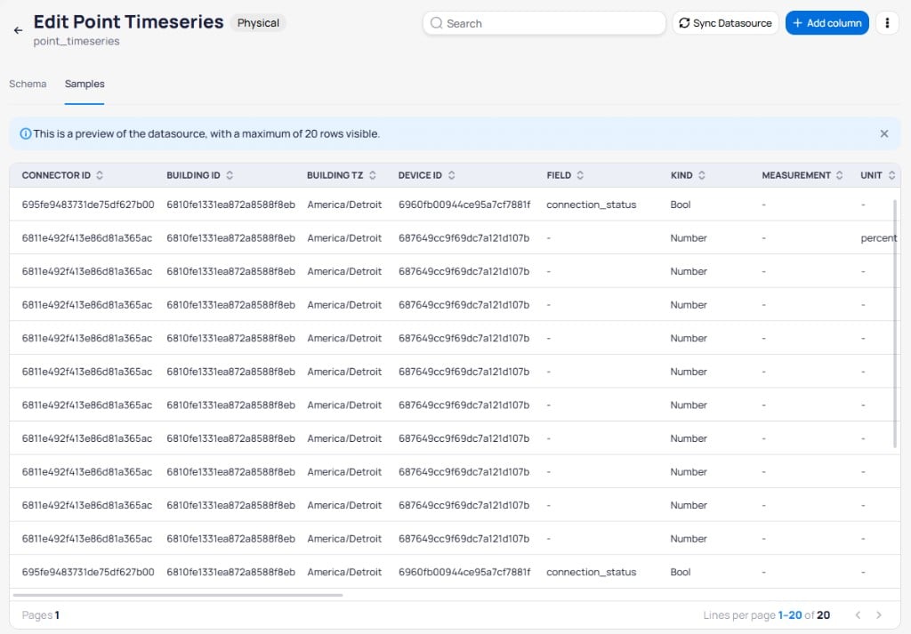
Samples tab showing a preview of 20 rows from a physical data source
Calculated columns, metrics, and URLs
Calculated columns, calculated metrics, and URLs extend your data sources beyond raw columns. Use this section for SQL patterns and examples. For create steps, field options, data-type limits, and columns-versus-metrics graphics, see Calculated fields.Calculated columns
Calculated columns apply row-level logic to produce a new value for each row independently, similar to a spreadsheet formula. Each calculated column contains a single SQL expression. Use calculated columns to:- Extract time components for filtering (for example,
toHour(date_time_local)returns the hour as an integer). - Isolate a specific sensor’s values using conditional logic (for example, return
number_valueonly whenontology_point_fieldmatches a target, otherwise return null). - Plot multiple sensor readings side-by-side in a single chart.
Column rules
- Each calculated column must have a unique name within the data source.
- Column names must use the exact database field names (for example,
building_name, not “Building Name”). - You cannot edit a calculated column’s SQL expression from the chart
fxeditor. Edit it inData Sourcesdirectly.
Metadata syntax on Real-Time tables
When referencing metadata fields (such asbuilding_name, device_name, or ontology_point_field) on the Point Time Series Real-Time table, you must wrap them in the dictGetString pattern:
discharge_air_pressure_setpoint with any ontology_point_field value. Use the appropriate payload column (number_value, string_value, or boolean_value) depending on the point’s data type.
Simplified syntax on Last Value tables
The Last Value table is pre-processed, so you can reference metadata columns directly withoutdictGetString:
Calculated metrics
Calculated metrics perform aggregate calculations across multiple rows. Unlike columns, metrics dynamically recalculate based on your chart’s grouping. If a chart is grouped by hour, the metric produces one value per hour. If grouped by device, it produces one value per device. Use aggregate functions likesumIf, countIf, or avgIf to filter rows before aggregating. You can combine multiple functions to build complex logic.
Example: net occupancy metric
This metric calculates occupancy by subtracting people leaving from people entering:
URLs
URL columns turn data into navigation actions in your dashboards.Internal URLs
Internal URLs follow the pattern/buildings/{building_id} and navigate within Cloud BMS on both desktop and mobile. Building BI validates the IDs automatically.
External URLs
External URLs open in a new browser tab, allowing users to navigate to resources outside KODE OS such as a CMMS system or a specific work order. For URL behavior on chart widgets, data-type limits on metrics, andHidden or Sensitive Values options, see Calculated fields.
Add a data source
Open the data sources page
Building BI > Data Sources.Start a new data source
+ Add Data Sources and choose Physical or Virtual.Configure the data source
Details tab, complete the required fields: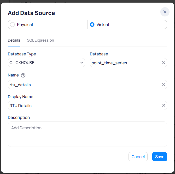
Add Data Source dialog showing the Details tab for a virtual data source
SQL Expression tab to define the query. The Source Tables field lists the tables referenced in your SQL. Write the SQL expression using the syntax that matches the selected database type (PostgreSQL or ClickHouse).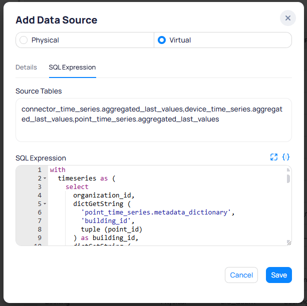
Add Data Source dialog showing the SQL Expression tab with source tables and query editor
Save the data source
Save to add the data source to your list. A confirmation toast appears.
Confirmation toast after creating a data source
Optimize virtual data sources
Unoptimized virtual data sources load slower and can produce errors with large datasets. A warning banner reading “Not Optimized” appears at the top of any unoptimized data source. See dashboard performance for broader optimization guidance.Optimize from the data source page
Open the data source
Data Sources and select the virtual data source you want to optimize.Edit the SQL expression
Edit Details. Switch to the SQL Expression tab to review and modify the query. An Optimize your Virtual Datasource section appears at the bottom with suggestions.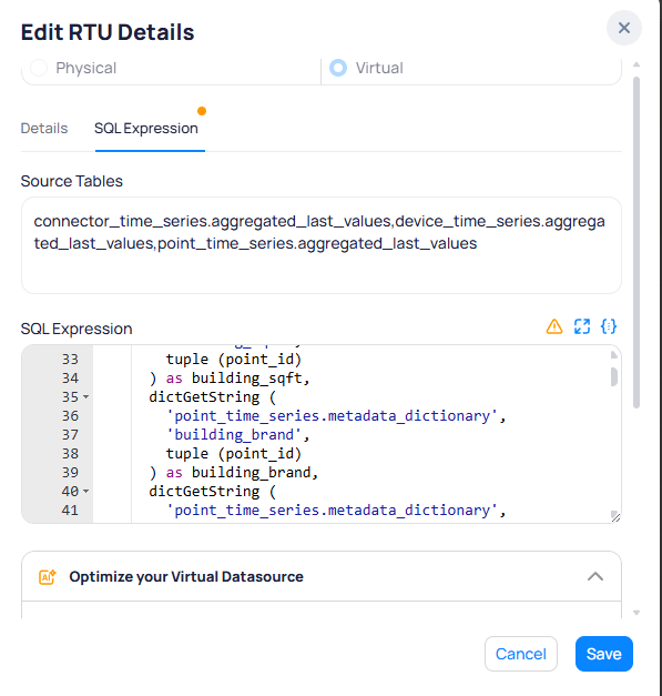
Edit Details dialog showing the SQL Expression tab with optimization suggestions
Apply optimization suggestions
Optimize your Virtual Datasource section. The system generates AI-powered filter suggestions to limit the data retrieved from the source. Review the suggestion and apply it to improve query performance.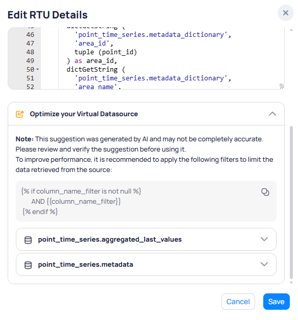
Optimization suggestions with AI-generated filters for source tables
Save your changes
Save to apply the optimization.Identify unoptimized sources from a dashboard
You can also check optimization status while editing a dashboard. ClickEdit Dashboard, select a chart, and open the Setup panel. The Data Source dropdown flags any unoptimized sources so you can address them directly.
Check column usage
Unused columns add overhead to your data sources. Use the column usage check to identify and remove them.Open column usage
Check Column Usage.Select what to check
Check Columns, Check Calculated, and Check Metrics. Each category shows the total number of items. Select Check to run the scan.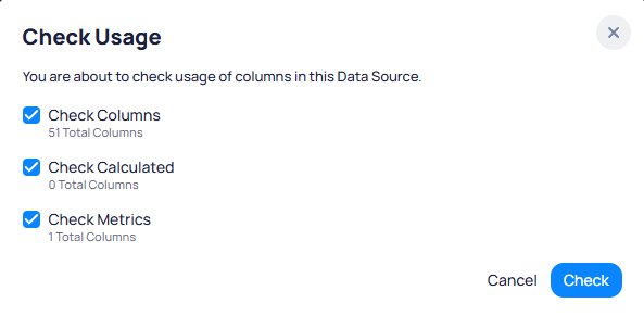
Check Usage dialog showing column, calculated, and metrics categories to scan
Remove unused columns
Point bounds and unit conversion
KODE OS stores point high/low bounds and a unit conversion foundation in the platform data model. These capabilities support analytics and diagnostics workflows in Building BI. They do not change displayed point values or trend charts by default.Point high/low bounds
The platform applies default minimum and maximum bounds per ontology field based on sensor or measurement type. Admins can review and adjust bounds per point in Point modeling. When an incoming value exceeds configured bounds, the platform flags the reading with an Out of Range state. Use this in Building BI to:- Filter point time series data to exclude bad readings from KPIs and rollups
- Build sensor health dashboards that list points currently out of range
- Group counts by device, system, floor, or area for calibration prioritization
- Replace dashboards that rely on static ontology bounds with platform bounds logic
Unit conversion foundation
The unit conversion layer normalizes compatible units within the same measurement type in the background. Use it in calculated columns and metrics when you aggregate data across buildings where the same point field may report in different units (for example,°C vs °F).
Build cleaner metrics
Use bounds and unit conversion together for more reliable KPIs:- Normalize units in calculated metrics when rolling up the same ontology field across sites with different
point_unitvalues. - Exclude out-of-range readings so a small set of failing sensors does not skew portfolio averages or space-level rollups.
- Filter dashboards on Out of Range in
cur_stateor related status fields to surface sensors that need calibration or replacement.
Limitations
Calculated columns and metrics do not support window functions or aggregations of aggregations (nesting aggregate functions). This is a calculated field limit, not a ClickHouse limit. Two workarounds exist:- Virtual tables — Perform a window function or one level of aggregation in the virtual table SQL, then use the result as a regular column in your charts.
Column reference
The Point Time Series tables (Real-Time and Last Value) share a common column structure. Use this reference when building calculated columns, metrics, or filters.Timestamp columns
Timestamp columns
Entity identifier columns
Entity identifier columns
Point classification columns
Point classification columns
Value columns
Value columns
Ontology columns
Ontology columns
Building metadata columns
Building metadata columns
Device metadata columns
Device metadata columns
Connectivity and status columns
Connectivity and status columns