> ## Documentation Index
> Fetch the complete documentation index at: https://documentation.kodelabs.com/llms.txt
> Use this file to discover all available pages before exploring further.
# Graphic Tool
> Build and customize floor plan, system, and device graphics with smart markers, zones, tables, and layers in the Cloud BMS Graphic Tool.
The Graphic Tool is a building-level module. Select a building from the [sites list](/products/kode-os/sites-and-map) to access the Graphic Tool for that site.
The Graphic Tool is the built-in visual editor in Cloud BMS for creating and customizing floor plan, system, and device graphics. It provides features for placing devices, drawing zones, configuring smart markers, building system schematics, and managing layers.
## Access the Graphic Tool
Click `Graphics` in the left navigation bar to open the Graphics module. The module organizes graphics into three categories accessible from the secondary sidebar: `Floor Plans`, `Devices`, and `Systems`.
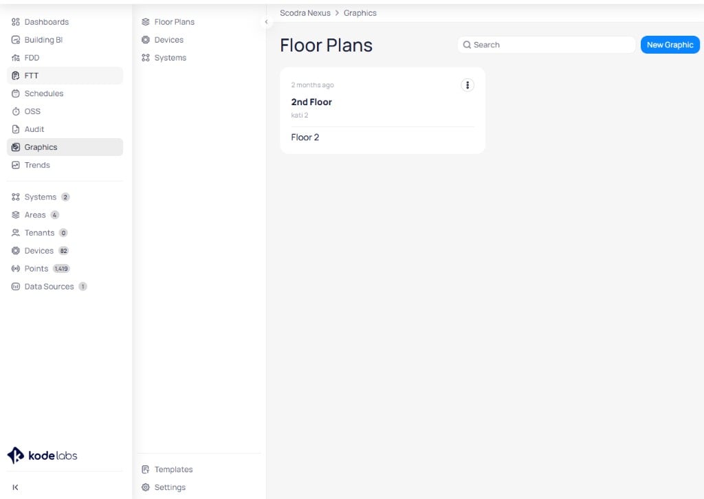 You can also enter the Graphic Tool from within any existing graphic by clicking the edit (pencil) icon.
## Create a new graphic
Click `New Graphic` in the upper right corner. A dialog prompts you to configure the graphic details.
You can also enter the Graphic Tool from within any existing graphic by clicking the edit (pencil) icon.
## Create a new graphic
Click `New Graphic` in the upper right corner. A dialog prompts you to configure the graphic details.
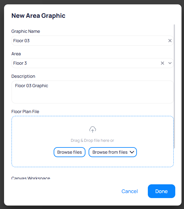 Enter a descriptive name for the graphic (for example, `Floor 03`).
Select the area this graphic represents. The area determines which devices are available for placement.
Add an optional description to provide context for the graphic.
Upload a floor plan image by dragging and dropping a file or clicking `Browse files`. You can also select an existing file from the file library using `Browse from files`.
## The Graphic Tool workspace
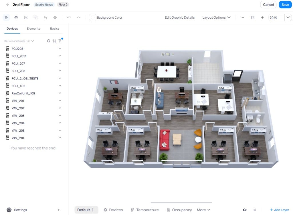
The workspace consists of the canvas area on the right and a panel on the left with three tabs: `Devices`, `Elements`, and `Basics`. The bottom toolbar provides layer tabs and overlay controls.
### Top toolbar
The top toolbar provides canvas-level controls for editing and navigating the graphic.
Enter a descriptive name for the graphic (for example, `Floor 03`).
Select the area this graphic represents. The area determines which devices are available for placement.
Add an optional description to provide context for the graphic.
Upload a floor plan image by dragging and dropping a file or clicking `Browse files`. You can also select an existing file from the file library using `Browse from files`.
## The Graphic Tool workspace
The workspace consists of the canvas area on the right and a panel on the left with three tabs: `Devices`, `Elements`, and `Basics`. The bottom toolbar provides layer tabs and overlay controls.
### Top toolbar
The top toolbar provides canvas-level controls for editing and navigating the graphic.
 From left to right, the toolbar contains:
| Icon | Action |
| --------------------------- | ------------------------------------------------------------------------------------------------- |
| **Arrow** (selection) | Enable editing mode. Select, move, and resize items on the canvas. |
| **Hand** (pan) | Switch to view mode. Pan across the canvas without selecting items. |
| **Single square** (group) | Group multiple selected items into a single unit. Select items first, then click to group. |
| **Double square** (ungroup) | Treat selected items as separate elements for individual editing. |
| **Lock** | Lock a selected item in place to prevent accidental movement. Available when an item is selected. |
| **Eye** | Toggle visibility of a selected item on the graphic. Available when an item is selected. |
| **Undo / Redo** | Reverse or reapply the last action. |
| **Background Color** | Change the canvas background color. |
| **Edit Graphic Details** | Update the graphic name, area, and description. |
| **Layout Options** | Configure canvas layout and display preferences. |
| **Zoom controls** | Zoom in, zoom out, fit to screen, and view the current zoom percentage. |
## Devices tab
The `Devices` tab lists all devices and points available for the selected area. Expand a device to see its points, then drag and drop them onto the canvas to place markers.
From left to right, the toolbar contains:
| Icon | Action |
| --------------------------- | ------------------------------------------------------------------------------------------------- |
| **Arrow** (selection) | Enable editing mode. Select, move, and resize items on the canvas. |
| **Hand** (pan) | Switch to view mode. Pan across the canvas without selecting items. |
| **Single square** (group) | Group multiple selected items into a single unit. Select items first, then click to group. |
| **Double square** (ungroup) | Treat selected items as separate elements for individual editing. |
| **Lock** | Lock a selected item in place to prevent accidental movement. Available when an item is selected. |
| **Eye** | Toggle visibility of a selected item on the graphic. Available when an item is selected. |
| **Undo / Redo** | Reverse or reapply the last action. |
| **Background Color** | Change the canvas background color. |
| **Edit Graphic Details** | Update the graphic name, area, and description. |
| **Layout Options** | Configure canvas layout and display preferences. |
| **Zoom controls** | Zoom in, zoom out, fit to screen, and view the current zoom percentage. |
## Devices tab
The `Devices` tab lists all devices and points available for the selected area. Expand a device to see its points, then drag and drop them onto the canvas to place markers.
 ### Smart markers
Smart markers provide dynamic, color-coded visualizations that change appearance based on live point values. Unlike default markers that show a static icon and value, smart markers apply rules and ranges to reflect the current state of a point.
### Smart markers
Smart markers provide dynamic, color-coded visualizations that change appearance based on live point values. Unlike default markers that show a static icon and value, smart markers apply rules and ranges to reflect the current state of a point.
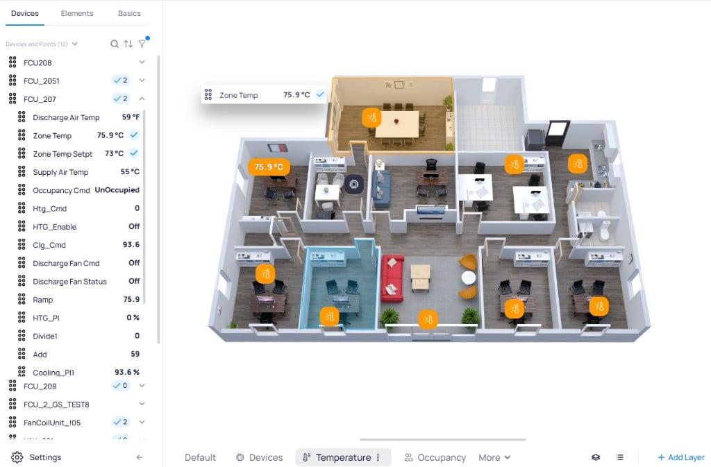 For each marker, you select a point and a smart marker configuration. The rules that determine how the marker changes color are managed in the [Graphic Tool settings](#settings).
#### Smart marker display options
Enable the `Smart Marker` toggle on any marker to access smart marker configuration. The following options control how the marker renders on the canvas:
Select the point that drives the marker's value and color behavior.
Choose a smart marker configuration that defines the value ranges and color rules. Configurations are created in the [Graphic Tool settings](#smart-marker-settings).
Display both the icon and the numeric value on the marker.
Display only a colored icon reflecting the current value range.
Display only the numeric value with color coding applied.
Choose whether the smart marker color applies to `Icon/value` (the text and icon) or `Background` (the marker container).
Display the device name alongside the marker on the canvas.
Force the marker to always render as a smart marker regardless of layer defaults.
#### Marker style options
Each marker's visual appearance is configurable through the lower section of the Markers panel:
Choose a layout preset (`Default` or other variants) and select between rounded or square corners for the marker container.
Set the font size (in pixels), toggle bold formatting, and choose the text color for the displayed point value.
Show or hide the marker icon. Expand this section to configure icon appearance.
Click `Save Style` to apply changes or `Reset Style` to revert to the default appearance.
#### Difference from setpoint markers
Difference from setpoint markers compare the current value against the device's setpoint. Configure a tolerated deviation (as an absolute value or percentage), and the marker changes color when the value drifts outside the acceptable range.
For each marker, you select a point and a smart marker configuration. The rules that determine how the marker changes color are managed in the [Graphic Tool settings](#settings).
#### Smart marker display options
Enable the `Smart Marker` toggle on any marker to access smart marker configuration. The following options control how the marker renders on the canvas:
Select the point that drives the marker's value and color behavior.
Choose a smart marker configuration that defines the value ranges and color rules. Configurations are created in the [Graphic Tool settings](#smart-marker-settings).
Display both the icon and the numeric value on the marker.
Display only a colored icon reflecting the current value range.
Display only the numeric value with color coding applied.
Choose whether the smart marker color applies to `Icon/value` (the text and icon) or `Background` (the marker container).
Display the device name alongside the marker on the canvas.
Force the marker to always render as a smart marker regardless of layer defaults.
#### Marker style options
Each marker's visual appearance is configurable through the lower section of the Markers panel:
Choose a layout preset (`Default` or other variants) and select between rounded or square corners for the marker container.
Set the font size (in pixels), toggle bold formatting, and choose the text color for the displayed point value.
Show or hide the marker icon. Expand this section to configure icon appearance.
Click `Save Style` to apply changes or `Reset Style` to revert to the default appearance.
#### Difference from setpoint markers
Difference from setpoint markers compare the current value against the device's setpoint. Configure a tolerated deviation (as an absolute value or percentage), and the marker changes color when the value drifts outside the acceptable range.
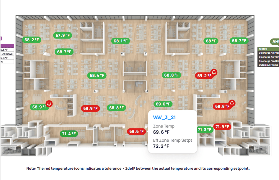 * **Green** markers indicate the current value is within the configured tolerance of the setpoint
* **Red** markers indicate the value has drifted beyond the tolerated deviation
* The **bell icon** on a marker indicates that the point has an active alarm generated by [FDD](/products/fdd/fdd-overview)
* Hovering over a marker reveals the device name, current value, and effective setpoint
These markers support dual setpoints for devices with separate heating and cooling modes, and can optionally display the delta value.
### Hover-over markers
Hover-over markers allow you to reference multiple points on a single marker while showing only one value by default. Additional points appear when the user hovers over the marker.
* **Green** markers indicate the current value is within the configured tolerance of the setpoint
* **Red** markers indicate the value has drifted beyond the tolerated deviation
* The **bell icon** on a marker indicates that the point has an active alarm generated by [FDD](/products/fdd/fdd-overview)
* Hovering over a marker reveals the device name, current value, and effective setpoint
These markers support dual setpoints for devices with separate heating and cooling modes, and can optionally display the delta value.
### Hover-over markers
Hover-over markers allow you to reference multiple points on a single marker while showing only one value by default. Additional points appear when the user hovers over the marker.
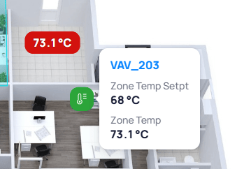 * Works with both smart markers and default markers
* Marker headers and labels can be hidden until hover
* When used with smart markers, hovering reveals the device name with a link to device details
### System markers
System markers act as navigation links between graphics. Drag a system from the `Systems` panel in the left-hand elements menu onto any graphic to create a clickable marker that navigates to that system's graphic view.
System markers are useful for:
* Linking related system graphics (for example, AHU graphic to chiller plant graphic)
* Navigating from floor plans to system schematics
* Creating a connected network of visual interfaces
### Point statuses and states
All markers on graphics display real-time status indicators next to point values:
| State | Indicator | Meaning |
| -------------- | ----------- | -------------------------------------------------- |
| **Alarm** | Red icon | Active alarm condition on this point |
| **Down** | Grey icon | Device or point is not communicating |
| **Fault** | Orange icon | Fault condition detected |
| **Stale** | Yellow icon | Value has not updated within the expected interval |
| **Overridden** | Purple icon | Point is currently overridden by a manual command |
Status icons are enabled by default on smart markers.
### Batch editing and alignment
Select multiple markers by dragging the mouse over them or by holding Shift and clicking individually. Perform batch updates to marker properties, move all selected markers as a group, or delete them in bulk.
Align multiple selected elements using the alignment toolbar:
* `Left`, `Right`, `Top`, `Bottom` alignment
* `Middle vertically` and `Middle horizontally` centering
### Right-click context menu
Right-click any marker or element on the canvas to access the following actions:
| Action | Description |
| --------------------- | -------------------------------------------------------------------------------------------------------------------------------------------------------------------------------- |
| `Duplicate` | Create a copy of the selected element in place |
| `Duplicate and Place` | Duplicate the element and assign it to a different device of the same type. A dialog lists all matching devices so you can create copies with identical style and configuration. |
| `Copy to` | Copy the element to another layer in the graphic |
| `Delete` | Remove the element from the canvas |
| `Edit Points` | Open the point selection dialog to add or remove points on the marker |
| `Bring to front` | Move the element above all other elements in the stacking order |
| `Send to back` | Move the element behind all other elements in the stacking order |
| `Lock/Unlock` | Lock the element in place to prevent accidental movement, or unlock a locked element |
## Elements tab
The `Elements` tab lists all items placed on the current graphic, including devices, markers, zones, and other elements. Use this tab to locate, select, and manage individual items.
* Works with both smart markers and default markers
* Marker headers and labels can be hidden until hover
* When used with smart markers, hovering reveals the device name with a link to device details
### System markers
System markers act as navigation links between graphics. Drag a system from the `Systems` panel in the left-hand elements menu onto any graphic to create a clickable marker that navigates to that system's graphic view.
System markers are useful for:
* Linking related system graphics (for example, AHU graphic to chiller plant graphic)
* Navigating from floor plans to system schematics
* Creating a connected network of visual interfaces
### Point statuses and states
All markers on graphics display real-time status indicators next to point values:
| State | Indicator | Meaning |
| -------------- | ----------- | -------------------------------------------------- |
| **Alarm** | Red icon | Active alarm condition on this point |
| **Down** | Grey icon | Device or point is not communicating |
| **Fault** | Orange icon | Fault condition detected |
| **Stale** | Yellow icon | Value has not updated within the expected interval |
| **Overridden** | Purple icon | Point is currently overridden by a manual command |
Status icons are enabled by default on smart markers.
### Batch editing and alignment
Select multiple markers by dragging the mouse over them or by holding Shift and clicking individually. Perform batch updates to marker properties, move all selected markers as a group, or delete them in bulk.
Align multiple selected elements using the alignment toolbar:
* `Left`, `Right`, `Top`, `Bottom` alignment
* `Middle vertically` and `Middle horizontally` centering
### Right-click context menu
Right-click any marker or element on the canvas to access the following actions:
| Action | Description |
| --------------------- | -------------------------------------------------------------------------------------------------------------------------------------------------------------------------------- |
| `Duplicate` | Create a copy of the selected element in place |
| `Duplicate and Place` | Duplicate the element and assign it to a different device of the same type. A dialog lists all matching devices so you can create copies with identical style and configuration. |
| `Copy to` | Copy the element to another layer in the graphic |
| `Delete` | Remove the element from the canvas |
| `Edit Points` | Open the point selection dialog to add or remove points on the marker |
| `Bring to front` | Move the element above all other elements in the stacking order |
| `Send to back` | Move the element behind all other elements in the stacking order |
| `Lock/Unlock` | Lock the element in place to prevent accidental movement, or unlock a locked element |
## Elements tab
The `Elements` tab lists all items placed on the current graphic, including devices, markers, zones, and other elements. Use this tab to locate, select, and manage individual items.
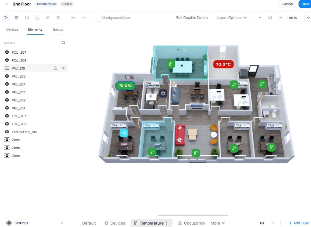 Hover over an item to reveal the **lock** and **eye** icons for that element. Hold Shift and click to select multiple items, then batch-apply lock or visibility changes to the entire selection.
## Basics tab
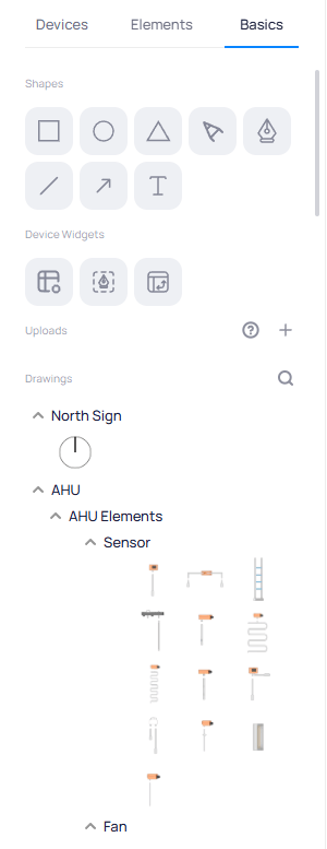
The `Basics` tab provides shapes, device widgets, uploaded files, and a library of pre-built drawing components for annotating and building graphics.
Hover over an item to reveal the **lock** and **eye** icons for that element. Hold Shift and click to select multiple items, then batch-apply lock or visibility changes to the entire selection.
## Basics tab
The `Basics` tab provides shapes, device widgets, uploaded files, and a library of pre-built drawing components for annotating and building graphics.
 ### Shapes
Drag shapes onto the canvas to annotate or highlight areas. Available shapes include rectangle, circle, triangle, polygon, drop, line, arrow, and text.
#### Shape style
Select a shape on the canvas to open the Shape Style panel on the right.
### Shapes
Drag shapes onto the canvas to annotate or highlight areas. Available shapes include rectangle, circle, triangle, polygon, drop, line, arrow, and text.
#### Shape style
Select a shape on the canvas to open the Shape Style panel on the right.
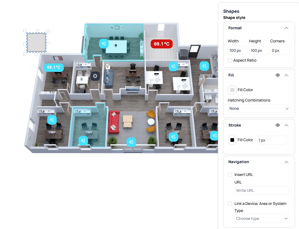 * **Format** -- set the `Width`, `Height`, and `Corners` (border radius) in pixels. Toggle `Aspect Ratio` to maintain proportions when resizing.
* **Fill** -- choose a `Fill Color` and optionally apply a `Hatching Combinations` pattern.
* **Stroke** -- toggle stroke visibility, set the `Fill Color` and stroke width in pixels.
* **Navigation** -- make the shape interactive by selecting `Insert URL` to link to an external page, or `Link a Device, Area or System` to navigate to a Cloud BMS resource when clicked.
### Device widgets
The Device Widgets section contains three drag-and-drop tools for displaying device data on the canvas.
#### Device table
Table views display point values from one or more devices directly within a graphic. Drag the **Device Table** widget onto the canvas, or click it to open the creation dialog.
* **Format** -- set the `Width`, `Height`, and `Corners` (border radius) in pixels. Toggle `Aspect Ratio` to maintain proportions when resizing.
* **Fill** -- choose a `Fill Color` and optionally apply a `Hatching Combinations` pattern.
* **Stroke** -- toggle stroke visibility, set the `Fill Color` and stroke width in pixels.
* **Navigation** -- make the shape interactive by selecting `Insert URL` to link to an external page, or `Link a Device, Area or System` to navigate to a Cloud BMS resource when clicked.
### Device widgets
The Device Widgets section contains three drag-and-drop tools for displaying device data on the canvas.
#### Device table
Table views display point values from one or more devices directly within a graphic. Drag the **Device Table** widget onto the canvas, or click it to open the creation dialog.
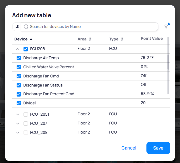 Expand a device to see its points with current values. Check the points you want to include, then click `Save`. The table appears as a single element on the canvas that you can move and resize.
**Table style**
Select a table on the canvas to open the Table Style panel. The following sections control the table's appearance:
* **Layout** -- choose a layout preset (`Default` or alignment variants) for content arrangement within the table
* **Table Header** -- configure the header text, font size, bold formatting, text color, and `Header Color` background. Toggle `Wrap text` to allow long headers to wrap to multiple lines.
* **Borders** -- toggle border visibility and customize border appearance
* **Point Label** -- set the `Column Width` in pixels for the point name column and toggle `Wrap Text`
* **Rows** -- configure the row font size, bold formatting, text color, and `Row Color` background
* **Point Value** -- set the `Column Width` in pixels for the value column and toggle `Wrap Text`
* **Point Configuration** -- reorder points using the draggable `Point Order` list. Click the edit icon next to a point to rename its label in the table.
* **States Configuration** -- define color states for table rows based on point values, similar to zone states. Click `+ Add state` to create value-to-color mappings.
**Setpoint highlighting**
Highlight a specific setpoint value on a table to draw attention to the target alongside the current reading. Enable the `Highlight Setpoint` toggle in the Properties section of the style panel to configure it.
Expand a device to see its points with current values. Check the points you want to include, then click `Save`. The table appears as a single element on the canvas that you can move and resize.
**Table style**
Select a table on the canvas to open the Table Style panel. The following sections control the table's appearance:
* **Layout** -- choose a layout preset (`Default` or alignment variants) for content arrangement within the table
* **Table Header** -- configure the header text, font size, bold formatting, text color, and `Header Color` background. Toggle `Wrap text` to allow long headers to wrap to multiple lines.
* **Borders** -- toggle border visibility and customize border appearance
* **Point Label** -- set the `Column Width` in pixels for the point name column and toggle `Wrap Text`
* **Rows** -- configure the row font size, bold formatting, text color, and `Row Color` background
* **Point Value** -- set the `Column Width` in pixels for the value column and toggle `Wrap Text`
* **Point Configuration** -- reorder points using the draggable `Point Order` list. Click the edit icon next to a point to rename its label in the table.
* **States Configuration** -- define color states for table rows based on point values, similar to zone states. Click `+ Add state` to create value-to-color mappings.
**Setpoint highlighting**
Highlight a specific setpoint value on a table to draw attention to the target alongside the current reading. Enable the `Highlight Setpoint` toggle in the Properties section of the style panel to configure it.
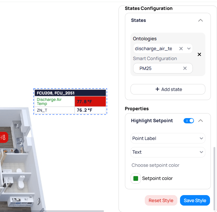 * **Point Label** -- select which point to use as the setpoint reference
* **Text** -- choose the display format for the highlighted value
* **Setpoint color** -- set the color used to highlight the setpoint value on the table
#### Zone tool
Zone drawings define colored regions on a graphic that change appearance based on aggregated live data from devices within the zone. Click the **Zone Tool** widget, then click on the floor plan to draw the zone outline. Each click places a point that defines a start and end line of the zone boundary. Close the shape to complete the zone.
Select a zone to open the Zones Configuration panel on the right.
* **Point Label** -- select which point to use as the setpoint reference
* **Text** -- choose the display format for the highlighted value
* **Setpoint color** -- set the color used to highlight the setpoint value on the table
#### Zone tool
Zone drawings define colored regions on a graphic that change appearance based on aggregated live data from devices within the zone. Click the **Zone Tool** widget, then click on the floor plan to draw the zone outline. Each click places a point that defines a start and end line of the zone boundary. Close the shape to complete the zone.
Select a zone to open the Zones Configuration panel on the right.
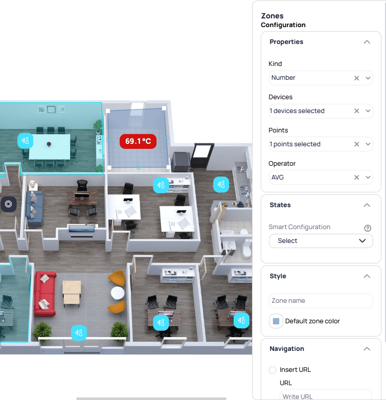 **Properties**
Select the data type for the zone: `Number` for numeric values or `String/Boolean` for enum and boolean points.
Select the devices within the zone that drive its color. Only devices placed within the zone's borders can be chosen.
Choose the common point across all selected devices (for example, room temperature or occupancy status).
Determine how multiple device values are combined. For numeric points: `AVG`, `MIN`, `MAX`, `SUM`, or `MED`. For boolean/enum points: `AND` (all values must match) or `OR` (any value triggers).
**States**
The States section defines how the zone changes color based on live values. Select a `Smart Configuration` to use a pre-built smart marker configuration, or define custom value ranges manually.
**Properties**
Select the data type for the zone: `Number` for numeric values or `String/Boolean` for enum and boolean points.
Select the devices within the zone that drive its color. Only devices placed within the zone's borders can be chosen.
Choose the common point across all selected devices (for example, room temperature or occupancy status).
Determine how multiple device values are combined. For numeric points: `AVG`, `MIN`, `MAX`, `SUM`, or `MED`. For boolean/enum points: `AND` (all values must match) or `OR` (any value triggers).
**States**
The States section defines how the zone changes color based on live values. Select a `Smart Configuration` to use a pre-built smart marker configuration, or define custom value ranges manually.
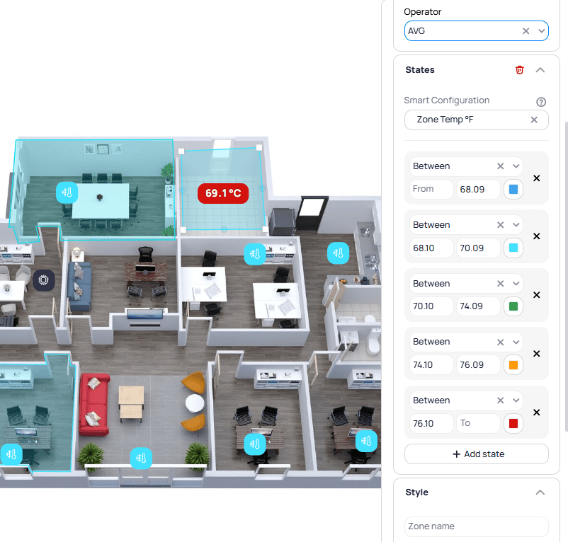 Click `+ Add state` to define additional ranges. Each state supports comparison operators (`Between`, `Greater than`, `Less than`) with a corresponding color.
**Style**
Enter a label to display on the zone.
Set the fallback color that displays when the zone's value does not match any configured state.
**Referenced Space**
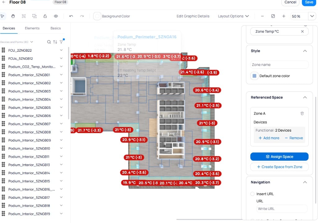
Use **Referenced Space** to connect a zone drawing to the spaces model:
* **Assign Space** -- link the selected zone to an existing space
* **Create Space from Zone** -- create a new space record from the zone
* **Add more / Remove** -- manage functionally linked devices in the referenced space context
Click `+ Add state` to define additional ranges. Each state supports comparison operators (`Between`, `Greater than`, `Less than`) with a corresponding color.
**Style**
Enter a label to display on the zone.
Set the fallback color that displays when the zone's value does not match any configured state.
**Referenced Space**
Use **Referenced Space** to connect a zone drawing to the spaces model:
* **Assign Space** -- link the selected zone to an existing space
* **Create Space from Zone** -- create a new space record from the zone
* **Add more / Remove** -- manage functionally linked devices in the referenced space context
 **Navigation**
Make the zone interactive by selecting `Insert URL` to link to an external page, or `Link a Device, Area or System` to navigate to a Cloud BMS resource when clicked.
The current version supports one point reference per zone. Each zone evaluates a single point type across the devices within its borders.
#### Pivot table
Pivot tables display devices as rows and points as columns, creating a matrix view of multiple devices side by side. Drag the **Pivot Table** widget onto the canvas. The creation flow has two steps:
**Navigation**
Make the zone interactive by selecting `Insert URL` to link to an external page, or `Link a Device, Area or System` to navigate to a Cloud BMS resource when clicked.
The current version supports one point reference per zone. Each zone evaluates a single point type across the devices within its borders.
#### Pivot table
Pivot tables display devices as rows and points as columns, creating a matrix view of multiple devices side by side. Drag the **Pivot Table** widget onto the canvas. The creation flow has two steps:
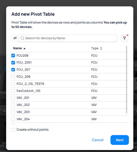 1. **Select devices** -- choose up to 50 devices to appear as rows. Use the search bar or filter by type. Check `Create without points` to add devices with no point columns.
2. **Select points** -- choose up to 10 points to appear as columns. The number next to each point indicates how many of the selected devices have that point.
**Pivot table style**
Select a pivot table on the canvas to open the Pivot Table Style panel:
* **Layout** -- choose a layout preset (`Default` or alignment variants)
* **Borders** -- toggle border visibility and customize border appearance
* **Devices > Column Header** -- configure the font size, bold formatting, text color, `Cell color`, and `Wrap text` for the device name column header
* **Devices > Column** -- configure the font size, bold formatting, text color, and `Cell color` for device name cells
* **Points > Column Header** -- configure the same style properties for the point column headers
* **Points > Column** -- configure style properties for point value cells
### Uploads
Upload images from your computer to use as backgrounds, overlays, or visual elements on the graphic. Click `+` to add a new file.
### Drawings
A library of pre-built drawing components provided by Cloud BMS for building system schematics and graphic layouts. Components are organized by category (sensors, fans, cooling and heating coils, valves, pipes, and more). Expand a category to browse, then drag components onto the canvas.
* Resize and rotate each component
* Group components into sub-assemblies for easier manipulation
* Creating the drawing is separate from placing markers, which you do as a second step
## Layers
Layers organize a graphic into multiple views so that a single graphic can present different data sets without visual clutter. Each layer displays its own set of markers, tables, and points. Switch between layers using the tabs in the bottom toolbar.
Click `+ Add Layer` to create a new layer.
1. **Select devices** -- choose up to 50 devices to appear as rows. Use the search bar or filter by type. Check `Create without points` to add devices with no point columns.
2. **Select points** -- choose up to 10 points to appear as columns. The number next to each point indicates how many of the selected devices have that point.
**Pivot table style**
Select a pivot table on the canvas to open the Pivot Table Style panel:
* **Layout** -- choose a layout preset (`Default` or alignment variants)
* **Borders** -- toggle border visibility and customize border appearance
* **Devices > Column Header** -- configure the font size, bold formatting, text color, `Cell color`, and `Wrap text` for the device name column header
* **Devices > Column** -- configure the font size, bold formatting, text color, and `Cell color` for device name cells
* **Points > Column Header** -- configure the same style properties for the point column headers
* **Points > Column** -- configure style properties for point value cells
### Uploads
Upload images from your computer to use as backgrounds, overlays, or visual elements on the graphic. Click `+` to add a new file.
### Drawings
A library of pre-built drawing components provided by Cloud BMS for building system schematics and graphic layouts. Components are organized by category (sensors, fans, cooling and heating coils, valves, pipes, and more). Expand a category to browse, then drag components onto the canvas.
* Resize and rotate each component
* Group components into sub-assemblies for easier manipulation
* Creating the drawing is separate from placing markers, which you do as a second step
## Layers
Layers organize a graphic into multiple views so that a single graphic can present different data sets without visual clutter. Each layer displays its own set of markers, tables, and points. Switch between layers using the tabs in the bottom toolbar.
Click `+ Add Layer` to create a new layer.
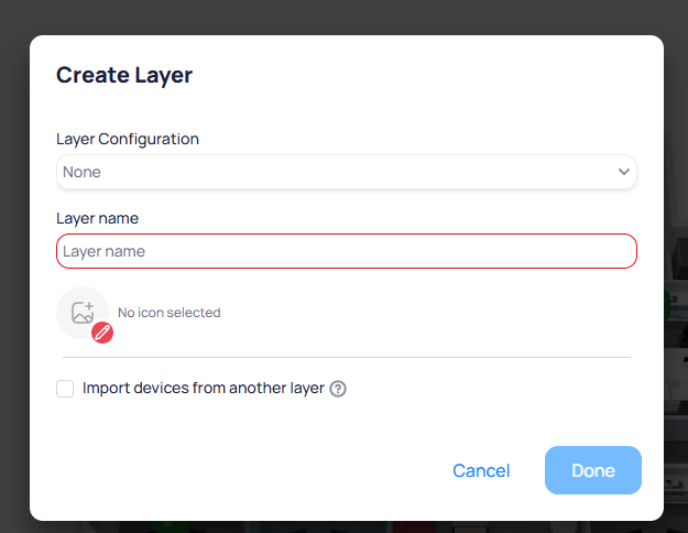 Select a pre-configured layer preset from the [Graphic Tool settings](#layer-settings). Presets auto-map device types and points when you drop devices onto the layer.
Enter a descriptive name for the layer (for example, `Temperature` or `Occupancy`).
Copy device placements from an existing layer into the new one. This avoids re-placing devices that share the same physical locations.
To reorder layers, click the `Arrange Layers` button in the bottom toolbar. Drag layers into the desired sequence.
Select a pre-configured layer preset from the [Graphic Tool settings](#layer-settings). Presets auto-map device types and points when you drop devices onto the layer.
Enter a descriptive name for the layer (for example, `Temperature` or `Occupancy`).
Copy device placements from an existing layer into the new one. This avoids re-placing devices that share the same physical locations.
To reorder layers, click the `Arrange Layers` button in the bottom toolbar. Drag layers into the desired sequence.
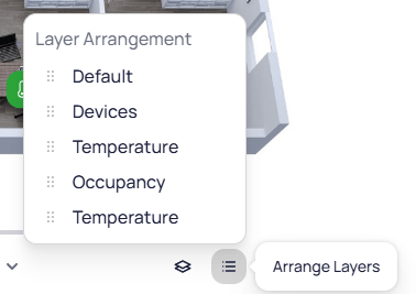 Layers apply to floor plans, device graphics, and system graphics.
## Overlays
Overlays are visual elements that render on top of the floor plan and can be toggled on or off independently from layers. Use overlays to display infrastructure layouts such as ductwork, piping, or wiring paths without cluttering the primary graphic view.
Layers apply to floor plans, device graphics, and system graphics.
## Overlays
Overlays are visual elements that render on top of the floor plan and can be toggled on or off independently from layers. Use overlays to display infrastructure layouts such as ductwork, piping, or wiring paths without cluttering the primary graphic view.
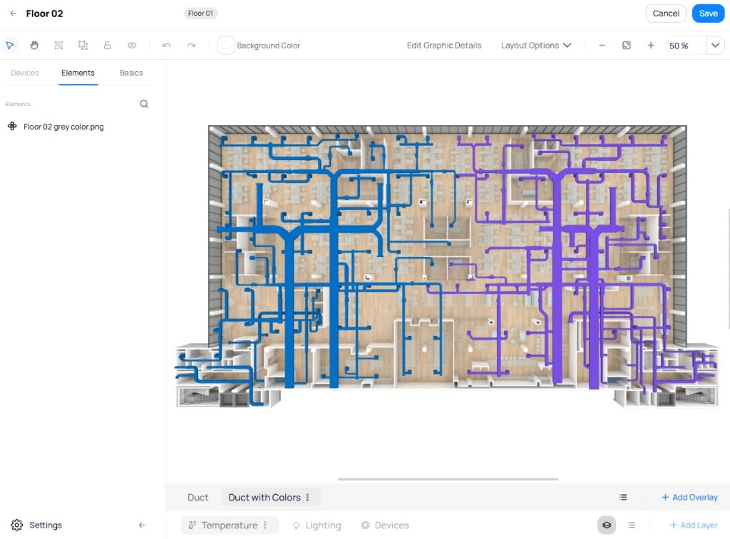 Click `+ Add Overlay` in the bottom toolbar to create a new overlay. Each overlay supports its own set of visual elements from the `Elements` tab. Toggle overlay visibility using the eye icon in the bottom toolbar.
## Keyboard shortcuts
| Shortcut | Action |
| ------------------------------ | ---------------------- |
| Ctrl + Z | Undo |
| Ctrl + Y | Redo |
| Ctrl + C | Copy |
| Ctrl + V | Paste |
| Delete | Delete selected object |
| Ctrl + A | Select all |
| Ctrl + D | Duplicate |
## Settings
Access the Graphic Tool settings by clicking `Settings` in the lower left corner of the Graphic Tool module. The settings page has four tabs: `Layers`, `Smart Markers`, `Icons`, and `Files`.
### Layers
Pre-configure layers so that devices placed on a graphic automatically attach the correct points. Click `+` next to the search bar to create a new layer configuration.
Click `+ Add Overlay` in the bottom toolbar to create a new overlay. Each overlay supports its own set of visual elements from the `Elements` tab. Toggle overlay visibility using the eye icon in the bottom toolbar.
## Keyboard shortcuts
| Shortcut | Action |
| ------------------------------ | ---------------------- |
| Ctrl + Z | Undo |
| Ctrl + Y | Redo |
| Ctrl + C | Copy |
| Ctrl + V | Paste |
| Delete | Delete selected object |
| Ctrl + A | Select all |
| Ctrl + D | Duplicate |
## Settings
Access the Graphic Tool settings by clicking `Settings` in the lower left corner of the Graphic Tool module. The settings page has four tabs: `Layers`, `Smart Markers`, `Icons`, and `Files`.
### Layers
Pre-configure layers so that devices placed on a graphic automatically attach the correct points. Click `+` next to the search bar to create a new layer configuration.
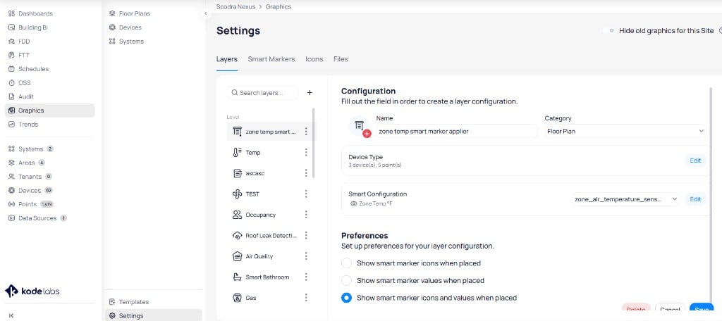 Enter a name for the layer configuration.
Select a category (for example, `Floor Plan`) to organize the layer.
Select the device types and points that this layer targets. Click `Edit` to configure which devices and points auto-attach when you drop a device onto a graphic using this layer.
Choose a smart marker configuration to apply automatically to markers placed on this layer. Click `Edit` to select a configuration.
**Preferences**
Set display preferences for markers placed on this layer:
* **Show smart marker icons when placed** -- display only the icon
* **Show smart marker values when placed** -- display only the value
* **Show smart marker icons and values when placed** -- display both
Enter a name for the layer configuration.
Select a category (for example, `Floor Plan`) to organize the layer.
Select the device types and points that this layer targets. Click `Edit` to configure which devices and points auto-attach when you drop a device onto a graphic using this layer.
Choose a smart marker configuration to apply automatically to markers placed on this layer. Click `Edit` to select a configuration.
**Preferences**
Set display preferences for markers placed on this layer:
* **Show smart marker icons when placed** -- display only the icon
* **Show smart marker values when placed** -- display only the value
* **Show smart marker icons and values when placed** -- display both
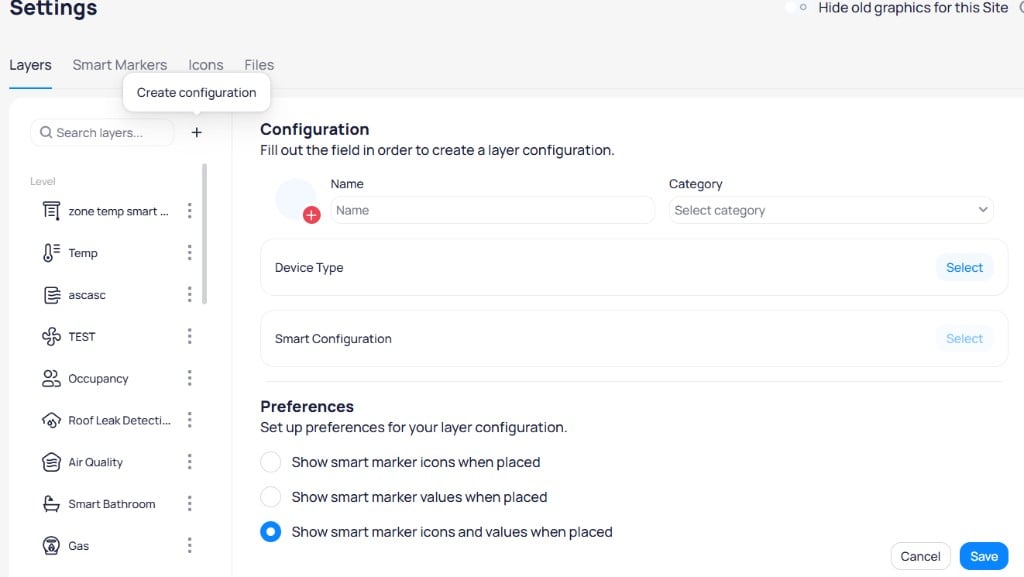 Layer configurations significantly speed up graphic creation. When a device type and smart configuration are set, dropping a device onto the graphic automatically adds the mapped point as a marker without manual point selection.
### Smart markers
Create and manage smart marker configurations. Click `+` to create a new configuration and choose between two types: `Static Ranges` or `Difference from Setpoint`.
Layer configurations significantly speed up graphic creation. When a device type and smart configuration are set, dropping a device onto the graphic automatically adds the mapped point as a marker without manual point selection.
### Smart markers
Create and manage smart marker configurations. Click `+` to create a new configuration and choose between two types: `Static Ranges` or `Difference from Setpoint`.
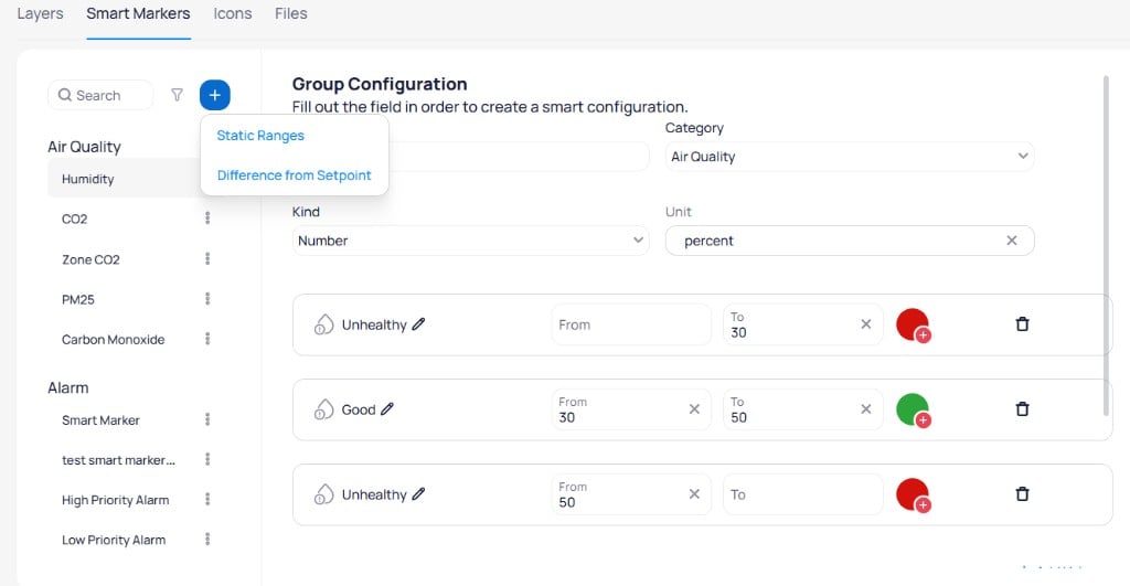 **Static Ranges** define fixed value ranges with corresponding colors and icons.
Select a category to organize the configuration (for example, `Air Quality` or `Temperature`).
Choose `Number` or `String/Boolean` depending on the point data type.
Set the unit of measurement (for example, `percent` or `°F`).
Define value ranges by clicking `+` next to each row. Each range has a label, `From` and `To` boundaries, an icon, and a color. Click the edit icon next to a label to rename it.
**Difference from Setpoint** markers compare current values against the device setpoint.
**Static Ranges** define fixed value ranges with corresponding colors and icons.
Select a category to organize the configuration (for example, `Air Quality` or `Temperature`).
Choose `Number` or `String/Boolean` depending on the point data type.
Set the unit of measurement (for example, `percent` or `°F`).
Define value ranges by clicking `+` next to each row. Each range has a label, `From` and `To` boundaries, an icon, and a color. Click the edit icon next to a label to rename it.
**Difference from Setpoint** markers compare current values against the device setpoint.
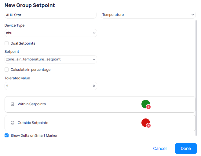 Select the device type this configuration applies to (for example, `ahu`).
Enable dual setpoints for devices with separate heating and cooling modes.
Select the setpoint field to compare against (for example, `zone_air_temperature_setpoint`).
Express the tolerated deviation as a percentage instead of an absolute value.
Set the acceptable deviation from the setpoint. Values within this range display the `Within Setpoints` color; values outside display the `Outside Setpoints` color.
Display the difference between the current value and the setpoint on the marker.
Pre-configured smart markers based on common use cases are available in the library. Use the three-dot menu next to any configuration to duplicate it or move it to a different category.
### Icons
The Icons tab provides two icon sources for use in graphics.
Select the device type this configuration applies to (for example, `ahu`).
Enable dual setpoints for devices with separate heating and cooling modes.
Select the setpoint field to compare against (for example, `zone_air_temperature_setpoint`).
Express the tolerated deviation as a percentage instead of an absolute value.
Set the acceptable deviation from the setpoint. Values within this range display the `Within Setpoints` color; values outside display the `Outside Setpoints` color.
Display the difference between the current value and the setpoint on the marker.
Pre-configured smart markers based on common use cases are available in the library. Use the three-dot menu next to any configuration to duplicate it or move it to a different category.
### Icons
The Icons tab provides two icon sources for use in graphics.
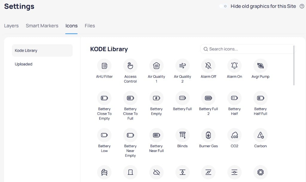 * **Kode Library** -- browse and search the built-in icon library with icons for common building equipment types
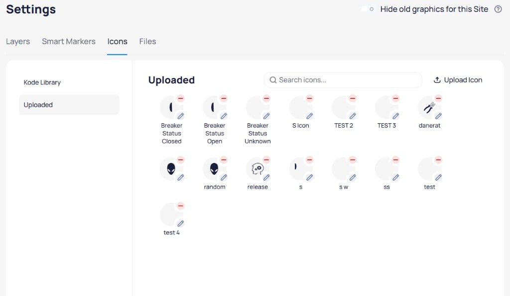
* **Uploaded** -- view and manage custom icons uploaded by your organization. Click `Upload Icon` to add a new icon. Custom icons must be SVG or PNG format with a maximum size of 2 MB.
* **Kode Library** -- browse and search the built-in icon library with icons for common building equipment types
* **Uploaded** -- view and manage custom icons uploaded by your organization. Click `Upload Icon` to add a new icon. Custom icons must be SVG or PNG format with a maximum size of 2 MB.
 ### Files
Manage uploaded graphic files used across floor plans, devices, and systems. Files are organized by category: `Floor Plans`, `Devices`, and `Systems`.
### Files
Manage uploaded graphic files used across floor plans, devices, and systems. Files are organized by category: `Floor Plans`, `Devices`, and `Systems`.
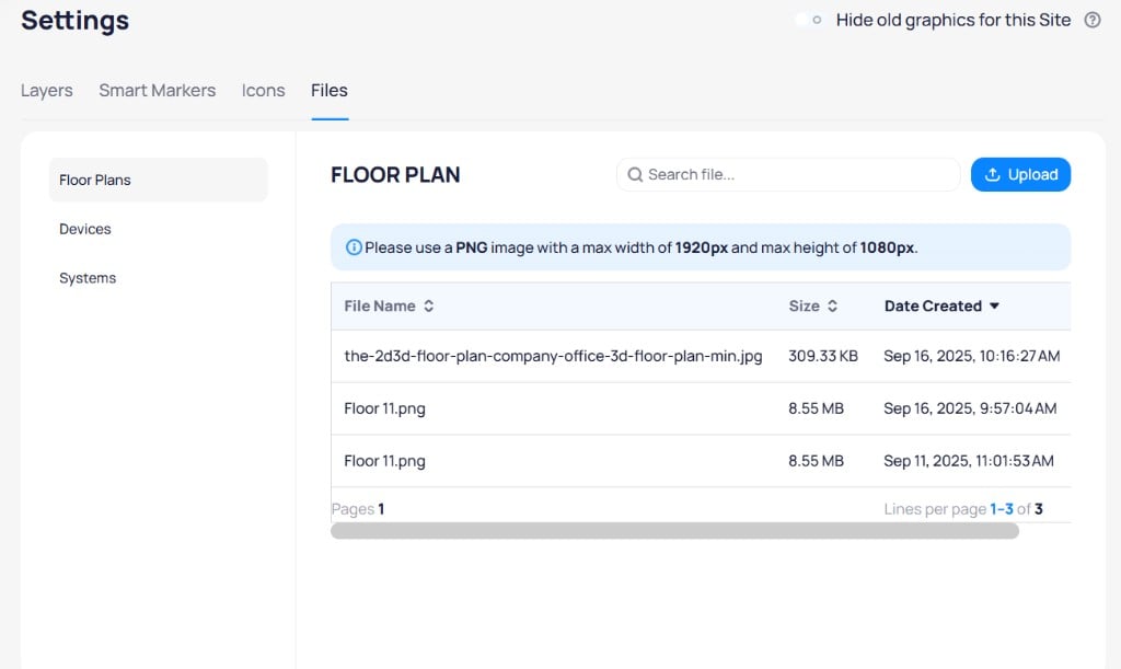 Click `Upload` to add a new file. Use the search bar to find existing files.
The recommended file format for graphic backgrounds is PNG with a maximum width of 1920px and maximum height of 1080px.
## Next steps
Place devices on floor plans with smart markers, zones, and tables.
Build system schematics from the drawing component library.
Create equipment-level visuals with live point data.
Click `Upload` to add a new file. Use the search bar to find existing files.
The recommended file format for graphic backgrounds is PNG with a maximum width of 1920px and maximum height of 1080px.
## Next steps
Place devices on floor plans with smart markers, zones, and tables.
Build system schematics from the drawing component library.
Create equipment-level visuals with live point data.