> ## Documentation Index
> Fetch the complete documentation index at: https://documentation.kodelabs.com/llms.txt
> Use this file to discover all available pages before exploring further.
# Widget customization and styling
> Customize widget styles, apply bulk styling, use color palettes, copy and paste styles, and add enhanced graphic views to Building BI dashboards.
Building BI lets you customize how widgets look across your dashboards. You can style individual widgets, apply styles in bulk, copy styles between widgets, manage color palettes, and add enhanced graphic views.
For per-chart [Style tab options](/products/building-bi/reference/chart-styling-options), [color tools](/products/building-bi/reference/color-tools), and [keyboard shortcuts](/products/building-bi/reference/keyboard-shortcuts), use the reference pages.
## In this guide
Place widgets and use Setup and Style panels.
Style overview, defaults, bulk edit, and copy styles.
Manage enhanced graphic views and color palettes.
Add mark areas, reference lines, zoom, and scroll.
## Configuration field tooltips
Hover over fields in the widget **Setup** and **Style** panels, dashboard-level controls, filters, slicers, and time range settings to see short inline guidance. Tooltips appear on hover without extra icons and disappear when you move the pointer away.
Use them to understand field names that are standardized across widget types. For example, **X-Axis** explains the field used for grouping or time series.
Field tooltips reduce training overhead when you configure unfamiliar chart types or share dashboards across teams.
## Add widgets to a dashboard
To start building charts, select `Edit Dashboard` to enter edit mode. The dashboard opens with the `Chart List` panel displayed on the right side, showing all available widget types. Use the search bar at the top of the panel to filter the list.
Drag a chart type from the `Chart List` and drop it onto the dashboard canvas. The `Chart Configuration` panel opens with `Setup` and `Style` tabs. Adjust the widget size by dragging its corners.
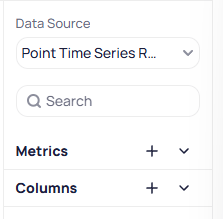
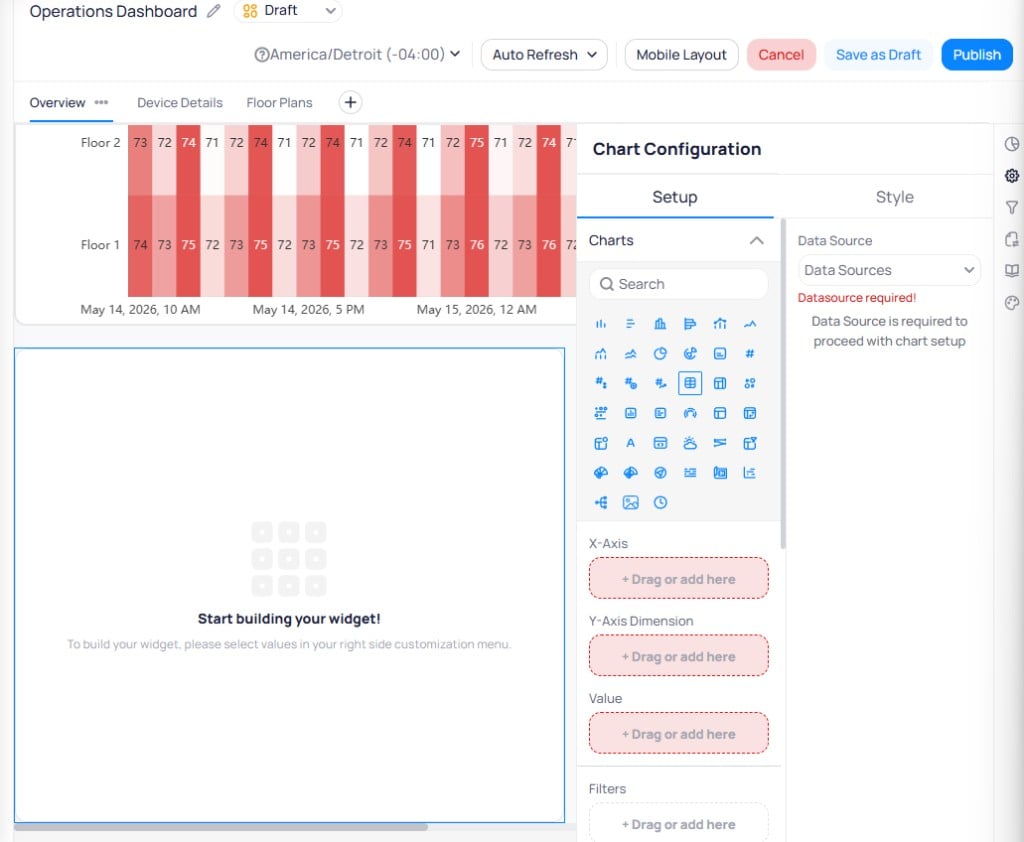 Choose a data source from the `Data Source` dropdown on the right side of the configuration panel. The available fields from that data source appear below, split into two expandable lists:
* **Metrics** -- pre-aggregated values such as averages, sums, or counts. Select the `fx` button next to a metric name to view its underlying formula.
* **Columns** -- fields pulled directly from the data source. Calculated columns also display the `fx` indicator.
Each field displays an icon indicating its data type: `#` for numbers, `A` for strings, a calendar icon for date/time, and a switch icon for booleans. Use the search bar to find specific fields. Select the `+` button next to `Metrics` or `Columns` to create a new calculated column, metric, or URL directly from the chart configuration panel.
Choose a data source from the `Data Source` dropdown on the right side of the configuration panel. The available fields from that data source appear below, split into two expandable lists:
* **Metrics** -- pre-aggregated values such as averages, sums, or counts. Select the `fx` button next to a metric name to view its underlying formula.
* **Columns** -- fields pulled directly from the data source. Calculated columns also display the `fx` indicator.
Each field displays an icon indicating its data type: `#` for numbers, `A` for strings, a calendar icon for date/time, and a switch icon for booleans. Use the search bar to find specific fields. Select the `+` button next to `Metrics` or `Columns` to create a new calculated column, metric, or URL directly from the chart configuration panel.
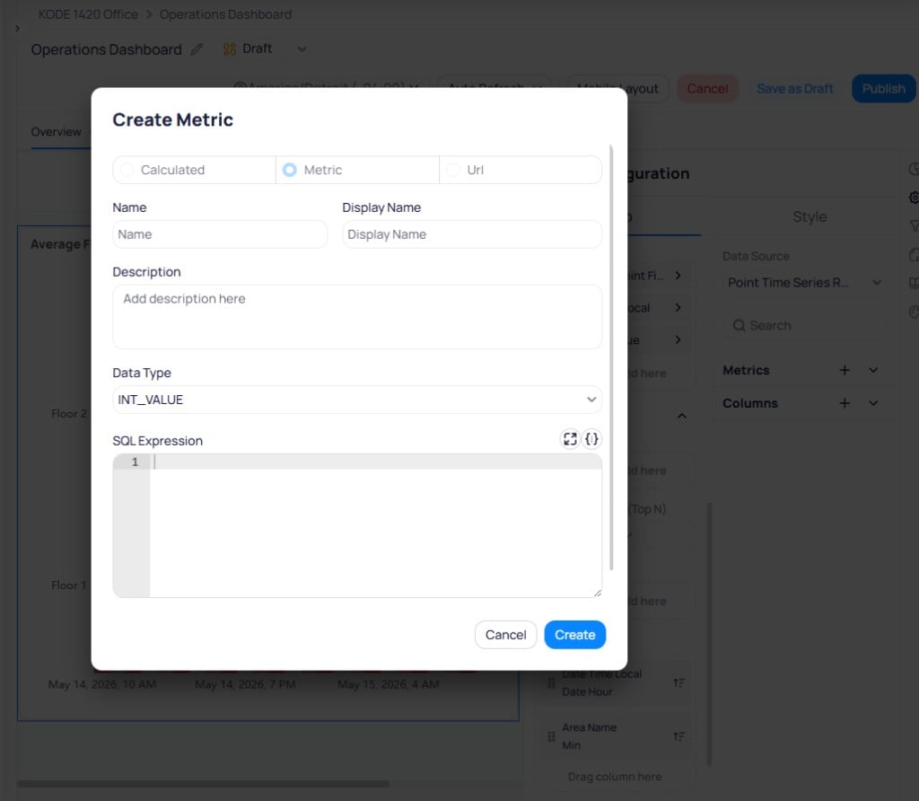 The `Create Metric` dialog has three tabs:
* **Calculated** -- creates a row-level calculated column with an SQL expression.
* **Metric** -- creates an aggregate metric that recalculates based on chart grouping.
* **URL** -- creates an internal or external link column.
Enter a `Name`, `Display Name`, optional `Description`, select the `Data Type`, and write the `SQL Expression`. Select `Create` to add it to the data source. See [Data sources](/products/building-bi/data-sources) for detailed guidance on writing calculated columns and metrics.
Calculated columns, metrics, and URLs created here are added to the data source itself, not just the current chart. Any changes affect all dashboards that use this data source.
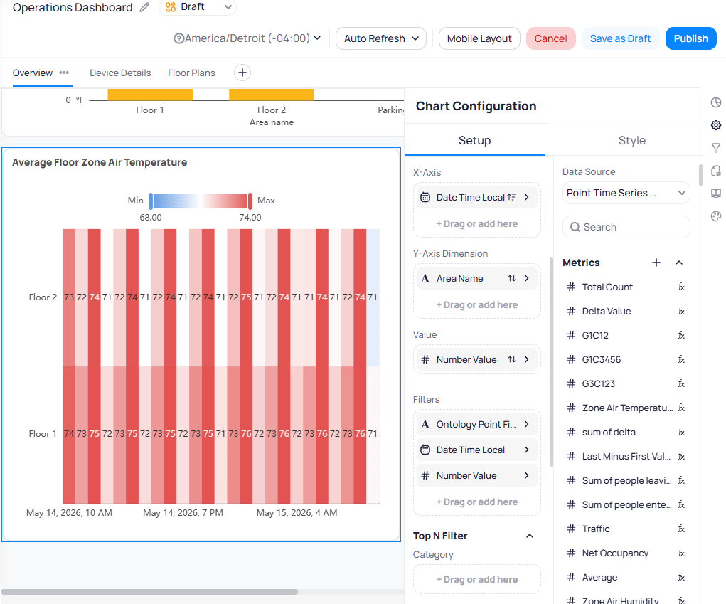
Drag and drop columns and metrics from the data source list into the `X-Axis`, `Y-Axis`, `Value`, `Filters`, and `Top N Filter` fields to define what the chart displays. Select the arrow (`>`) next to any field to configure display name, aggregate function, and sort order.
The `Create Metric` dialog has three tabs:
* **Calculated** -- creates a row-level calculated column with an SQL expression.
* **Metric** -- creates an aggregate metric that recalculates based on chart grouping.
* **URL** -- creates an internal or external link column.
Enter a `Name`, `Display Name`, optional `Description`, select the `Data Type`, and write the `SQL Expression`. Select `Create` to add it to the data source. See [Data sources](/products/building-bi/data-sources) for detailed guidance on writing calculated columns and metrics.
Calculated columns, metrics, and URLs created here are added to the data source itself, not just the current chart. Any changes affect all dashboards that use this data source.
Drag and drop columns and metrics from the data source list into the `X-Axis`, `Y-Axis`, `Value`, `Filters`, and `Top N Filter` fields to define what the chart displays. Select the arrow (`>`) next to any field to configure display name, aggregate function, and sort order.
 ### Chart types
Building BI includes charts, tables, KPI cards, and specialized widgets. For Setup fields and use cases per type, see [Chart types](/products/building-bi/reference/chart-types). For guidance on which visual to pick, see [Choosing visualizations](/products/building-bi/concepts/choosing-visualizations).
| Category | Chart types |
| ----------------- | ------------------------------------------------------------------------------------------------------------------------------------------------------------------------------------------------------------------------------------------------------------------------------------------------------------------------------------------------------------------------------------------------------------------------------------------------------------------------------------------------------------------------------------------------------------------------------------------------------------------------------------------------------------------------------ |
| Bar | [Bar](/products/building-bi/reference/chart-types#bar), [Horizontal Bar](/products/building-bi/reference/chart-types#horizontal-bar), [Stacked Bar](/products/building-bi/reference/chart-types#stacked-bar), [Horizontal Stacked Bar](/products/building-bi/reference/chart-types#horizontal-stacked-bar) |
| Line | [Line](/products/building-bi/reference/chart-types#line), [Line Area](/products/building-bi/reference/chart-types#line-area), [Stacked Line](/products/building-bi/reference/chart-types#stacked-line), [Time Series](/products/building-bi/reference/chart-types#time-series) |
| Combo and scatter | [Combo](/products/building-bi/reference/chart-types#combo), [Scatter](/products/building-bi/reference/chart-types#scatter), [Advanced Scatter](/products/building-bi/reference/chart-types#advanced-scatter) |
| Distribution | [Pie](/products/building-bi/reference/chart-types#pie), [Sunburst](/products/building-bi/reference/chart-types#sunburst), [Polar Bar](/products/building-bi/reference/chart-types#polar-bar), [Stacked Polar Bar](/products/building-bi/reference/chart-types#stacked-polar-bar), [Treemap](/products/building-bi/reference/chart-types#treemap) |
| Statistical | [Heatmap](/products/building-bi/reference/chart-types#heatmap), [Boxplot](/products/building-bi/reference/chart-types#boxplot), [Horizontal Boxplot](/products/building-bi/reference/chart-types#horizontal-boxplot), [Sankey](/products/building-bi/reference/chart-types#sankey) |
| Number and KPI | [Card](/products/building-bi/reference/chart-types#card), [Multi-row Card](/products/building-bi/reference/chart-types#multi-row-card), [Number (Period)](/products/building-bi/reference/chart-types#number-period), [Number (Target)](/products/building-bi/reference/chart-types#number-target), [Number with Trend-line](/products/building-bi/reference/chart-types#number-with-trend-line), [Gauge](/products/building-bi/reference/chart-types#gauge) |
| Tables | [Table Raw](/products/building-bi/reference/chart-types#table-raw), [Table Pivot](/products/building-bi/reference/chart-types#table-pivot), [Table Aggregated](/products/building-bi/reference/chart-types#table-aggregated) |
| Specialized | [Text](/products/building-bi/reference/chart-types#text), [iFrame](/products/building-bi/reference/chart-types#iframe), [Weather](/products/building-bi/reference/chart-types#weather), [Slicer](/products/building-bi/reference/chart-types#slicer), [Navigation](/products/building-bi/reference/chart-types#navigation), [Graphics](/products/building-bi/reference/chart-types#graphics), [Timeline](/products/building-bi/reference/chart-types#timeline), [Tree](/products/building-bi/reference/chart-types#tree), [Picture](/products/building-bi/reference/chart-types#picture), [Building Date Time](/products/building-bi/reference/chart-types#building-date-time) |
### Setup tab reference
The `Setup` tab controls which data the widget displays and how it is structured. The fields available depend on the chart type. A heatmap exposes `X-Axis`, `Y-Axis Dimension`, and `Value` fields, while a bar chart uses `X-Axis`, `Y-Axis`, and `Legend` instead. Drag columns and metrics from the data source list into these fields to configure your widget.
For the full field catalog, see [Chart setup parameters](/products/building-bi/reference/chart-setup-parameters). For per-type Setup requirements, see [Chart types](/products/building-bi/reference/chart-types).
A grid of chart type icons at the top of the `Setup` tab. Select any icon to switch the widget to a different chart type without removing it from the canvas. The axis and data fields update to match the new chart type.
The primary horizontal dimension for your data. Typically set to a time field (such as `Date Time Local`) for trend charts or a category field (such as `Area Name`) for comparison charts. Select the arrow (`>`) next to the field to configure the display name, aggregate function, and sort direction.
The vertical dimension for your data. Depending on the chart type, this may accept a metric for value-based charts or a category column for dimension-based charts like heatmaps.
Splits data into categories within the chart. For example, set `Legend` to `Area Name` to break down total energy usage by individual floors. Available on bar, line, combo, and similar multi-series chart types.
The numeric measure the chart displays. Used on chart types like heatmaps and treemap charts where the value is mapped to color intensity or size rather than an axis position.
Restricts the data shown in the widget. Add one or more columns and configure filter criteria for each. Select the arrow (`>`) next to a filter to define the condition. Filter options vary by data type: date fields offer range pickers, string fields offer value lists, and numeric fields offer comparison operators.
Limits the chart to the highest or lowest N values. Set the `Category` column, choose `Top` or `Bottom` from the dropdown, enter the number of items, and set the `Top N by Value` column to rank by.
Controls how data is ordered in the chart. Select the double-arrow icon (`⇅`) next to any column to change its sort direction. Drag columns within the `Sort Order` section to set priority when sorting by multiple fields. You can also add new columns for sorting directly in this section.
Controls how often the widget queries new data. Set shorter intervals (every minute) for live operational data, or longer intervals (hourly or daily) for historical trends. Choose the longest acceptable interval to optimize dashboard loading times.
## Style tab overview
The `Style` tab controls how a widget looks. It does not change the underlying data or Setup mappings. Available sections depend on the chart type. Toggle a section on or off with the eye icon next to its name.
At the top of the tab you can:
* Select `Set as Default Style` to save styling from this widget as the page default.
* Select `Apply Default Style` to apply the saved page default to this widget.
* Toggle `Draggable` to allow or block repositioning on the canvas.
* Toggle `Resizable` to allow or block resizing by dragging corners.
For field-level Style options by section and chart type, see [Chart styling options](/products/building-bi/reference/chart-styling-options).
Select and edit multiple widgets at once by holding Shift and clicking them on the dashboard canvas, then apply style changes in bulk.
## Default styles
Default styles let you save styling from one widget and apply it to other widgets on the same page. Application is manual: editing the default does not rewrite existing widgets until you select `Apply Default Style`. (Older Global Styles inherited automatically; Default Styles are a stamp you re-apply on purpose.)
Each page maintains its own default style — this setting does not carry across pages or dashboards.
Default styles apply at the page level, not the dashboard level. Each page has its own independent default style.
### Set a default style
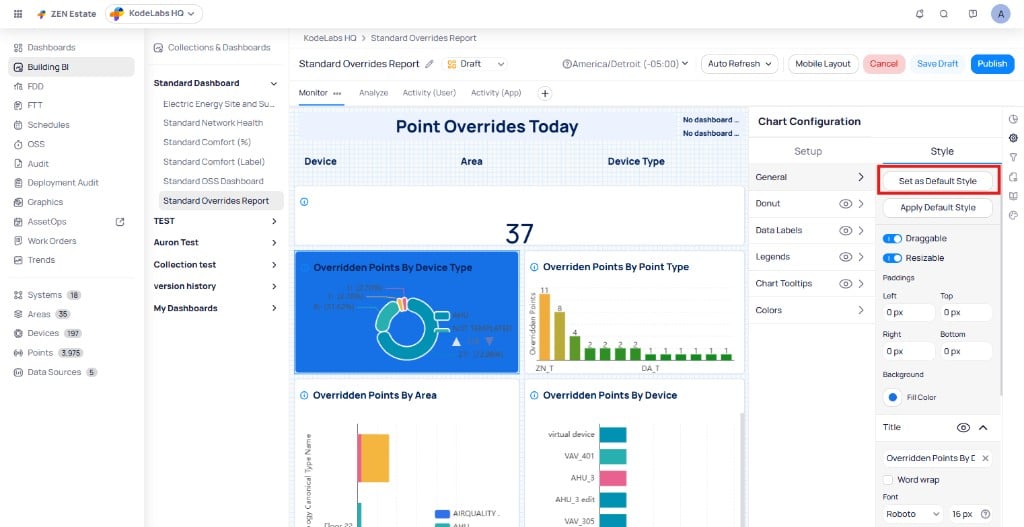
Enter edit mode on your dashboard and select the widget you want to use as your style source. Open the `Style` tab in the widget configuration panel.
Adjust the style properties you want to save as the default. This can include background colors, borders, title formatting, margins, and chart-specific settings.
Select `Set as Default Style` at the top of the `Style` tab. Building BI saves the current widget style as the page default.
### Chart types
Building BI includes charts, tables, KPI cards, and specialized widgets. For Setup fields and use cases per type, see [Chart types](/products/building-bi/reference/chart-types). For guidance on which visual to pick, see [Choosing visualizations](/products/building-bi/concepts/choosing-visualizations).
| Category | Chart types |
| ----------------- | ------------------------------------------------------------------------------------------------------------------------------------------------------------------------------------------------------------------------------------------------------------------------------------------------------------------------------------------------------------------------------------------------------------------------------------------------------------------------------------------------------------------------------------------------------------------------------------------------------------------------------------------------------------------------------ |
| Bar | [Bar](/products/building-bi/reference/chart-types#bar), [Horizontal Bar](/products/building-bi/reference/chart-types#horizontal-bar), [Stacked Bar](/products/building-bi/reference/chart-types#stacked-bar), [Horizontal Stacked Bar](/products/building-bi/reference/chart-types#horizontal-stacked-bar) |
| Line | [Line](/products/building-bi/reference/chart-types#line), [Line Area](/products/building-bi/reference/chart-types#line-area), [Stacked Line](/products/building-bi/reference/chart-types#stacked-line), [Time Series](/products/building-bi/reference/chart-types#time-series) |
| Combo and scatter | [Combo](/products/building-bi/reference/chart-types#combo), [Scatter](/products/building-bi/reference/chart-types#scatter), [Advanced Scatter](/products/building-bi/reference/chart-types#advanced-scatter) |
| Distribution | [Pie](/products/building-bi/reference/chart-types#pie), [Sunburst](/products/building-bi/reference/chart-types#sunburst), [Polar Bar](/products/building-bi/reference/chart-types#polar-bar), [Stacked Polar Bar](/products/building-bi/reference/chart-types#stacked-polar-bar), [Treemap](/products/building-bi/reference/chart-types#treemap) |
| Statistical | [Heatmap](/products/building-bi/reference/chart-types#heatmap), [Boxplot](/products/building-bi/reference/chart-types#boxplot), [Horizontal Boxplot](/products/building-bi/reference/chart-types#horizontal-boxplot), [Sankey](/products/building-bi/reference/chart-types#sankey) |
| Number and KPI | [Card](/products/building-bi/reference/chart-types#card), [Multi-row Card](/products/building-bi/reference/chart-types#multi-row-card), [Number (Period)](/products/building-bi/reference/chart-types#number-period), [Number (Target)](/products/building-bi/reference/chart-types#number-target), [Number with Trend-line](/products/building-bi/reference/chart-types#number-with-trend-line), [Gauge](/products/building-bi/reference/chart-types#gauge) |
| Tables | [Table Raw](/products/building-bi/reference/chart-types#table-raw), [Table Pivot](/products/building-bi/reference/chart-types#table-pivot), [Table Aggregated](/products/building-bi/reference/chart-types#table-aggregated) |
| Specialized | [Text](/products/building-bi/reference/chart-types#text), [iFrame](/products/building-bi/reference/chart-types#iframe), [Weather](/products/building-bi/reference/chart-types#weather), [Slicer](/products/building-bi/reference/chart-types#slicer), [Navigation](/products/building-bi/reference/chart-types#navigation), [Graphics](/products/building-bi/reference/chart-types#graphics), [Timeline](/products/building-bi/reference/chart-types#timeline), [Tree](/products/building-bi/reference/chart-types#tree), [Picture](/products/building-bi/reference/chart-types#picture), [Building Date Time](/products/building-bi/reference/chart-types#building-date-time) |
### Setup tab reference
The `Setup` tab controls which data the widget displays and how it is structured. The fields available depend on the chart type. A heatmap exposes `X-Axis`, `Y-Axis Dimension`, and `Value` fields, while a bar chart uses `X-Axis`, `Y-Axis`, and `Legend` instead. Drag columns and metrics from the data source list into these fields to configure your widget.
For the full field catalog, see [Chart setup parameters](/products/building-bi/reference/chart-setup-parameters). For per-type Setup requirements, see [Chart types](/products/building-bi/reference/chart-types).
A grid of chart type icons at the top of the `Setup` tab. Select any icon to switch the widget to a different chart type without removing it from the canvas. The axis and data fields update to match the new chart type.
The primary horizontal dimension for your data. Typically set to a time field (such as `Date Time Local`) for trend charts or a category field (such as `Area Name`) for comparison charts. Select the arrow (`>`) next to the field to configure the display name, aggregate function, and sort direction.
The vertical dimension for your data. Depending on the chart type, this may accept a metric for value-based charts or a category column for dimension-based charts like heatmaps.
Splits data into categories within the chart. For example, set `Legend` to `Area Name` to break down total energy usage by individual floors. Available on bar, line, combo, and similar multi-series chart types.
The numeric measure the chart displays. Used on chart types like heatmaps and treemap charts where the value is mapped to color intensity or size rather than an axis position.
Restricts the data shown in the widget. Add one or more columns and configure filter criteria for each. Select the arrow (`>`) next to a filter to define the condition. Filter options vary by data type: date fields offer range pickers, string fields offer value lists, and numeric fields offer comparison operators.
Limits the chart to the highest or lowest N values. Set the `Category` column, choose `Top` or `Bottom` from the dropdown, enter the number of items, and set the `Top N by Value` column to rank by.
Controls how data is ordered in the chart. Select the double-arrow icon (`⇅`) next to any column to change its sort direction. Drag columns within the `Sort Order` section to set priority when sorting by multiple fields. You can also add new columns for sorting directly in this section.
Controls how often the widget queries new data. Set shorter intervals (every minute) for live operational data, or longer intervals (hourly or daily) for historical trends. Choose the longest acceptable interval to optimize dashboard loading times.
## Style tab overview
The `Style` tab controls how a widget looks. It does not change the underlying data or Setup mappings. Available sections depend on the chart type. Toggle a section on or off with the eye icon next to its name.
At the top of the tab you can:
* Select `Set as Default Style` to save styling from this widget as the page default.
* Select `Apply Default Style` to apply the saved page default to this widget.
* Toggle `Draggable` to allow or block repositioning on the canvas.
* Toggle `Resizable` to allow or block resizing by dragging corners.
For field-level Style options by section and chart type, see [Chart styling options](/products/building-bi/reference/chart-styling-options).
Select and edit multiple widgets at once by holding Shift and clicking them on the dashboard canvas, then apply style changes in bulk.
## Default styles
Default styles let you save styling from one widget and apply it to other widgets on the same page. Application is manual: editing the default does not rewrite existing widgets until you select `Apply Default Style`. (Older Global Styles inherited automatically; Default Styles are a stamp you re-apply on purpose.)
Each page maintains its own default style — this setting does not carry across pages or dashboards.
Default styles apply at the page level, not the dashboard level. Each page has its own independent default style.
### Set a default style
Enter edit mode on your dashboard and select the widget you want to use as your style source. Open the `Style` tab in the widget configuration panel.
Adjust the style properties you want to save as the default. This can include background colors, borders, title formatting, margins, and chart-specific settings.
Select `Set as Default Style` at the top of the `Style` tab. Building BI saves the current widget style as the page default.
 ### Apply a default style
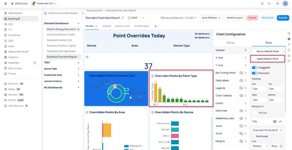
Select the widget you want to update. Open the `Style` tab in the widget configuration panel.
Select `Apply Default Style`. The widget adopts the saved default style for that page.
### Apply a default style
Select the widget you want to update. Open the `Style` tab in the widget configuration panel.
Select `Apply Default Style`. The widget adopts the saved default style for that page.
 ### Apply a default style to multiple widgets
Open the three-dot menu on any widget and choose `Select All Widgets on Page` or `Select All [Chart Type] Widgets on Page`.
Select `Apply Default Style` from the action bar. All selected widgets update to match the page default.
After publishing your dashboard, you can reset the default style to start fresh on any page.
## Bulk styling
Bulk styling lets you apply style changes to multiple widgets at once. The available style options depend on whether you select widgets of the same chart type or a mix of different types.
### Widget three-dot menu
The three-dot menu on each widget provides the following actions:
| Action | Description |
| ------------------ | ---------------------------------------------------------------------------------- |
| `Duplicate` | Creates a copy of the widget on the same page |
| `Copy to` | Copies the widget to another page within the dashboard or to a different dashboard |
| `Copy Style` | Copies the style settings from the widget to the clipboard |
| `Paste Style` | Applies a previously copied style to this widget |
| `Save as Template` | Saves the widget as a reusable chart template |
| `Select All` | Opens a nested menu with `[Chart Type] Charts on Page` and `All Charts on Page` |
| `Delete` | Removes the widget from the dashboard |
### Apply a default style to multiple widgets
Open the three-dot menu on any widget and choose `Select All Widgets on Page` or `Select All [Chart Type] Widgets on Page`.
Select `Apply Default Style` from the action bar. All selected widgets update to match the page default.
After publishing your dashboard, you can reset the default style to start fresh on any page.
## Bulk styling
Bulk styling lets you apply style changes to multiple widgets at once. The available style options depend on whether you select widgets of the same chart type or a mix of different types.
### Widget three-dot menu
The three-dot menu on each widget provides the following actions:
| Action | Description |
| ------------------ | ---------------------------------------------------------------------------------- |
| `Duplicate` | Creates a copy of the widget on the same page |
| `Copy to` | Copies the widget to another page within the dashboard or to a different dashboard |
| `Copy Style` | Copies the style settings from the widget to the clipboard |
| `Paste Style` | Applies a previously copied style to this widget |
| `Save as Template` | Saves the widget as a reusable chart template |
| `Select All` | Opens a nested menu with `[Chart Type] Charts on Page` and `All Charts on Page` |
| `Delete` | Removes the widget from the dashboard |
 ### Select widgets for bulk editing
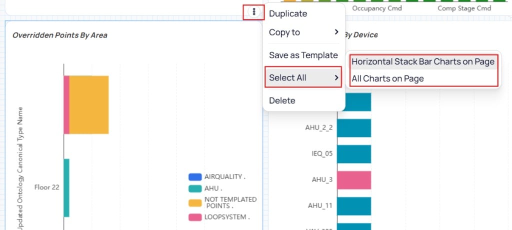
Open the three-dot menu on any widget and choose `Select All`. The nested menu offers two options:
* `[Chart Type] Charts on Page` -- selects only widgets that match the current chart type (for example, `Horizontal Stack Bar Charts on Page`).
* `All Charts on Page` -- selects every widget on the current page.
You can also use keyboard shortcuts to select widgets:
* Press Ctrl + A to select all widgets on the page.
* Hold Ctrl and click individual widgets to build a custom selection.
### Same chart type selected
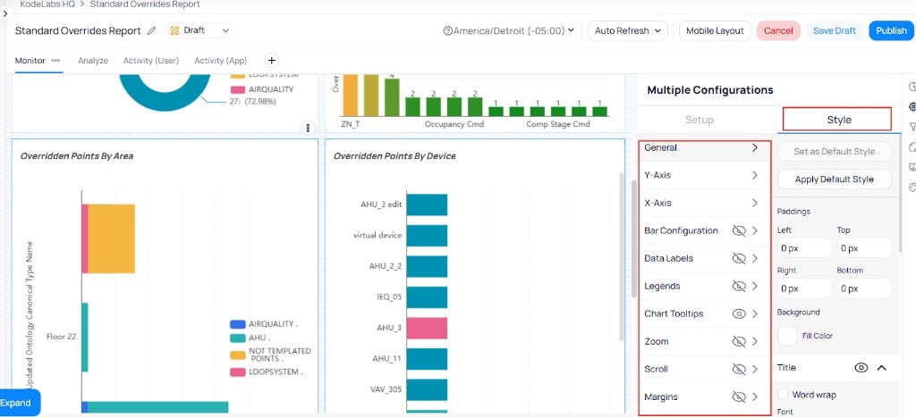
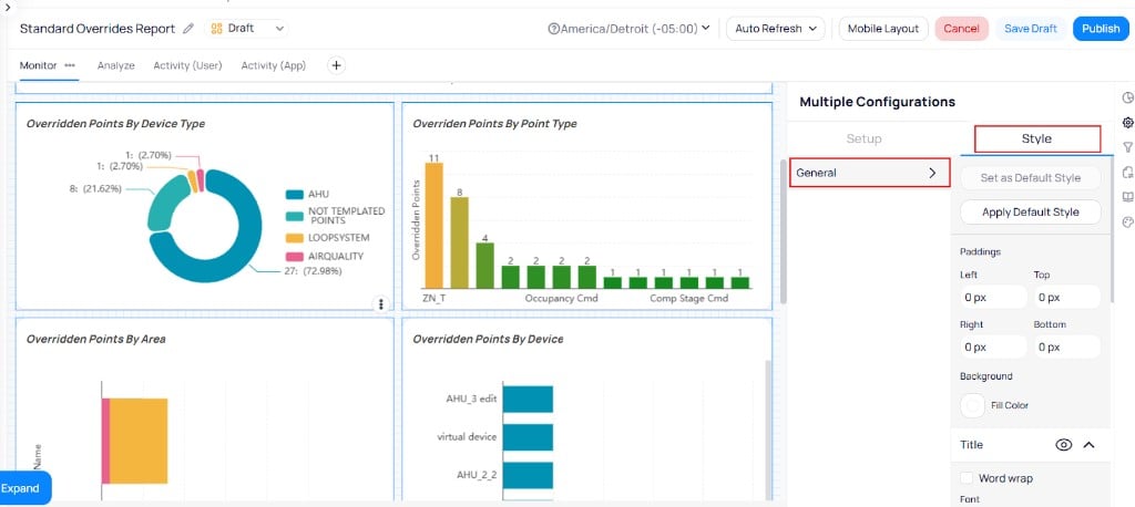
When all selected widgets share the same chart type, the `Multiple Configurations` panel appears with both general and chart-specific style sections:
* **General styles** -- `Paddings`, background, title, and default style buttons.
* **Chart-specific styles** -- axis labels, bar configuration, data labels, legends, chart tooltips, colors, zoom, scroll, and margins.
### Select widgets for bulk editing
Open the three-dot menu on any widget and choose `Select All`. The nested menu offers two options:
* `[Chart Type] Charts on Page` -- selects only widgets that match the current chart type (for example, `Horizontal Stack Bar Charts on Page`).
* `All Charts on Page` -- selects every widget on the current page.
You can also use keyboard shortcuts to select widgets:
* Press Ctrl + A to select all widgets on the page.
* Hold Ctrl and click individual widgets to build a custom selection.
### Same chart type selected
When all selected widgets share the same chart type, the `Multiple Configurations` panel appears with both general and chart-specific style sections:
* **General styles** -- `Paddings`, background, title, and default style buttons.
* **Chart-specific styles** -- axis labels, bar configuration, data labels, legends, chart tooltips, colors, zoom, scroll, and margins.
 ### Mixed chart types selected
When your selection includes different chart types, the `Multiple Configurations` panel shows only the `General` section. Chart-specific sections are hidden because they do not apply to all selected widget types.
Available settings in this mode:
* `Paddings`
* Background color
* Title formatting
* Default style buttons
### Mixed chart types selected
When your selection includes different chart types, the `Multiple Configurations` panel shows only the `General` section. Chart-specific sections are hidden because they do not apply to all selected widget types.
Available settings in this mode:
* `Paddings`
* Background color
* Title formatting
* Default style buttons
 ## Remove and duplicate in bulk
You can remove or duplicate multiple widgets at once using bulk selection.
Use the three-dot menu to select widgets, or press Ctrl + A to select all widgets on the page. Hold Ctrl and click to add or remove individual widgets from your selection.
Select `Duplicate` or `Delete` from the action bar to apply the operation to all selected widgets.
Deleting widgets in bulk cannot be undone. Verify your selection before confirming the deletion.
## Copy and paste styles
Copy and paste lets you transfer visual styling from one widget to another without setting a page-level default. Use it to style multiple similar charts quickly or reuse fonts and layout settings across widget types.
**Copy Style** copies visual settings only. It does not copy data queries, data source mappings, or widget-specific data configuration.
### Compatibility behavior
| Target widget | What paste applies |
| ------------------------ | --------------------------------------------------------------------------------------- |
| **Same chart type** | Full style configuration (axes, colors, legends, labels, and layout) |
| **Different chart type** | General visual styles only (fonts, padding, background, and compatible layout settings) |
### Copy and paste within a dashboard
Open your dashboard in edit mode.
Select the widget whose style you want to copy. Open the three-dot menu and select `Copy Style`.
## Remove and duplicate in bulk
You can remove or duplicate multiple widgets at once using bulk selection.
Use the three-dot menu to select widgets, or press Ctrl + A to select all widgets on the page. Hold Ctrl and click to add or remove individual widgets from your selection.
Select `Duplicate` or `Delete` from the action bar to apply the operation to all selected widgets.
Deleting widgets in bulk cannot be undone. Verify your selection before confirming the deletion.
## Copy and paste styles
Copy and paste lets you transfer visual styling from one widget to another without setting a page-level default. Use it to style multiple similar charts quickly or reuse fonts and layout settings across widget types.
**Copy Style** copies visual settings only. It does not copy data queries, data source mappings, or widget-specific data configuration.
### Compatibility behavior
| Target widget | What paste applies |
| ------------------------ | --------------------------------------------------------------------------------------- |
| **Same chart type** | Full style configuration (axes, colors, legends, labels, and layout) |
| **Different chart type** | General visual styles only (fonts, padding, background, and compatible layout settings) |
### Copy and paste within a dashboard
Open your dashboard in edit mode.
Select the widget whose style you want to copy. Open the three-dot menu and select `Copy Style`.
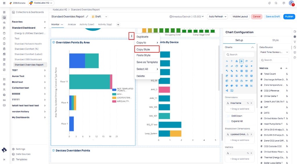 Select the target widget. Open the three-dot menu and select `Paste Style`. The target widget adopts the copied styling.
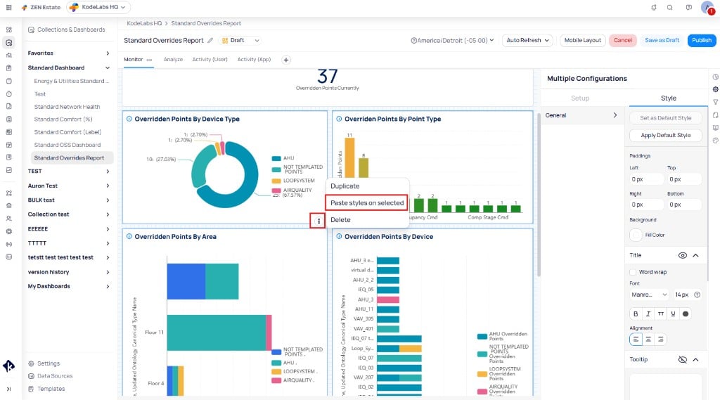
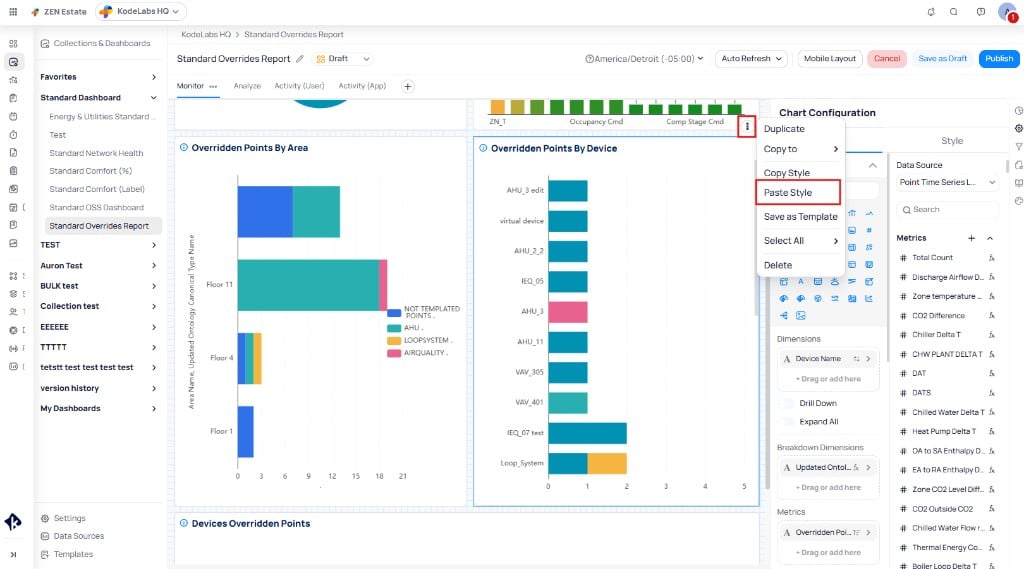 To paste a style to multiple widgets at once, hold Ctrl and click each target widget, or use `Select All` from the three-dot menu. Then open the three-dot menu on any selected widget and select `Paste styles on selected`. The `Multiple Configurations` panel appears, and all selected widgets adopt the copied styling.
 ### Copy and paste across pages and dashboards
You can copy a style on one dashboard page and paste it on another page or dashboard. Data bindings stay on each target widget; only compatible visual properties transfer.
## Keyboard shortcuts
For the full shortcut list, see [Keyboard shortcuts](/products/building-bi/reference/keyboard-shortcuts). Common selection shortcuts while editing:
| Shortcut | Action |
| ------------------------------ | --------------------------------------------------- |
| Ctrl + A | Select all widgets on the current page |
| Ctrl + click | Add or remove individual widgets from the selection |
| Shift + click | Multi-select widgets on the dashboard canvas |
## Enhanced graphic view
The enhanced graphic view embeds a floorplan **Graphics** widget in a Building BI dashboard. Graphic markers update automatically when users apply slicers, dashboard filters, page filters, or cross-filter selections from other widgets. Non-matching markers are hidden so the floorplan stays aligned with the active filter context.
Graphics respond to BI filters without changing the underlying data query or widget data configuration — only marker visibility updates.
### Filter interactions
| Filter source | Result |
| ----------------------------- | ------------------------------------------------------------------------------------- |
| **Slicers** | Select a device, point, or ontology field; the graphic shows only matching markers |
| **Dashboard or page filters** | Filter by fields such as point name; the graphic reflects the active filter scope |
| **Cross-filtering** | Select a row in a table or another widget; the graphic updates to match the selection |
Interaction is enabled automatically when a **Graphics** widget shares the dashboard with filter-enabled widgets.
### Build an enhanced graphic dashboard
Create a new dashboard or open an existing one in edit mode.
Add slicer widgets to the top of your dashboard for `Device Name`, `Point Name`, and `Ontology Point Field`. Each slicer provides a searchable dropdown where users can select one or more items to filter the entire page.
Add a table widget to display the filtered results. Configure it with columns such as `Area Name`, `Device Name`, and `Point Name` so users can review the raw data alongside the graphic. Users can cross-filter the graphic by selecting rows in the table.
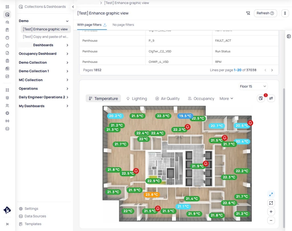
Add a `Graphics` widget to the dashboard canvas. Select the floor from the floor dropdown to display the corresponding floorplan. Ensure devices are added to the area and points are assigned on the graphic.
The graphic displays data across multiple layers. Select a layer tab to switch between views:
* **Temperature** -- shows temperature readings at sensor locations with color-coded markers (green for normal, red for alerts).
* **Lighting** -- shows lighting status across zones.
* **Air Quality** -- shows air quality readings at sensor locations.
* **Occupancy** -- shows occupancy counts by zone.
* **More** -- expands to show additional available layers.
### Copy and paste across pages and dashboards
You can copy a style on one dashboard page and paste it on another page or dashboard. Data bindings stay on each target widget; only compatible visual properties transfer.
## Keyboard shortcuts
For the full shortcut list, see [Keyboard shortcuts](/products/building-bi/reference/keyboard-shortcuts). Common selection shortcuts while editing:
| Shortcut | Action |
| ------------------------------ | --------------------------------------------------- |
| Ctrl + A | Select all widgets on the current page |
| Ctrl + click | Add or remove individual widgets from the selection |
| Shift + click | Multi-select widgets on the dashboard canvas |
## Enhanced graphic view
The enhanced graphic view embeds a floorplan **Graphics** widget in a Building BI dashboard. Graphic markers update automatically when users apply slicers, dashboard filters, page filters, or cross-filter selections from other widgets. Non-matching markers are hidden so the floorplan stays aligned with the active filter context.
Graphics respond to BI filters without changing the underlying data query or widget data configuration — only marker visibility updates.
### Filter interactions
| Filter source | Result |
| ----------------------------- | ------------------------------------------------------------------------------------- |
| **Slicers** | Select a device, point, or ontology field; the graphic shows only matching markers |
| **Dashboard or page filters** | Filter by fields such as point name; the graphic reflects the active filter scope |
| **Cross-filtering** | Select a row in a table or another widget; the graphic updates to match the selection |
Interaction is enabled automatically when a **Graphics** widget shares the dashboard with filter-enabled widgets.
### Build an enhanced graphic dashboard
Create a new dashboard or open an existing one in edit mode.
Add slicer widgets to the top of your dashboard for `Device Name`, `Point Name`, and `Ontology Point Field`. Each slicer provides a searchable dropdown where users can select one or more items to filter the entire page.
Add a table widget to display the filtered results. Configure it with columns such as `Area Name`, `Device Name`, and `Point Name` so users can review the raw data alongside the graphic. Users can cross-filter the graphic by selecting rows in the table.
Add a `Graphics` widget to the dashboard canvas. Select the floor from the floor dropdown to display the corresponding floorplan. Ensure devices are added to the area and points are assigned on the graphic.
The graphic displays data across multiple layers. Select a layer tab to switch between views:
* **Temperature** -- shows temperature readings at sensor locations with color-coded markers (green for normal, red for alerts).
* **Lighting** -- shows lighting status across zones.
* **Air Quality** -- shows air quality readings at sensor locations.
* **Occupancy** -- shows occupancy counts by zone.
* **More** -- expands to show additional available layers.
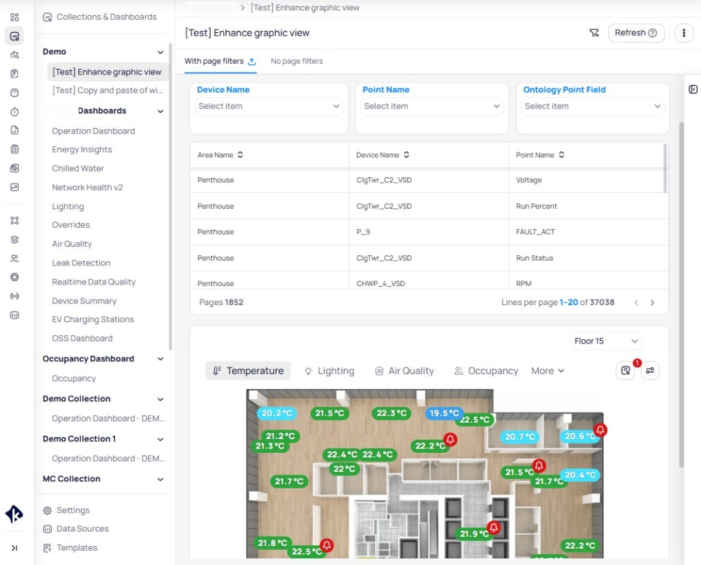 Slicer, filter, and cross-filter selections update both the data table and the graphic in real time. When you select a device from the `Device Name` slicer, the table and graphic show only data for that device. This creates an interactive drill-down view where users move from a floorplan overview to specific device context.
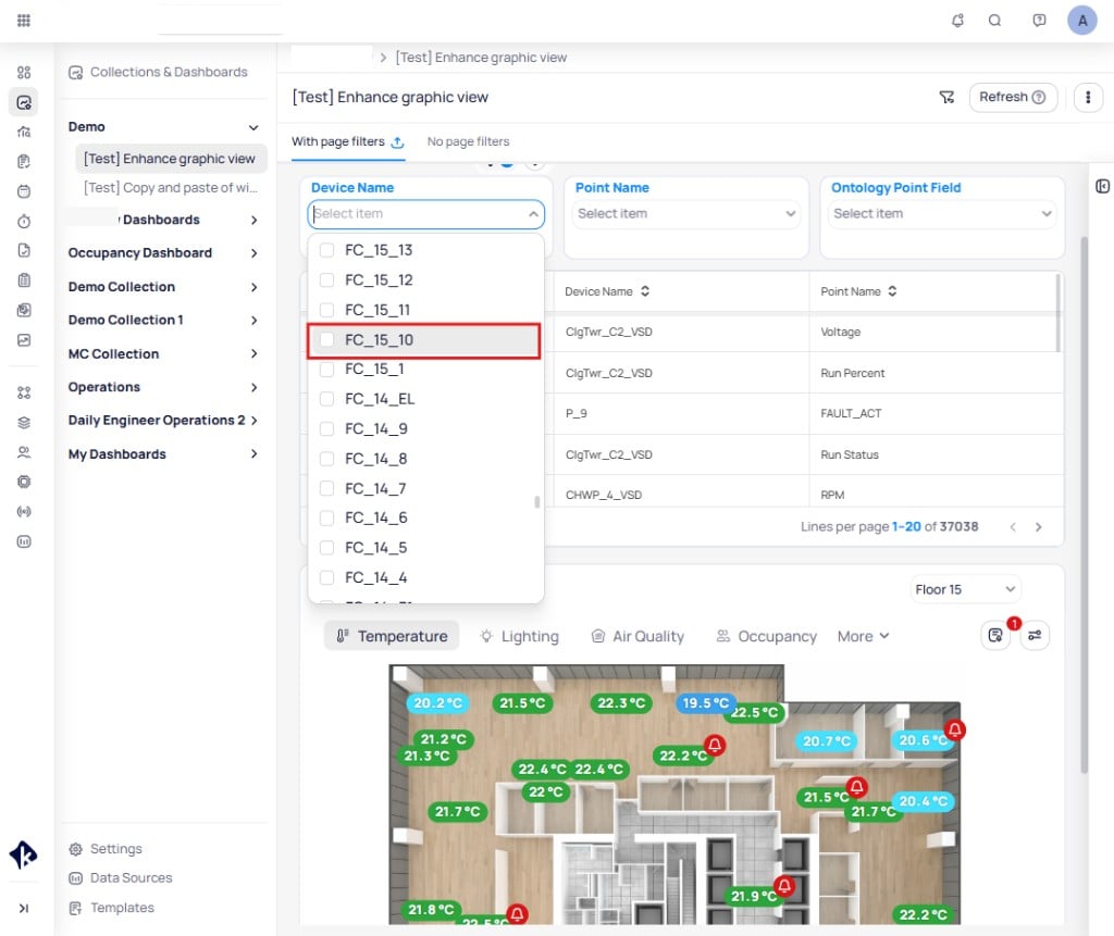 Collapse the left navigation panel using the `<` icon to give the graphic widget maximum screen space. This is especially useful on floorplan views where marker density is high.
 ## Color palette management
Building BI provides organization-level color palettes for consistent visual styling across dashboards and teams. Create palettes for branding, themes, or data visualization contexts in [Building BI settings](/products/building-bi/settings#custom-color-palettes), then apply them from widget style configuration.
Enter edit mode on your dashboard and select a widget. Navigate to `Chart Configuration` > `Style` tab > `Colors` section.
Select a color type from the `Type` dropdown in the `Colors` section:
* `Color Scheme` -- predefined sets of complementary colors designed by KODE Labs. Schemes are grouped into categories: `Bright`, `Cold`, `Default`, and `Pastel`. Select a category, then choose a specific scheme from the color swatches.
* `Color Palette` -- custom sets of complementary colors created by your organization. Color palettes are managed in `Settings` and are available across all dashboards in your portfolio.
* `Color Series` -- a sequential color series for ordered data.
* `Range` -- a color range mapped to specific numeric value boundaries.
* `Gradient` -- a smooth transition between two or more colors.
The widget preview updates instantly when you select a new color option.
### Series colors
Series colors let you assign specific colors to individual string or Boolean metrics. Keep colors standardized across dashboards for consistency (for example, green for normal operation and red for fault conditions).
### Gradients
Gradients create a smooth color transition between two values. Select `Gradient` from the `Type` dropdown in the `Colors` section. Set the `Minimum` and `Maximum` values with their corresponding colors. Enable `Dynamic Gradient` to automatically adjust the range boundaries to the minimum and maximum values in your data. Toggle `Middle Color` on to add a third color at the midpoint of the gradient. The `Preview` bar shows the resulting color transition.
## Color palette management
Building BI provides organization-level color palettes for consistent visual styling across dashboards and teams. Create palettes for branding, themes, or data visualization contexts in [Building BI settings](/products/building-bi/settings#custom-color-palettes), then apply them from widget style configuration.
Enter edit mode on your dashboard and select a widget. Navigate to `Chart Configuration` > `Style` tab > `Colors` section.
Select a color type from the `Type` dropdown in the `Colors` section:
* `Color Scheme` -- predefined sets of complementary colors designed by KODE Labs. Schemes are grouped into categories: `Bright`, `Cold`, `Default`, and `Pastel`. Select a category, then choose a specific scheme from the color swatches.
* `Color Palette` -- custom sets of complementary colors created by your organization. Color palettes are managed in `Settings` and are available across all dashboards in your portfolio.
* `Color Series` -- a sequential color series for ordered data.
* `Range` -- a color range mapped to specific numeric value boundaries.
* `Gradient` -- a smooth transition between two or more colors.
The widget preview updates instantly when you select a new color option.
### Series colors
Series colors let you assign specific colors to individual string or Boolean metrics. Keep colors standardized across dashboards for consistency (for example, green for normal operation and red for fault conditions).
### Gradients
Gradients create a smooth color transition between two values. Select `Gradient` from the `Type` dropdown in the `Colors` section. Set the `Minimum` and `Maximum` values with their corresponding colors. Enable `Dynamic Gradient` to automatically adjust the range boundaries to the minimum and maximum values in your data. Toggle `Middle Color` on to add a third color at the midpoint of the gradient. The `Preview` bar shows the resulting color transition.
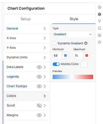 In charts such as heat maps, data label text color automatically switches between white and black based on the background gradient to maintain readable contrast.
### Range inclusion rules
When you define a color range, the range excludes the `From Value` (left value) but includes the `To Value` (right value). For example, a range of 20 to 30 set to green means 30 displays as green, but 20 does not.
## Mark areas
Mark areas highlight shaded background zones on a chart. Use them to visually denote acceptable operational ranges or fault threshold zones behind your plotted data.
Mark areas can be generated dynamically based on column values or set to static boundaries. Additional styling options let you control the fill color, opacity, and label placement. For Style tab controls, see [Mark areas](/products/building-bi/reference/chart-styling-options#mark-areas).
## Reference lines
Reference lines overlay static horizontal or vertical lines on a chart. Use them to mark setpoint temperatures, threshold limits, or target values so users can instantly assess whether data falls within expected boundaries.
Reference lines can be generated dynamically based on column values or set to fixed positions. Additional styling options include line color, thickness, and label formatting. For Style tab controls, see [Reference lines](/products/building-bi/reference/chart-styling-options#reference-lines).
Use reference lines frequently on operational dashboards. They help users interpret data at a glance without needing to check separate documentation for acceptable ranges.
## Zoom and scroll
Enable zoom and scroll for charts with long time-series data or large datasets. When enabled, users can zoom into specific time periods or scroll along the X-axis to navigate through data interactively. See [Top N vs scrolling](/products/building-bi/concepts/choosing-visualizations#top-n-vs-scrolling) to choose the appropriate approach. For Style tab controls, see [Zoom and scroll](/products/building-bi/reference/chart-styling-options#zoom-and-scroll).
This option is particularly useful for dashboards displaying historical trends where users need to drill into specific periods.
## Styling best practices
Follow these principles when styling widgets and dashboards:
* **Clarity over complexity** -- if a chart is hard to read, it is not useful. Simplify the visualization before adding more styling.
* **Use titles effectively** -- every widget title should answer two questions: what is this showing, and for what context?
* **Avoid overcrowding** -- too many data labels make a chart unreadable, and too many colors make it confusing. Remove non-essential visual elements.
* **Use reference lines** -- reference lines help users interpret data at a glance. Add them for setpoints, thresholds, or target values on operational dashboards.
* **Keep consistency across dashboards** -- use the same colors, naming conventions, and layout patterns across all dashboards in a portfolio.
## Accessibility considerations
When choosing colors for your charts and dashboards, consider two accessibility factors:
* **Color blindness** -- Verify that your color choices are distinguishable for users with different types of color vision deficiency.
* **Contrast** -- Confirm that text maintains sufficient contrast against its background color, particularly in data labels and legends.
Use tools such as a contrast checker or color blindness simulator to validate that your color choices meet accessibility standards before publishing.
## Related reading
Match chart types to the question you need to answer.
Look up Setup requirements for every widget type.
Look up Style tab options by chart type.
Configure series colors, gradients, and palettes.
## Next steps
Create and configure interactive dashboards with charts, tables, and widgets.
Connect dashboards to live building data from Cloud BMS modules and devices.
In charts such as heat maps, data label text color automatically switches between white and black based on the background gradient to maintain readable contrast.
### Range inclusion rules
When you define a color range, the range excludes the `From Value` (left value) but includes the `To Value` (right value). For example, a range of 20 to 30 set to green means 30 displays as green, but 20 does not.
## Mark areas
Mark areas highlight shaded background zones on a chart. Use them to visually denote acceptable operational ranges or fault threshold zones behind your plotted data.
Mark areas can be generated dynamically based on column values or set to static boundaries. Additional styling options let you control the fill color, opacity, and label placement. For Style tab controls, see [Mark areas](/products/building-bi/reference/chart-styling-options#mark-areas).
## Reference lines
Reference lines overlay static horizontal or vertical lines on a chart. Use them to mark setpoint temperatures, threshold limits, or target values so users can instantly assess whether data falls within expected boundaries.
Reference lines can be generated dynamically based on column values or set to fixed positions. Additional styling options include line color, thickness, and label formatting. For Style tab controls, see [Reference lines](/products/building-bi/reference/chart-styling-options#reference-lines).
Use reference lines frequently on operational dashboards. They help users interpret data at a glance without needing to check separate documentation for acceptable ranges.
## Zoom and scroll
Enable zoom and scroll for charts with long time-series data or large datasets. When enabled, users can zoom into specific time periods or scroll along the X-axis to navigate through data interactively. See [Top N vs scrolling](/products/building-bi/concepts/choosing-visualizations#top-n-vs-scrolling) to choose the appropriate approach. For Style tab controls, see [Zoom and scroll](/products/building-bi/reference/chart-styling-options#zoom-and-scroll).
This option is particularly useful for dashboards displaying historical trends where users need to drill into specific periods.
## Styling best practices
Follow these principles when styling widgets and dashboards:
* **Clarity over complexity** -- if a chart is hard to read, it is not useful. Simplify the visualization before adding more styling.
* **Use titles effectively** -- every widget title should answer two questions: what is this showing, and for what context?
* **Avoid overcrowding** -- too many data labels make a chart unreadable, and too many colors make it confusing. Remove non-essential visual elements.
* **Use reference lines** -- reference lines help users interpret data at a glance. Add them for setpoints, thresholds, or target values on operational dashboards.
* **Keep consistency across dashboards** -- use the same colors, naming conventions, and layout patterns across all dashboards in a portfolio.
## Accessibility considerations
When choosing colors for your charts and dashboards, consider two accessibility factors:
* **Color blindness** -- Verify that your color choices are distinguishable for users with different types of color vision deficiency.
* **Contrast** -- Confirm that text maintains sufficient contrast against its background color, particularly in data labels and legends.
Use tools such as a contrast checker or color blindness simulator to validate that your color choices meet accessibility standards before publishing.
## Related reading
Match chart types to the question you need to answer.
Look up Setup requirements for every widget type.
Look up Style tab options by chart type.
Configure series colors, gradients, and palettes.
## Next steps
Create and configure interactive dashboards with charts, tables, and widgets.
Connect dashboards to live building data from Cloud BMS modules and devices.