> ## Documentation Index
> Fetch the complete documentation index at: https://documentation.kodelabs.com/llms.txt
> Use this file to discover all available pages before exploring further.
# Chart styling options
> Look up Style tab options for Building BI widgets, including axes, labels, colors, and chart-type-specific sections.
The `Style` tab controls how a widget looks. It never changes the data the chart shows. Configure data in the [Setup tab](/products/building-bi/reference/chart-setup-parameters). For how-to tasks such as default styles, bulk styling, and copy/paste, see [Widget customization](/products/building-bi/widget-customization).
Sections available depend on the chart type. `General`, `Colors`, and `Margins` appear on almost every chart. Other sections appear only on types that use them. See [Style options by chart type](#style-options-by-chart-type). Each section has an eye icon that shows or hides it. Color options are covered in depth in [Color tools](/products/building-bi/reference/color-tools).
The top of the `Style` tab also includes reusable-style and layout controls:
* `Set as Default Style` — saves the current widget styling as the page-level default.
* `Apply Default Style` — applies the saved page default to this widget.
* `Draggable` — allows repositioning the widget on the canvas.
* `Resizable` — allows resizing the widget by dragging its corners.
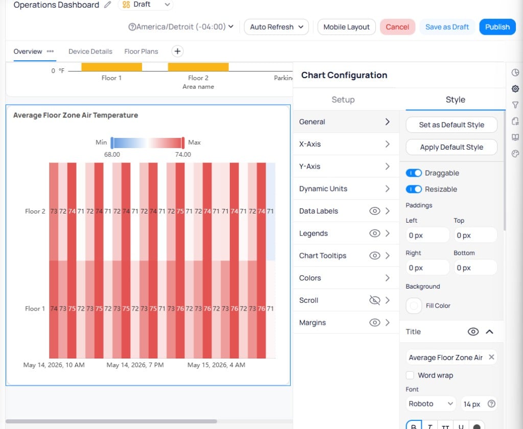 Select multiple widgets by holding Shift and clicking them on the canvas, then change shared style options in bulk.
## General
Controls the widget container and layout.
Sets internal spacing around the chart content. Configure `Left`, `Top`, `Right`, and `Bottom` independently in pixels.
Sets the fill color for the widget card. Toggle on to apply a color, or leave off for a transparent background.
Adds a header to the widget. Enter the title text, enable `Word wrap`, and configure font family, size, weight, style, uppercase, underline, and color. Set text alignment to left, center, or right.
Adds an informational tooltip icon to the widget. Enter the tooltip text. Set `Icon Color` and choose `Placement` of `In Header` or `Floating`. Use tooltips for calculated or non-obvious values.
Controls corner rounding on the widget card. Set `Corner Radius Type` to `All` for uniform corners, or configure each corner. Enter the radius in pixels.
Adds borders to the widget card. Select `All Borders` or configure individual sides. Set border `Weight` in pixels and choose a color.
Controls what the widget shows when no data is returned. Set a custom `Message`. Toggle `Chart Icon` to show or hide the chart type icon. Configure `Background Color`, `Icon Color`, and `Text Color`.
Sets the widget footprint on the dashboard grid. Use with `Draggable` and `Resizable` to control whether viewers can move or resize it.
## X-Axis and Y-Axis
Both axes share the same options. Combo and Line charts add a `Secondary Y-Axis` with the same controls.
Shows or hides the whole axis.
Renames the axis label (for example, "Floor" instead of a raw field name). Set a `Margin` between the title and the axis. Configure font family, size, weight, style, and color.
Formats axis tick labels.
* **Font** — family, size, weight, style, and color.
* **Margin** — spacing between labels and the chart area. On the Y-Axis, this also sets width for label text.
* **Overflow** — set to `truncate` to clip long labels, or leave unset for full text (Y-Axis only).
* **Interval** — overrides automatic label spacing. Set to `0` to show every label.
* **Rotate** — tilts labels so long names do not overlap.
* **Prefix** — text before each axis value (for example, a currency symbol).
* **Dynamic unit** — appends a measurement suffix from another data field.
* **Suffix** — text after each axis value.
Locks the axis to fixed bounds instead of auto-scaling. Has no effect if Y-Axis Limits are set in the Setup tab. See [Chart setup parameters](/products/building-bi/reference/chart-setup-parameters).
Cleans up displayed numbers with decimals, percentage, thousands separator, and unit options.
Shows or hides grid lines behind the chart. Set `Line width` in pixels and choose a grid line `Color`.
Allows more than one X-axis on supported charts.
Sets bar thickness on horizontal bar charts.
## Dynamic units
Resolve prefix and suffix values from data at runtime instead of fixed text. Dynamic units are available wherever static prefix or suffix formatting exists, including axis values, data labels, and chart tooltips.
For each prefix or suffix field, choose:
| Option | Behavior |
| ----------------- | ------------------------------------------------------------------------------------------ |
| **Static value** | Fixed text you enter (for example, degrees F or kW) |
| **Dynamic value** | Select a **Unit Name** from the dropdown to resolve the unit from a data column at runtime |
Select `New Dynamic Unit` to create a rule that maps a metric or column to a unit suffix. Existing rules list the metric name and unit type. Use the three-dot menu on any rule to edit or delete it.
Conditions can use an aggregate function. For example, add a temperature unit suffix to readings from temperature points.
Dynamic units help when you deploy the same dashboard across buildings that use different measurement units. The widget adapts at runtime without manual restyling per site.
Widget `Dynamic units` format chart labels at display time. The [platform unit conversion foundation](/products/building-bi/data-sources#point-bounds-and-unit-conversion) normalizes values in metrics and bounds logic. It does not change raw stored readings or trend display units yet.
## Bar configuration
Available on Bar and Combo charts (including horizontal and stacked variants). Adjusts bar thickness and spacing between bars. Sets how multiple series are arranged: `Grouped` (side by side) or `Stacked` (on top of one another).
## Data labels
Value labels printed directly on chart elements. On Combo charts, bar and line labels are configured separately.
Shows or hides the labels.
What each label displays: Value, Name, Name + Value, Percentage, and related options.
Places the label `Inside` or `Outside` the chart element.
Sets label angle in degrees and how many labels to skip.
Sets font family, size, weight (bold), and style (italic) for data label text.
Adds text before each data label value.
Appends a measurement suffix based on another data field. Select a unit from the dropdown.
Adds text after each data label value.
Controls numeric display. Set `Units` to a format type, configure `Decimals`, and enable `Thousands` separators for large values.
On Pie charts, shows the leader line connecting a slice to its outside label.
## Legends
Identifies series in multi-series charts.
Shows or hides the legend.
Moves the legend to the top, bottom, left, or right using position icons. Set X and Y offset values in pixels for fine placement.
When there are too many series to fit, the legend scrolls rather than wrapping.
Sets font family, size, weight, style, and color for legend entries.
## Chart tooltips
The pane that appears when a viewer hovers or clicks a data point. Use tooltips for exact values, timestamps, or device names without cluttering the chart.
Select multiple widgets by holding Shift and clicking them on the canvas, then change shared style options in bulk.
## General
Controls the widget container and layout.
Sets internal spacing around the chart content. Configure `Left`, `Top`, `Right`, and `Bottom` independently in pixels.
Sets the fill color for the widget card. Toggle on to apply a color, or leave off for a transparent background.
Adds a header to the widget. Enter the title text, enable `Word wrap`, and configure font family, size, weight, style, uppercase, underline, and color. Set text alignment to left, center, or right.
Adds an informational tooltip icon to the widget. Enter the tooltip text. Set `Icon Color` and choose `Placement` of `In Header` or `Floating`. Use tooltips for calculated or non-obvious values.
Controls corner rounding on the widget card. Set `Corner Radius Type` to `All` for uniform corners, or configure each corner. Enter the radius in pixels.
Adds borders to the widget card. Select `All Borders` or configure individual sides. Set border `Weight` in pixels and choose a color.
Controls what the widget shows when no data is returned. Set a custom `Message`. Toggle `Chart Icon` to show or hide the chart type icon. Configure `Background Color`, `Icon Color`, and `Text Color`.
Sets the widget footprint on the dashboard grid. Use with `Draggable` and `Resizable` to control whether viewers can move or resize it.
## X-Axis and Y-Axis
Both axes share the same options. Combo and Line charts add a `Secondary Y-Axis` with the same controls.
Shows or hides the whole axis.
Renames the axis label (for example, "Floor" instead of a raw field name). Set a `Margin` between the title and the axis. Configure font family, size, weight, style, and color.
Formats axis tick labels.
* **Font** — family, size, weight, style, and color.
* **Margin** — spacing between labels and the chart area. On the Y-Axis, this also sets width for label text.
* **Overflow** — set to `truncate` to clip long labels, or leave unset for full text (Y-Axis only).
* **Interval** — overrides automatic label spacing. Set to `0` to show every label.
* **Rotate** — tilts labels so long names do not overlap.
* **Prefix** — text before each axis value (for example, a currency symbol).
* **Dynamic unit** — appends a measurement suffix from another data field.
* **Suffix** — text after each axis value.
Locks the axis to fixed bounds instead of auto-scaling. Has no effect if Y-Axis Limits are set in the Setup tab. See [Chart setup parameters](/products/building-bi/reference/chart-setup-parameters).
Cleans up displayed numbers with decimals, percentage, thousands separator, and unit options.
Shows or hides grid lines behind the chart. Set `Line width` in pixels and choose a grid line `Color`.
Allows more than one X-axis on supported charts.
Sets bar thickness on horizontal bar charts.
## Dynamic units
Resolve prefix and suffix values from data at runtime instead of fixed text. Dynamic units are available wherever static prefix or suffix formatting exists, including axis values, data labels, and chart tooltips.
For each prefix or suffix field, choose:
| Option | Behavior |
| ----------------- | ------------------------------------------------------------------------------------------ |
| **Static value** | Fixed text you enter (for example, degrees F or kW) |
| **Dynamic value** | Select a **Unit Name** from the dropdown to resolve the unit from a data column at runtime |
Select `New Dynamic Unit` to create a rule that maps a metric or column to a unit suffix. Existing rules list the metric name and unit type. Use the three-dot menu on any rule to edit or delete it.
Conditions can use an aggregate function. For example, add a temperature unit suffix to readings from temperature points.
Dynamic units help when you deploy the same dashboard across buildings that use different measurement units. The widget adapts at runtime without manual restyling per site.
Widget `Dynamic units` format chart labels at display time. The [platform unit conversion foundation](/products/building-bi/data-sources#point-bounds-and-unit-conversion) normalizes values in metrics and bounds logic. It does not change raw stored readings or trend display units yet.
## Bar configuration
Available on Bar and Combo charts (including horizontal and stacked variants). Adjusts bar thickness and spacing between bars. Sets how multiple series are arranged: `Grouped` (side by side) or `Stacked` (on top of one another).
## Data labels
Value labels printed directly on chart elements. On Combo charts, bar and line labels are configured separately.
Shows or hides the labels.
What each label displays: Value, Name, Name + Value, Percentage, and related options.
Places the label `Inside` or `Outside` the chart element.
Sets label angle in degrees and how many labels to skip.
Sets font family, size, weight (bold), and style (italic) for data label text.
Adds text before each data label value.
Appends a measurement suffix based on another data field. Select a unit from the dropdown.
Adds text after each data label value.
Controls numeric display. Set `Units` to a format type, configure `Decimals`, and enable `Thousands` separators for large values.
On Pie charts, shows the leader line connecting a slice to its outside label.
## Legends
Identifies series in multi-series charts.
Shows or hides the legend.
Moves the legend to the top, bottom, left, or right using position icons. Set X and Y offset values in pixels for fine placement.
When there are too many series to fit, the legend scrolls rather than wrapping.
Sets font family, size, weight, style, and color for legend entries.
## Chart tooltips
The pane that appears when a viewer hovers or clicks a data point. Use tooltips for exact values, timestamps, or device names without cluttering the chart.
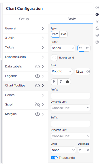 Shows or hides the tooltip.
Choose `Hover` or `Click`. On cross-filter charts, Click is used for filtering, so Hover keeps both behaviors available.
Choose `Item` (hovered point only) or `Axis` (all series at that axis position).
Sets how tooltip entries are sorted. Choose `Series` to match the legend, or sort by value ascending or descending.
Sets the tooltip background color.
Sets font family, size, weight, style, and color for tooltip text.
Adds text before or after tooltip values.
Appends a measurement suffix based on another data field.
Controls numeric formatting in tooltips. Set `Units`, configure `Decimals`, and toggle `Thousands` separators.
## Colors
Sets the color of data series in the `Style` tab. Managed palettes live in Settings. See [Color tools](/products/building-bi/reference/color-tools) for full detail.
| Mode | Effect |
| ------------ | ----------------------------------------------------------------------------------- |
| Color Scheme | Apply a named palette across the series. |
| Single Color | One color for the whole chart. |
| Gradient | Shade values from a low color through to a high color (optionally with a midpoint). |
| Value Ranges | Assign colors to value bands (for example, green below 70, red above). |
| Per-Series | Override the color of an individual series. |
| Conditional | Color cells or points by a rule. |
Number and Gauge widgets can also color the value by whether it is under, equal to, or over its target.
## Line styles and markers
For Line and Combo charts. `Line Styles` sets line thickness and dash style. Choose `Default Line Style` for uniform lines, or expand `Custom Line Styles` to configure each series. Select the edit icon next to a series to customize it.
`Markers` adds dots or symbols at each data point. Set `Type` (Circle, Square, Triangle, Diamond), `Size` in pixels, and toggle `Show all markers` to display markers at every point or only at key intervals.
## Confidence bands
For Line charts. A confidence band is a shaded range drawn around a series to show uncertainty (for example, a 95% interval). Each band is configured with:
| Field | Effect |
| ------------------------ | ----------------------------------------------------------------------------------------------------------- |
| Confidence band of | The existing series the band attaches to. |
| Name | A label for the band, shown in the legend. Must be unique on the widget. |
| Lower and Upper Boundary | The fields (with an aggregate function) that set the bottom and top of the band. Each must return a number. |
| Show on legend | Whether the band appears in the legend. |
| Color | The band's fill color. |
You can add several bands, including more than one on the same series. Two bands cannot use the same series and the same boundary fields.
## Mark areas
Shaded background zones that highlight a range — a peak window, an acceptable operating band, or a fault threshold. Each area is set with the axis to draw on (X or Y), a lower and upper boundary, a color, and an optional name (with its own position and font).
Mark areas can use dynamic column values or static boundaries. Additional options control fill color, opacity, and label placement. Add as many as needed. Available on Bar, Line, Combo, Scatter, and Boxplot charts.
## Reference lines
Static horizontal or vertical lines for marking a setpoint or threshold. Reference lines can use dynamic column values or fixed positions. Style options include line color, thickness, and label formatting. Add one or more per chart. Available on Bar, Line, Combo, Scatter, and Boxplot charts.
## Data bars
For tables. In-cell horizontal bars that show each numeric value's magnitude. On a Pivot table, bars appear only on the lowest level of the hierarchy, not on sub-totals or totals.
| Option | Choices or values | Effect |
| -------------------------- | ----------------------------- | --------------------------------------------------------------- |
| Apply to | One column or several columns | Which numeric columns get bars. |
| Display | Bar only or Bar and value | Whether the number stays visible alongside the bar. |
| Scale | Static or Dynamic | Fixed min and max, or bounds taken from the column's own range. |
| Positive or Negative color | Two colors | Separate colors for positive and negative bars. |
## Zoom and scroll
For long time-series or large datasets.
`Zoom` lets the viewer focus on part of the range. Enable it per axis. Viewers can click and drag to zoom into a region. Scroll-wheel zoom is supported on some chart types. Available on line, combo, and time-series chart types.
`Scroll` keeps the chart compact by showing a set number of items at a time with a scroll bar, per axis.
Shows or hides the tooltip.
Choose `Hover` or `Click`. On cross-filter charts, Click is used for filtering, so Hover keeps both behaviors available.
Choose `Item` (hovered point only) or `Axis` (all series at that axis position).
Sets how tooltip entries are sorted. Choose `Series` to match the legend, or sort by value ascending or descending.
Sets the tooltip background color.
Sets font family, size, weight, style, and color for tooltip text.
Adds text before or after tooltip values.
Appends a measurement suffix based on another data field.
Controls numeric formatting in tooltips. Set `Units`, configure `Decimals`, and toggle `Thousands` separators.
## Colors
Sets the color of data series in the `Style` tab. Managed palettes live in Settings. See [Color tools](/products/building-bi/reference/color-tools) for full detail.
| Mode | Effect |
| ------------ | ----------------------------------------------------------------------------------- |
| Color Scheme | Apply a named palette across the series. |
| Single Color | One color for the whole chart. |
| Gradient | Shade values from a low color through to a high color (optionally with a midpoint). |
| Value Ranges | Assign colors to value bands (for example, green below 70, red above). |
| Per-Series | Override the color of an individual series. |
| Conditional | Color cells or points by a rule. |
Number and Gauge widgets can also color the value by whether it is under, equal to, or over its target.
## Line styles and markers
For Line and Combo charts. `Line Styles` sets line thickness and dash style. Choose `Default Line Style` for uniform lines, or expand `Custom Line Styles` to configure each series. Select the edit icon next to a series to customize it.
`Markers` adds dots or symbols at each data point. Set `Type` (Circle, Square, Triangle, Diamond), `Size` in pixels, and toggle `Show all markers` to display markers at every point or only at key intervals.
## Confidence bands
For Line charts. A confidence band is a shaded range drawn around a series to show uncertainty (for example, a 95% interval). Each band is configured with:
| Field | Effect |
| ------------------------ | ----------------------------------------------------------------------------------------------------------- |
| Confidence band of | The existing series the band attaches to. |
| Name | A label for the band, shown in the legend. Must be unique on the widget. |
| Lower and Upper Boundary | The fields (with an aggregate function) that set the bottom and top of the band. Each must return a number. |
| Show on legend | Whether the band appears in the legend. |
| Color | The band's fill color. |
You can add several bands, including more than one on the same series. Two bands cannot use the same series and the same boundary fields.
## Mark areas
Shaded background zones that highlight a range — a peak window, an acceptable operating band, or a fault threshold. Each area is set with the axis to draw on (X or Y), a lower and upper boundary, a color, and an optional name (with its own position and font).
Mark areas can use dynamic column values or static boundaries. Additional options control fill color, opacity, and label placement. Add as many as needed. Available on Bar, Line, Combo, Scatter, and Boxplot charts.
## Reference lines
Static horizontal or vertical lines for marking a setpoint or threshold. Reference lines can use dynamic column values or fixed positions. Style options include line color, thickness, and label formatting. Add one or more per chart. Available on Bar, Line, Combo, Scatter, and Boxplot charts.
## Data bars
For tables. In-cell horizontal bars that show each numeric value's magnitude. On a Pivot table, bars appear only on the lowest level of the hierarchy, not on sub-totals or totals.
| Option | Choices or values | Effect |
| -------------------------- | ----------------------------- | --------------------------------------------------------------- |
| Apply to | One column or several columns | Which numeric columns get bars. |
| Display | Bar only or Bar and value | Whether the number stays visible alongside the bar. |
| Scale | Static or Dynamic | Fixed min and max, or bounds taken from the column's own range. |
| Positive or Negative color | Two colors | Separate colors for positive and negative bars. |
## Zoom and scroll
For long time-series or large datasets.
`Zoom` lets the viewer focus on part of the range. Enable it per axis. Viewers can click and drag to zoom into a region. Scroll-wheel zoom is supported on some chart types. Available on line, combo, and time-series chart types.
`Scroll` keeps the chart compact by showing a set number of items at a time with a scroll bar, per axis.
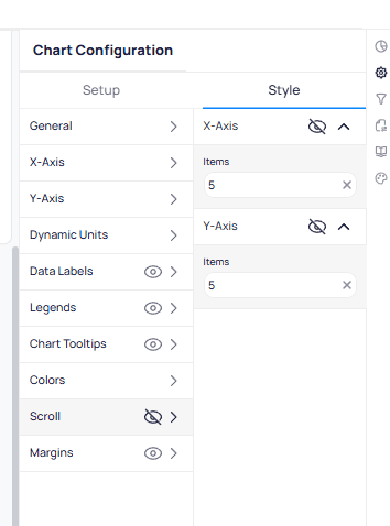 Sets how many data points are visible on the X-Axis at once. Remaining points are accessible by scrolling. For example, `5` shows five items at a time.
Sets how many data points are visible on the Y-Axis at once. Works the same as X-Axis Items for vertically oriented data.
## Margins
External spacing around the plot area as a percentage of the widget size. Configure `Top`, `Right`, `Bottom`, and `Left` independently with the slider or by entering a percentage. Use margins to center the chart or stop axis labels from being clipped.
Sets how many data points are visible on the X-Axis at once. Remaining points are accessible by scrolling. For example, `5` shows five items at a time.
Sets how many data points are visible on the Y-Axis at once. Works the same as X-Axis Items for vertically oriented data.
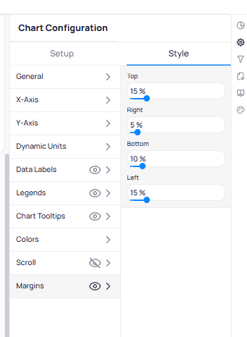
## Margins
External spacing around the plot area as a percentage of the widget size. Configure `Top`, `Right`, `Bottom`, and `Left` independently with the slider or by entering a percentage. Use margins to center the chart or stop axis labels from being clipped.
 ## Style options by chart type
Which Style sections appear depends on the chart type. `General`, `Colors`, and `Margins` are nearly universal. The table below lists the sections specific to each type.
| Chart type | Style sections it adds |
| -------------------------------------------------------------------------------------------------------------------------------- | ------------------------------------------------------------------------------------------------------------------------------------------------------------------------------- |
| [Bar](/products/building-bi/reference/chart-types#bar) (all variants) | X and Y Axis, Data Labels, Legends, Bar Configuration, Mark Areas, Reference Lines, Zoom and Scroll |
| [Line](/products/building-bi/reference/chart-types#line) (all variants) | X and Y Axis, Secondary Y-Axis, Data Labels, Legends, Line Styles and Markers, Confidence Bands, Mark Areas, Reference Lines, Zoom and Scroll |
| [Combo](/products/building-bi/reference/chart-types#combo) | X and Y Axis, Secondary Y-Axis, Bar Configuration, Line Styles and Markers (bar and line styled separately), Data Labels, Legends, Mark Areas, Reference Lines, Zoom and Scroll |
| [Scatter](/products/building-bi/reference/chart-types#scatter) | X and Y Axis, Markers, Regression Line, Legends, Mark Areas, Zoom |
| [Advanced Scatter](/products/building-bi/reference/chart-types#advanced-scatter) | X and Y Axis, Data Labels, Markers, Legends |
| [Pie](/products/building-bi/reference/chart-types#pie) | Data Labels (with label line), Legends, Donut |
| [Sunburst](/products/building-bi/reference/chart-types#sunburst) | Borders, Minimum Angle, Radius, Legends |
| [Treemap](/products/building-bi/reference/chart-types#treemap) | Borders, Drill-down, Data Labels, Legends |
| [Polar Bar](/products/building-bi/reference/chart-types#polar-bar) (both) | Dimension Axis, Metric Axis, Polar Properties (center size, Radial or Polar), Data Labels, Legends, Zoom |
| [Boxplot](/products/building-bi/reference/chart-types#boxplot) (both) | X and Y Axis, Mark Areas, Reference Lines, Zoom and Scroll |
| [Tree](/products/building-bi/reference/chart-types#tree) | Orientation and Layout, X and Y Axis, Data Labels, Legends, Zoom and Scroll |
| [Sankey](/products/building-bi/reference/chart-types#sankey) | Levels (per-band node and link colors), Data Labels, Legends, Zoom and Scroll |
| [Gauge](/products/building-bi/reference/chart-types#gauge) | Value, Target, Scale (min-max), Data Labels |
| [Card](/products/building-bi/reference/chart-types#card) and [Number](/products/building-bi/reference/chart-types#number-period) | Value, Description (Number with Target adds a Target value; Number with Period adds a Change indicator) |
| [Multi-row Card](/products/building-bi/reference/chart-types#multi-row-card) | Card layout, Labels |
| [Table](/products/building-bi/reference/chart-types#table-raw) (Raw, Aggregated, or Pivot) | Table Appearance, Data Bars |
| [Building Date Time](/products/building-bi/reference/chart-types#building-date-time) | Date, Time, Timezone |
| [Weather](/products/building-bi/reference/chart-types#weather) | Weather details (current, daily forecast, hourly) |
| [Text](/products/building-bi/reference/chart-types#text) | Rich-text editing on the widget itself |
| [Slicer](/products/building-bi/reference/chart-types#slicer) | Display options — see [Slicer widget](/products/building-bi/reference/slicer-widget) |
## Chart-type-specific sections
Options that appear only on the chart types named.
| Section | Chart type | Effect |
| ------------------------- | --------------------------------------------------------------------------------------------------------------------------------------------------------------------------------------------------------------------------------------------------------------------------- | ---------------------------------------------------------------------------------------------------------------------------------------------------------------------------------------------- |
| Donut | [Pie](/products/building-bi/reference/chart-types#pie) | Turns the pie into a donut; sets the inner and outer radius and the ring border. |
| Borders | [Pie](/products/building-bi/reference/chart-types#pie), [Sunburst](/products/building-bi/reference/chart-types#sunburst), [Treemap](/products/building-bi/reference/chart-types#treemap) | Border color, width, and corner radius around each slice or rectangle. |
| Minimum Angle | [Sunburst](/products/building-bi/reference/chart-types#sunburst) | The smallest slice angle, so thin slices stay visible. |
| Radius | [Sunburst](/products/building-bi/reference/chart-types#sunburst) | The size of the rings. |
| Drill-down | [Treemap](/products/building-bi/reference/chart-types#treemap) | Controls the click-to-expand behavior. |
| Polar Properties | [Polar Bar](/products/building-bi/reference/chart-types#polar-bar) | The center hole size and whether bars are drawn `Radial` or `Polar`. |
| Dimension and Metric Axis | [Polar Bar](/products/building-bi/reference/chart-types#polar-bar) | The polar equivalents of the X and Y axes (title, labels, format, range). |
| Regression Line | [Scatter](/products/building-bi/reference/chart-types#scatter) | Adds a trend line (linear), with its own line style, weight, color, name, and an option to show it in the legend. |
| Value | [Card](/products/building-bi/reference/chart-types#card), [Number](/products/building-bi/reference/chart-types#number-period), [Gauge](/products/building-bi/reference/chart-types#gauge), [Advanced Scatter](/products/building-bi/reference/chart-types#advanced-scatter) | The displayed number: font, color, number format, and a prefix or suffix such as kWh. |
| Target | [Gauge](/products/building-bi/reference/chart-types#gauge), [Number with Target](/products/building-bi/reference/chart-types#number-target) | The target value's label and formatting; Gauge also sets the scale's minimum, maximum, and target. |
| Change indicator | [Number with Period](/products/building-bi/reference/chart-types#number-period) | The period-over-period change, shown as a percentage with an up/down arrow and separate colors for positive and negative. |
| Description | [Card](/products/building-bi/reference/chart-types#card), [Number](/products/building-bi/reference/chart-types#number-period) | A caption beneath the value. |
| Card layout and Labels | [Multi-row Card](/products/building-bi/reference/chart-types#multi-row-card) | Card orientation, spacing, borders, and label formatting. |
| Table Appearance | [Tables](/products/building-bi/reference/chart-types#table-raw) | Header, row, sub-total, and total formatting (font, color, height, word wrap); pagination; borders; and per-column formatting (number or date format, background and font colors, hyperlinks). |
| Levels | [Sankey](/products/building-bi/reference/chart-types#sankey) | Per-band node and link colors, and band labels. |
| Orientation and Layout | [Tree](/products/building-bi/reference/chart-types#tree) | The branch direction and whether the tree is drawn as an orthogonal or radial layout. |
| Date, Time, and Timezone | [Building Date Time](/products/building-bi/reference/chart-types#building-date-time) | Date format and length, 12- or 24-hour time and precision, the timezone label, and alignment. |
| Weather details | [Weather](/products/building-bi/reference/chart-types#weather) | Whether to show current conditions, building name/address, a daily forecast (and how many days), and the hourly chart, plus its colors. |
### Combo chart sections
Combo charts combine bar and line series and expose the most style sections of any chart type:
* **Secondary Y-Axis** — configures the right-side axis used by line series. Same options as Y-Axis (title, values, grid lines).
* **Bar Configuration** — controls bar thickness and spacing between bars.
* **Bar Data Labels** — value labels on bar elements. Same options as Data Labels, scoped to bars only.
* **Line Data Labels** — value labels on line elements. Same options as Data Labels, scoped to lines only.
* **Bar Colors** — colors for bar series. Uses the `Type` dropdown (Color Scheme, Color Palette, Color Series, Range, Gradient).
* **Line Styles** — line appearance. Choose `Default Line Style` or expand `Custom Line Styles` per series.
* **Line Colors** — colors for line series using the `Type` dropdown. When set to `Color Series`, each line series shows its assigned color and label.
* **Markers** — data point markers on line series. Set `Type`, `Size`, and `Show all markers`.
### Weather widget sections
The weather widget has a `General` section and a `Weather` section:
* **Compact View** — toggles a condensed layout.
* **Current Weather** — toggle `Show Building Name`, `Show Building Address`, and `Current Weather Details`.
* **Daily Forecast** — show or hide the multi-day forecast. Set `Forecasted Days` (2 through 7) with the slider.
* **Hourly Chart** — show or hide the hourly temperature chart. Set `Chart Fill Color` and `Chart Line Color`.
* **Colors** — set `Labels Color` and `Values Color` for weather text.
### Table widget sections
Table widgets (Table Raw, Table Aggregated, Table Pivot) use a different Style tab structure:
* **General** — includes `Dynamic Column Width`, `Disable Tooltips`, and `Show Row Info in Tooltip` in addition to standard general settings.
* **Batch Apply Actions** — apply style changes across all columns at once.
* **Order Columns** — reorder columns by dragging.
* **Table Properties** — overall table behavior and layout.
* **Data Bars** — inline bar visualizations within table cells.
* **Headers** — header row styling. Set `Height`, `Word wrap`, `Font`, `Alignment`, and `Background`.
* **Rows** — data row styling. Set `Height`, `Word wrap`, `Font`, and `Alignment` independently from headers.
* **Total** — totals row at the bottom. Set `Label`, `Height`, `Word wrap`, `Font`, and `Background`.
* **Pagination** — page navigation for large datasets. Set `Custom colors` for label, page size, and total label colors.
* **Borders** — set `Borders type`, `Width`, and border `Color`.
#### Column-level styling
Each column appears in the left panel. Select a column to open its style panel:
Sets column `Width` in pixels. A value of `0` uses auto-width.
Sets `Borders type`, `Width`, and border `Color` for that column.
Overrides header style for this column. Set `Alignment`, `Font`, and `Background` color.
Overrides row style for this column. Set `Alignment` and `Font` independently from the header.
Adds text before each cell value.
Selects a unit from the `Choose Unit` dropdown to apply unit conversion to the prefix.
Adds text after each cell value (for example, degrees C).
Sets the display text for cells with no data (for example, a dash).
Configures numeric display. Set `Units` (Adaptive, None, or a specific unit), `Decimals`, and toggle `Thousands`.
Sets `Type` to `Static` for a fixed color or `Dynamic` for conditional coloring. Select the `Color` when using Static.
Sets `Type` to `Static` or `Dynamic`. Use Dynamic for conditional background colors based on value ranges.
Configures this column in the totals row. Set `Aggregate Function` (Sum, Average, Min, Max, Count). Configure `Font Color` and `Background Color` with Static or Dynamic types.
Applies a URL from `Apply URL` to make cell values clickable links. URLs must be configured in the data source.
Applies an action from `Apply Actions` to enable interactive behaviors on cell click.
## Bulk and reusable styling
Default styles, bulk styling, and copy/paste apply appearance across many widgets without redoing each option. These workflows live in [Widget customization](/products/building-bi/widget-customization#default-styles).
* **Default styles** — save a page-level look and apply it on demand. Changing the default does not alter existing widgets until you re-apply it. See [Default styles vs global styles](/products/building-bi/widget-customization#default-styles).
* **Copy and Paste Style** — replicate the appearance of one widget onto others, including `Paste Styles on Selected`.
* **Bulk selection** — select widgets of a single type to edit general and chart-specific options. A mixed selection limits you to general options. See [Keyboard shortcuts and bulk selection](/products/building-bi/reference/keyboard-shortcuts).
## See also
* The data side of a chart: [Chart setup parameters](/products/building-bi/reference/chart-setup-parameters)
* Color options in depth: [Color tools](/products/building-bi/reference/color-tools)
* Available chart types: [Chart types](/products/building-bi/reference/chart-types)
* The principles behind good styling: [Dashboard styling principles](/products/building-bi/widget-customization#styling-best-practices)
* Task guide: [Widget customization](/products/building-bi/widget-customization)
## Next steps
Apply default styles, bulk styling, and copy/paste workflows.
Configure series colors, gradients, ranges, and palettes.
## Related reading
Style widgets, apply defaults, manage palettes, and add graphics.
Match chart types to the question you need to answer.
Look up Setup requirements for every widget type.
Configure series colors, gradients, and palettes.
## Style options by chart type
Which Style sections appear depends on the chart type. `General`, `Colors`, and `Margins` are nearly universal. The table below lists the sections specific to each type.
| Chart type | Style sections it adds |
| -------------------------------------------------------------------------------------------------------------------------------- | ------------------------------------------------------------------------------------------------------------------------------------------------------------------------------- |
| [Bar](/products/building-bi/reference/chart-types#bar) (all variants) | X and Y Axis, Data Labels, Legends, Bar Configuration, Mark Areas, Reference Lines, Zoom and Scroll |
| [Line](/products/building-bi/reference/chart-types#line) (all variants) | X and Y Axis, Secondary Y-Axis, Data Labels, Legends, Line Styles and Markers, Confidence Bands, Mark Areas, Reference Lines, Zoom and Scroll |
| [Combo](/products/building-bi/reference/chart-types#combo) | X and Y Axis, Secondary Y-Axis, Bar Configuration, Line Styles and Markers (bar and line styled separately), Data Labels, Legends, Mark Areas, Reference Lines, Zoom and Scroll |
| [Scatter](/products/building-bi/reference/chart-types#scatter) | X and Y Axis, Markers, Regression Line, Legends, Mark Areas, Zoom |
| [Advanced Scatter](/products/building-bi/reference/chart-types#advanced-scatter) | X and Y Axis, Data Labels, Markers, Legends |
| [Pie](/products/building-bi/reference/chart-types#pie) | Data Labels (with label line), Legends, Donut |
| [Sunburst](/products/building-bi/reference/chart-types#sunburst) | Borders, Minimum Angle, Radius, Legends |
| [Treemap](/products/building-bi/reference/chart-types#treemap) | Borders, Drill-down, Data Labels, Legends |
| [Polar Bar](/products/building-bi/reference/chart-types#polar-bar) (both) | Dimension Axis, Metric Axis, Polar Properties (center size, Radial or Polar), Data Labels, Legends, Zoom |
| [Boxplot](/products/building-bi/reference/chart-types#boxplot) (both) | X and Y Axis, Mark Areas, Reference Lines, Zoom and Scroll |
| [Tree](/products/building-bi/reference/chart-types#tree) | Orientation and Layout, X and Y Axis, Data Labels, Legends, Zoom and Scroll |
| [Sankey](/products/building-bi/reference/chart-types#sankey) | Levels (per-band node and link colors), Data Labels, Legends, Zoom and Scroll |
| [Gauge](/products/building-bi/reference/chart-types#gauge) | Value, Target, Scale (min-max), Data Labels |
| [Card](/products/building-bi/reference/chart-types#card) and [Number](/products/building-bi/reference/chart-types#number-period) | Value, Description (Number with Target adds a Target value; Number with Period adds a Change indicator) |
| [Multi-row Card](/products/building-bi/reference/chart-types#multi-row-card) | Card layout, Labels |
| [Table](/products/building-bi/reference/chart-types#table-raw) (Raw, Aggregated, or Pivot) | Table Appearance, Data Bars |
| [Building Date Time](/products/building-bi/reference/chart-types#building-date-time) | Date, Time, Timezone |
| [Weather](/products/building-bi/reference/chart-types#weather) | Weather details (current, daily forecast, hourly) |
| [Text](/products/building-bi/reference/chart-types#text) | Rich-text editing on the widget itself |
| [Slicer](/products/building-bi/reference/chart-types#slicer) | Display options — see [Slicer widget](/products/building-bi/reference/slicer-widget) |
## Chart-type-specific sections
Options that appear only on the chart types named.
| Section | Chart type | Effect |
| ------------------------- | --------------------------------------------------------------------------------------------------------------------------------------------------------------------------------------------------------------------------------------------------------------------------- | ---------------------------------------------------------------------------------------------------------------------------------------------------------------------------------------------- |
| Donut | [Pie](/products/building-bi/reference/chart-types#pie) | Turns the pie into a donut; sets the inner and outer radius and the ring border. |
| Borders | [Pie](/products/building-bi/reference/chart-types#pie), [Sunburst](/products/building-bi/reference/chart-types#sunburst), [Treemap](/products/building-bi/reference/chart-types#treemap) | Border color, width, and corner radius around each slice or rectangle. |
| Minimum Angle | [Sunburst](/products/building-bi/reference/chart-types#sunburst) | The smallest slice angle, so thin slices stay visible. |
| Radius | [Sunburst](/products/building-bi/reference/chart-types#sunburst) | The size of the rings. |
| Drill-down | [Treemap](/products/building-bi/reference/chart-types#treemap) | Controls the click-to-expand behavior. |
| Polar Properties | [Polar Bar](/products/building-bi/reference/chart-types#polar-bar) | The center hole size and whether bars are drawn `Radial` or `Polar`. |
| Dimension and Metric Axis | [Polar Bar](/products/building-bi/reference/chart-types#polar-bar) | The polar equivalents of the X and Y axes (title, labels, format, range). |
| Regression Line | [Scatter](/products/building-bi/reference/chart-types#scatter) | Adds a trend line (linear), with its own line style, weight, color, name, and an option to show it in the legend. |
| Value | [Card](/products/building-bi/reference/chart-types#card), [Number](/products/building-bi/reference/chart-types#number-period), [Gauge](/products/building-bi/reference/chart-types#gauge), [Advanced Scatter](/products/building-bi/reference/chart-types#advanced-scatter) | The displayed number: font, color, number format, and a prefix or suffix such as kWh. |
| Target | [Gauge](/products/building-bi/reference/chart-types#gauge), [Number with Target](/products/building-bi/reference/chart-types#number-target) | The target value's label and formatting; Gauge also sets the scale's minimum, maximum, and target. |
| Change indicator | [Number with Period](/products/building-bi/reference/chart-types#number-period) | The period-over-period change, shown as a percentage with an up/down arrow and separate colors for positive and negative. |
| Description | [Card](/products/building-bi/reference/chart-types#card), [Number](/products/building-bi/reference/chart-types#number-period) | A caption beneath the value. |
| Card layout and Labels | [Multi-row Card](/products/building-bi/reference/chart-types#multi-row-card) | Card orientation, spacing, borders, and label formatting. |
| Table Appearance | [Tables](/products/building-bi/reference/chart-types#table-raw) | Header, row, sub-total, and total formatting (font, color, height, word wrap); pagination; borders; and per-column formatting (number or date format, background and font colors, hyperlinks). |
| Levels | [Sankey](/products/building-bi/reference/chart-types#sankey) | Per-band node and link colors, and band labels. |
| Orientation and Layout | [Tree](/products/building-bi/reference/chart-types#tree) | The branch direction and whether the tree is drawn as an orthogonal or radial layout. |
| Date, Time, and Timezone | [Building Date Time](/products/building-bi/reference/chart-types#building-date-time) | Date format and length, 12- or 24-hour time and precision, the timezone label, and alignment. |
| Weather details | [Weather](/products/building-bi/reference/chart-types#weather) | Whether to show current conditions, building name/address, a daily forecast (and how many days), and the hourly chart, plus its colors. |
### Combo chart sections
Combo charts combine bar and line series and expose the most style sections of any chart type:
* **Secondary Y-Axis** — configures the right-side axis used by line series. Same options as Y-Axis (title, values, grid lines).
* **Bar Configuration** — controls bar thickness and spacing between bars.
* **Bar Data Labels** — value labels on bar elements. Same options as Data Labels, scoped to bars only.
* **Line Data Labels** — value labels on line elements. Same options as Data Labels, scoped to lines only.
* **Bar Colors** — colors for bar series. Uses the `Type` dropdown (Color Scheme, Color Palette, Color Series, Range, Gradient).
* **Line Styles** — line appearance. Choose `Default Line Style` or expand `Custom Line Styles` per series.
* **Line Colors** — colors for line series using the `Type` dropdown. When set to `Color Series`, each line series shows its assigned color and label.
* **Markers** — data point markers on line series. Set `Type`, `Size`, and `Show all markers`.
### Weather widget sections
The weather widget has a `General` section and a `Weather` section:
* **Compact View** — toggles a condensed layout.
* **Current Weather** — toggle `Show Building Name`, `Show Building Address`, and `Current Weather Details`.
* **Daily Forecast** — show or hide the multi-day forecast. Set `Forecasted Days` (2 through 7) with the slider.
* **Hourly Chart** — show or hide the hourly temperature chart. Set `Chart Fill Color` and `Chart Line Color`.
* **Colors** — set `Labels Color` and `Values Color` for weather text.
### Table widget sections
Table widgets (Table Raw, Table Aggregated, Table Pivot) use a different Style tab structure:
* **General** — includes `Dynamic Column Width`, `Disable Tooltips`, and `Show Row Info in Tooltip` in addition to standard general settings.
* **Batch Apply Actions** — apply style changes across all columns at once.
* **Order Columns** — reorder columns by dragging.
* **Table Properties** — overall table behavior and layout.
* **Data Bars** — inline bar visualizations within table cells.
* **Headers** — header row styling. Set `Height`, `Word wrap`, `Font`, `Alignment`, and `Background`.
* **Rows** — data row styling. Set `Height`, `Word wrap`, `Font`, and `Alignment` independently from headers.
* **Total** — totals row at the bottom. Set `Label`, `Height`, `Word wrap`, `Font`, and `Background`.
* **Pagination** — page navigation for large datasets. Set `Custom colors` for label, page size, and total label colors.
* **Borders** — set `Borders type`, `Width`, and border `Color`.
#### Column-level styling
Each column appears in the left panel. Select a column to open its style panel:
Sets column `Width` in pixels. A value of `0` uses auto-width.
Sets `Borders type`, `Width`, and border `Color` for that column.
Overrides header style for this column. Set `Alignment`, `Font`, and `Background` color.
Overrides row style for this column. Set `Alignment` and `Font` independently from the header.
Adds text before each cell value.
Selects a unit from the `Choose Unit` dropdown to apply unit conversion to the prefix.
Adds text after each cell value (for example, degrees C).
Sets the display text for cells with no data (for example, a dash).
Configures numeric display. Set `Units` (Adaptive, None, or a specific unit), `Decimals`, and toggle `Thousands`.
Sets `Type` to `Static` for a fixed color or `Dynamic` for conditional coloring. Select the `Color` when using Static.
Sets `Type` to `Static` or `Dynamic`. Use Dynamic for conditional background colors based on value ranges.
Configures this column in the totals row. Set `Aggregate Function` (Sum, Average, Min, Max, Count). Configure `Font Color` and `Background Color` with Static or Dynamic types.
Applies a URL from `Apply URL` to make cell values clickable links. URLs must be configured in the data source.
Applies an action from `Apply Actions` to enable interactive behaviors on cell click.
## Bulk and reusable styling
Default styles, bulk styling, and copy/paste apply appearance across many widgets without redoing each option. These workflows live in [Widget customization](/products/building-bi/widget-customization#default-styles).
* **Default styles** — save a page-level look and apply it on demand. Changing the default does not alter existing widgets until you re-apply it. See [Default styles vs global styles](/products/building-bi/widget-customization#default-styles).
* **Copy and Paste Style** — replicate the appearance of one widget onto others, including `Paste Styles on Selected`.
* **Bulk selection** — select widgets of a single type to edit general and chart-specific options. A mixed selection limits you to general options. See [Keyboard shortcuts and bulk selection](/products/building-bi/reference/keyboard-shortcuts).
## See also
* The data side of a chart: [Chart setup parameters](/products/building-bi/reference/chart-setup-parameters)
* Color options in depth: [Color tools](/products/building-bi/reference/color-tools)
* Available chart types: [Chart types](/products/building-bi/reference/chart-types)
* The principles behind good styling: [Dashboard styling principles](/products/building-bi/widget-customization#styling-best-practices)
* Task guide: [Widget customization](/products/building-bi/widget-customization)
## Next steps
Apply default styles, bulk styling, and copy/paste workflows.
Configure series colors, gradients, ranges, and palettes.
## Related reading
Style widgets, apply defaults, manage palettes, and add graphics.
Match chart types to the question you need to answer.
Look up Setup requirements for every widget type.
Configure series colors, gradients, and palettes.