> ## Documentation Index
> Fetch the complete documentation index at: https://documentation.kodelabs.com/llms.txt
> Use this file to discover all available pages before exploring further.
# Dashboards
> Create, edit, share, and manage Building BI dashboards with interactive charts, widgets, and customizable layouts.
Building BI dashboards let you visualize building data through interactive charts, tables, and widgets. You can create custom layouts, share dashboards with your team, and publish them for broader access.
For chart type fields and Style tab options, see [Chart types](/products/building-bi/reference/chart-types) and [Chart styling options](/products/building-bi/reference/chart-styling-options). For visualization selection guidance, see [Choosing visualizations](/products/building-bi/concepts/choosing-visualizations).
## In this guide
Create dashboards, tabs, widgets, and filters.
Jump to each widget type in the Chart types reference.
Use drafts, permissions, and version history.
Share links, export PDF files, and schedule reports.
 ## Create a dashboard
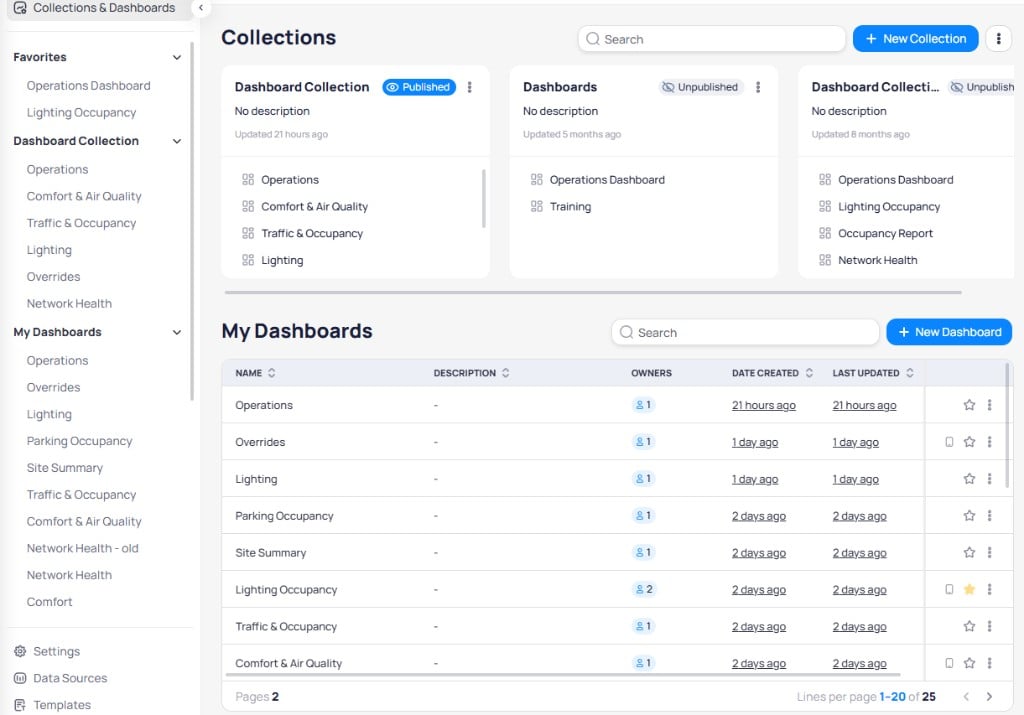
Navigate to `Building BI` > `Collections & Dashboards`.
Select `+ New Dashboard` in the `My Dashboards` section.
Enter a `Dashboard Title`, select a [`Timezone`](/products/building-bi/reference/timezone-configuration), and add an optional `Description`.
## Create a dashboard
Navigate to `Building BI` > `Collections & Dashboards`.
Select `+ New Dashboard` in the `My Dashboards` section.
Enter a `Dashboard Title`, select a [`Timezone`](/products/building-bi/reference/timezone-configuration), and add an optional `Description`.
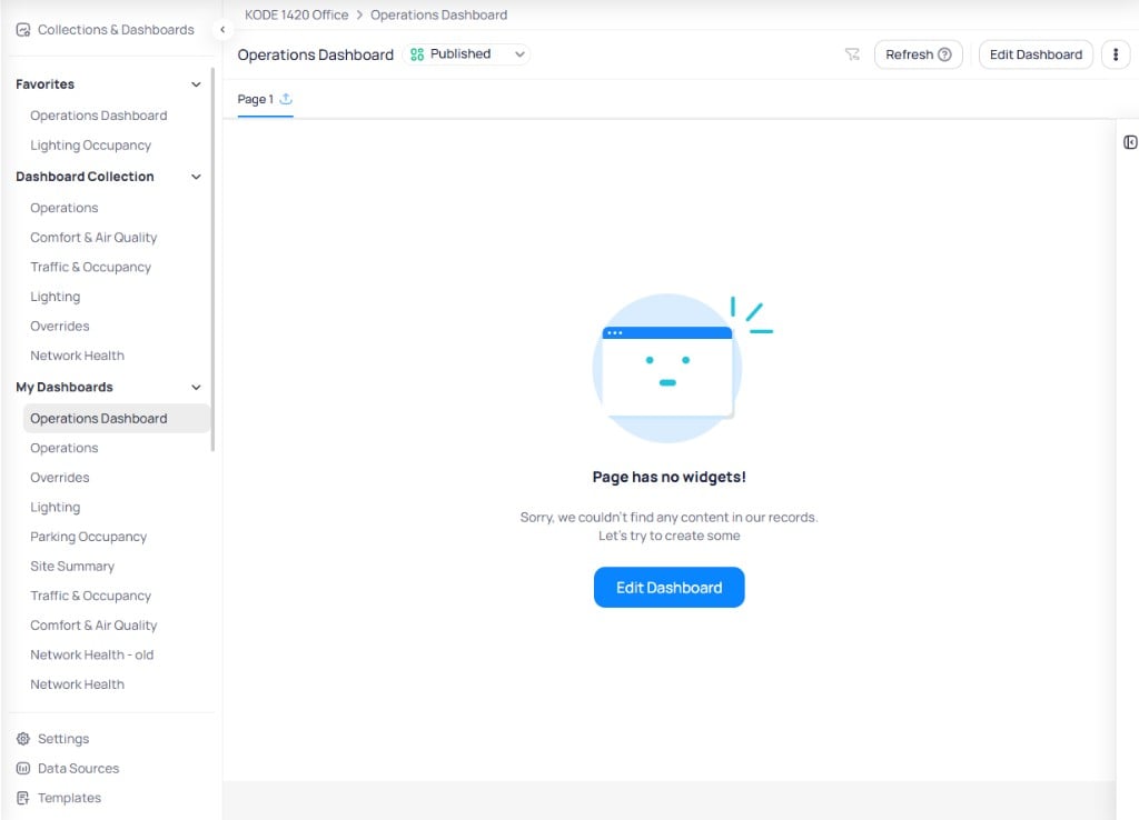
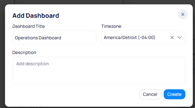 Select `Create` to save your new dashboard. Click on the dashboard you have created. The dashboard opens with an empty canvas.
 ## Collaboration
Only one person can edit a dashboard at a time. If multiple users edit simultaneously, the last save overwrites earlier changes.
Building BI provides a [draft and publish workflow](/products/building-bi/concepts/draft-mode-version-history) with two ways to save your work:
* **Save as Draft** -- keeps your changes private. Other users continue to see the previously published version.
* **Publish** -- pushes all changes live to every viewer and collaborator.
Select `Save as Draft` to save a private draft. A confirmation dialog asks you to confirm before proceeding.
## Collaboration
Only one person can edit a dashboard at a time. If multiple users edit simultaneously, the last save overwrites earlier changes.
Building BI provides a [draft and publish workflow](/products/building-bi/concepts/draft-mode-version-history) with two ways to save your work:
* **Save as Draft** -- keeps your changes private. Other users continue to see the previously published version.
* **Publish** -- pushes all changes live to every viewer and collaborator.
Select `Save as Draft` to save a private draft. A confirmation dialog asks you to confirm before proceeding.
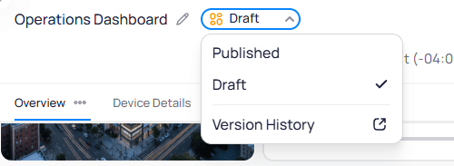
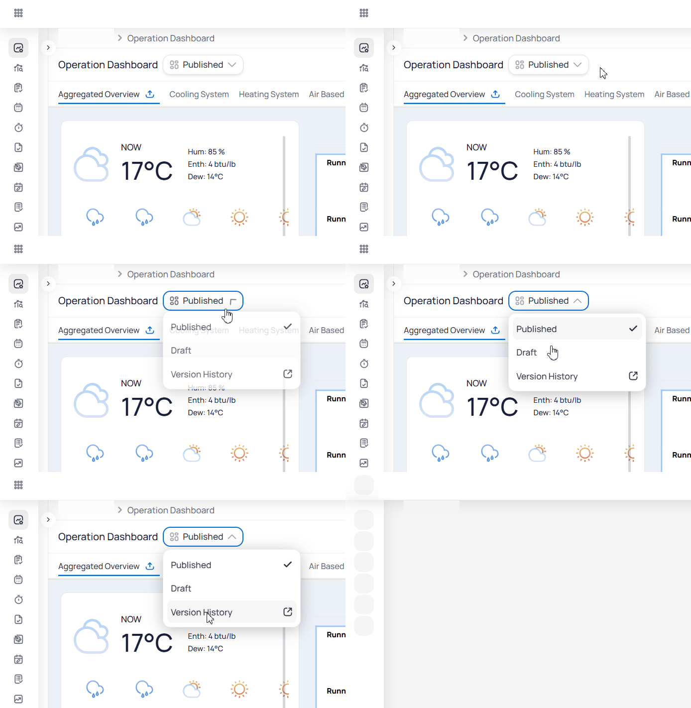
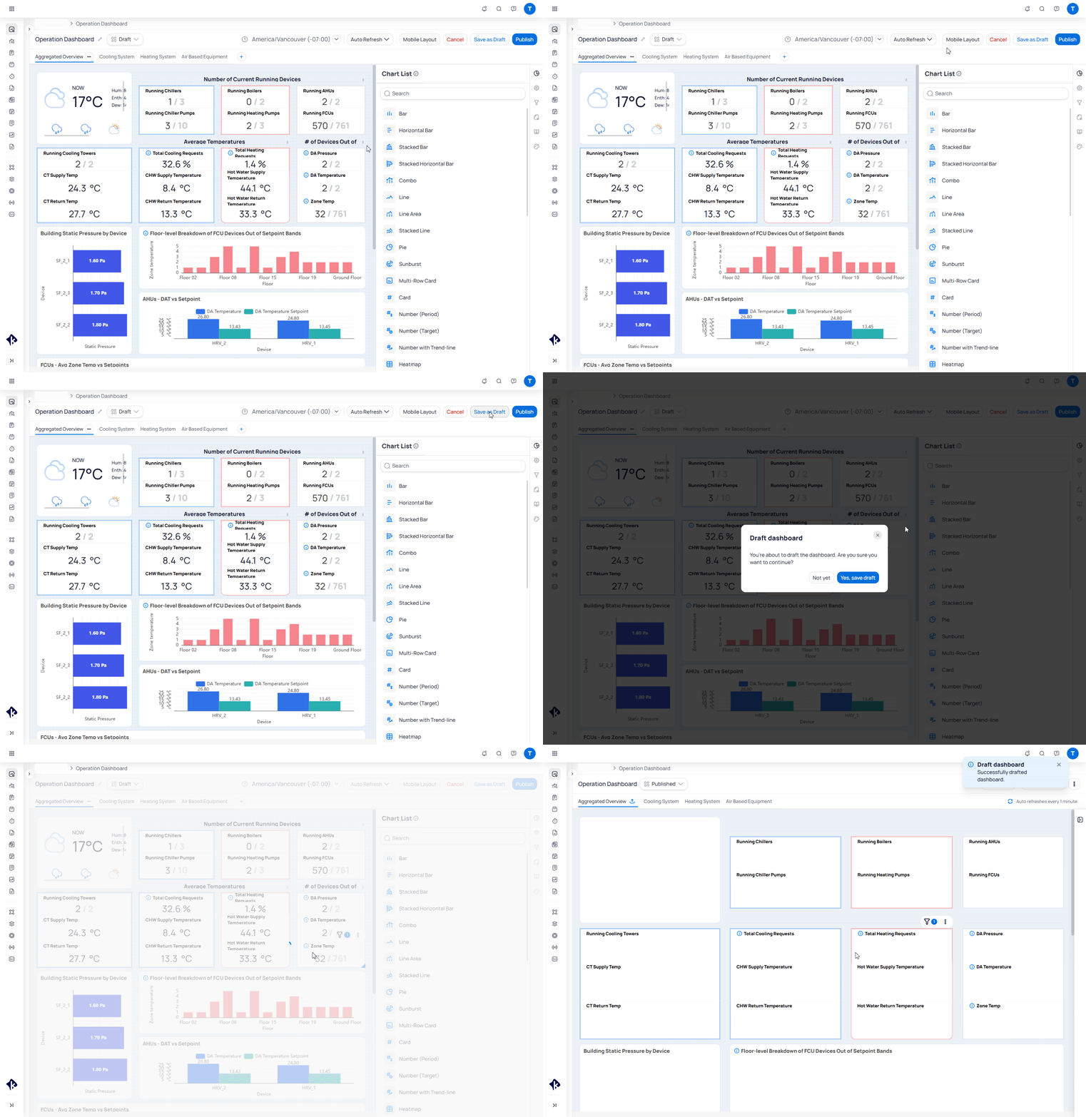 Use the status dropdown next to the dashboard name to switch between `Published` and `Draft` views, or to open `Version History`.
 Collaborators added through `Permissions` receive full edit access, including the ability to manage other users on that dashboard. They cannot remove the original owner.
If you want an external user to edit a dashboard without granting full access to the original, duplicate the dashboard first and share the copy.
## Dashboard tabs
Tabs split a dashboard into separate pages, each with its own set of widgets and data queries. Use tabs to organize analytics by topic and improve loading performance on large dashboards.
To manage tabs while in edit mode:
* **Add a tab** -- select the `+` icon next to the existing tab names. The new tab appears with an editable name field.
* **Rename a tab** -- double-click the tab name and type the new name.
* **Duplicate, delete, or save as template** -- select the three-dot menu (`...`) on the tab.
Collaborators added through `Permissions` receive full edit access, including the ability to manage other users on that dashboard. They cannot remove the original owner.
If you want an external user to edit a dashboard without granting full access to the original, duplicate the dashboard first and share the copy.
## Dashboard tabs
Tabs split a dashboard into separate pages, each with its own set of widgets and data queries. Use tabs to organize analytics by topic and improve loading performance on large dashboards.
To manage tabs while in edit mode:
* **Add a tab** -- select the `+` icon next to the existing tab names. The new tab appears with an editable name field.
* **Rename a tab** -- double-click the tab name and type the new name.
* **Duplicate, delete, or save as template** -- select the three-dot menu (`...`) on the tab.
 Split large dashboards across multiple tabs. Each tab loads its data independently, which reduces query volume and speeds up rendering.
## Add widgets and charts
Open the dashboard and select `Edit Dashboard`. The Chart List panel opens on the right side showing all available chart types.
Split large dashboards across multiple tabs. Each tab loads its data independently, which reduces query volume and speeds up rendering.
## Add widgets and charts
Open the dashboard and select `Edit Dashboard`. The Chart List panel opens on the right side showing all available chart types.
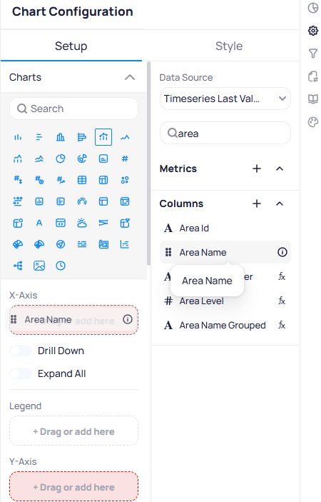
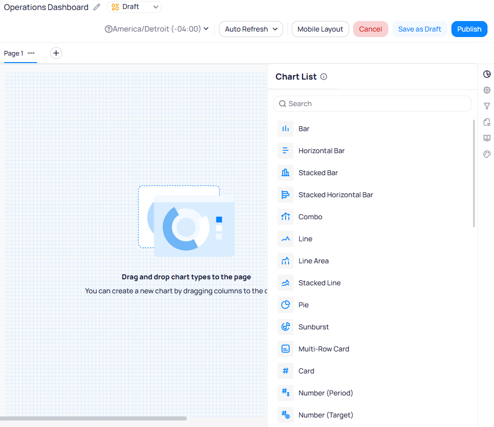 Drag a chart type from the Chart List onto the canvas. The `Chart Configuration` panel opens with `Setup` and `Style` tabs. For Setup requirements by type, see [Chart types](/products/building-bi/reference/chart-types).
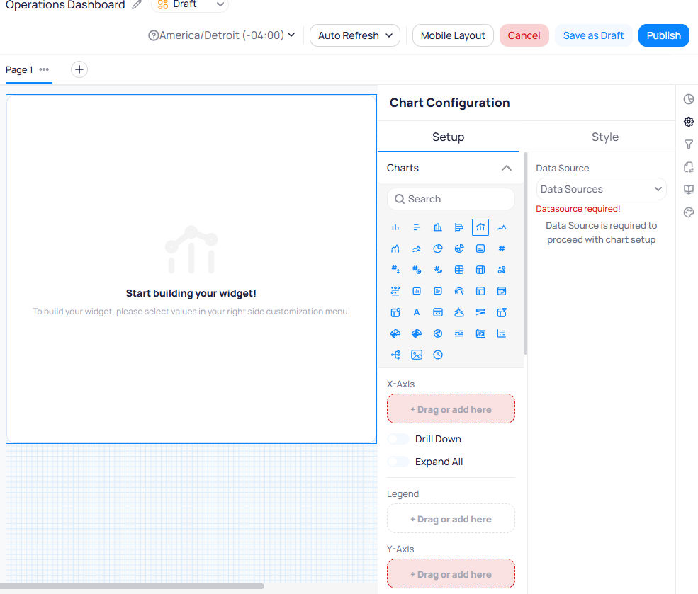
Choose a data source from the `Data Source` dropdown in the configuration panel. The panel shows a "Datasource required!" warning until you select one. Once selected, the available `Metrics` and `Columns` from that data source appear in the panel.
Drag a chart type from the Chart List onto the canvas. The `Chart Configuration` panel opens with `Setup` and `Style` tabs. For Setup requirements by type, see [Chart types](/products/building-bi/reference/chart-types).
Choose a data source from the `Data Source` dropdown in the configuration panel. The panel shows a "Datasource required!" warning until you select one. Once selected, the available `Metrics` and `Columns` from that data source appear in the panel.
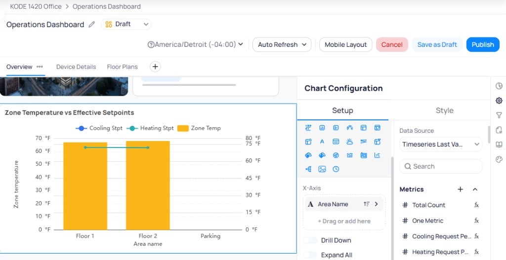 Search for columns and metrics using the search bar above the lists. Drag items into the `X-Axis`, `Y-Axis`, `Secondary Y-Axis`, and `Legend` fields to define what the chart displays.
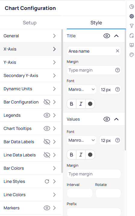
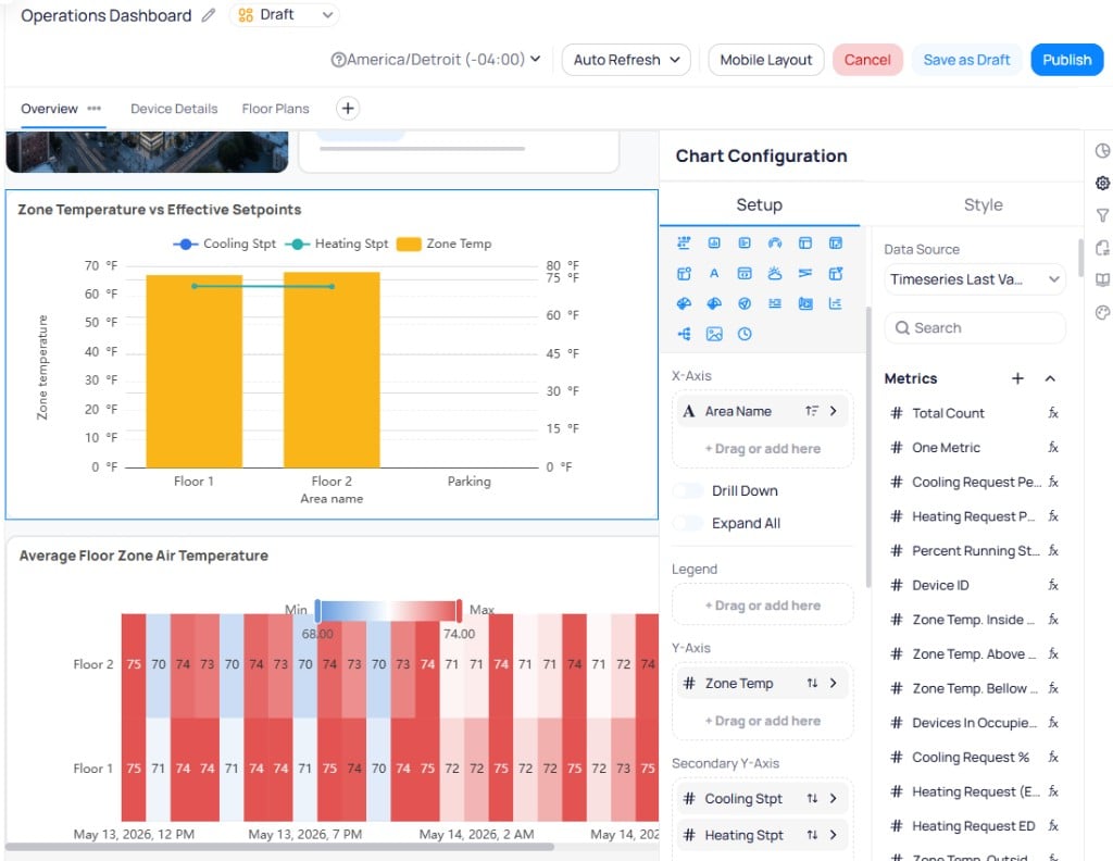 Switch to the `Style` tab to configure visual settings. Set the chart title, colors, and size. Reposition widgets on the canvas using drag-and-drop. For Style field options, see [Chart styling options](/products/building-bi/reference/chart-styling-options).
 Select `Save as Draft` to keep changes private, or `Publish` to push them live.
Use the three-dot menu on any chart to duplicate or delete it. You can also select multiple widgets at once by holding Shift and clicking each widget, then apply style changes in bulk.
## Widget setup and configuration
Each widget has two configuration tabs: `Setup` and `Style`. The options available in both tabs vary depending on the chart type you select. A [Combo](/products/building-bi/reference/chart-types#combo) chart exposes X-Axis, Y-Axis, Secondary Y-Axis, and Legend fields along with bar and line style controls, while a [Card](/products/building-bi/reference/chart-types#card) widget only requires a single metric and offers title and number formatting options. Always configure the `Setup` tab first to define your data, then switch to `Style` to adjust the visual presentation.
Hover over configuration fields to see inline tooltips that explain each setting. See [Configuration field tooltips](/products/building-bi/widget-customization#configuration-field-tooltips) for coverage across widget setup, filters, and time range controls.
### Setup tab
The `Setup` tab controls which data the widget displays and how it is structured. Available fields from your data source are split into two categories:
* **Metrics** — pre-aggregated values such as averages, sums, or counts. Click the `fx` button next to a metric name to view its underlying formula.
* **Columns** — fields pulled directly from the data source. Calculated columns also display the `fx` indicator.
You cannot edit calculated metric or calculated column formulas from the `fx` popup in the chart configuration. To modify the formula, go to the data source directly. See [Data sources](/products/building-bi/data-sources) for details.
Each field displays an icon indicating its data type:
| Icon | Data type |
| -------- | --------- |
| `#` | Number |
| `A` | String |
| Calendar | Date/time |
| Switch | Boolean |
Depending on the chart type, the `Setup` tab includes some or all of the following parameters:
The primary dimensions for your data. Define what appears on each axis of the chart.
Splits data into categories. For example, break down total energy usage by individual floors.
Restricts the data shown in the chart. Filter by time range, device name, ontology type, or any column value.
Limits the chart to the highest or lowest N values. For example, set `Top N` to `5` to show only the five highest-consuming units.
Organize the chart by a column's values. Click the double-arrow icon (`⇅`) next to any column to change its sort direction. Drag columns in the `Sort Order` section to set priority.
Controls how often the chart queries new data. Set this to the longest acceptable interval to optimize dashboard loading times.
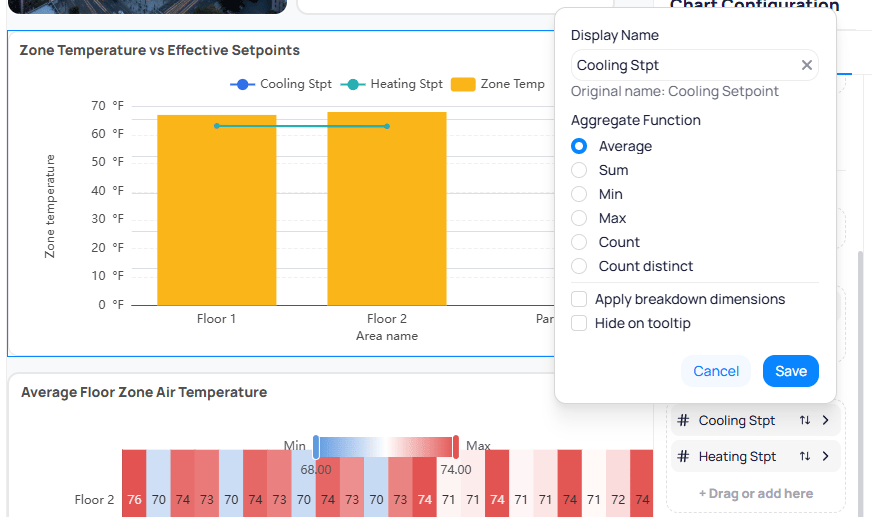
When you add a column or metric to a parameter, select the arrow (`>`) next to it to open additional options. You can rename the `Display Name`, choose an `Aggregate Function` (Average, Sum, Min, Max, Count, or Count distinct), apply breakdown dimensions, or hide the field from tooltips.
Select `Save as Draft` to keep changes private, or `Publish` to push them live.
Use the three-dot menu on any chart to duplicate or delete it. You can also select multiple widgets at once by holding Shift and clicking each widget, then apply style changes in bulk.
## Widget setup and configuration
Each widget has two configuration tabs: `Setup` and `Style`. The options available in both tabs vary depending on the chart type you select. A [Combo](/products/building-bi/reference/chart-types#combo) chart exposes X-Axis, Y-Axis, Secondary Y-Axis, and Legend fields along with bar and line style controls, while a [Card](/products/building-bi/reference/chart-types#card) widget only requires a single metric and offers title and number formatting options. Always configure the `Setup` tab first to define your data, then switch to `Style` to adjust the visual presentation.
Hover over configuration fields to see inline tooltips that explain each setting. See [Configuration field tooltips](/products/building-bi/widget-customization#configuration-field-tooltips) for coverage across widget setup, filters, and time range controls.
### Setup tab
The `Setup` tab controls which data the widget displays and how it is structured. Available fields from your data source are split into two categories:
* **Metrics** — pre-aggregated values such as averages, sums, or counts. Click the `fx` button next to a metric name to view its underlying formula.
* **Columns** — fields pulled directly from the data source. Calculated columns also display the `fx` indicator.
You cannot edit calculated metric or calculated column formulas from the `fx` popup in the chart configuration. To modify the formula, go to the data source directly. See [Data sources](/products/building-bi/data-sources) for details.
Each field displays an icon indicating its data type:
| Icon | Data type |
| -------- | --------- |
| `#` | Number |
| `A` | String |
| Calendar | Date/time |
| Switch | Boolean |
Depending on the chart type, the `Setup` tab includes some or all of the following parameters:
The primary dimensions for your data. Define what appears on each axis of the chart.
Splits data into categories. For example, break down total energy usage by individual floors.
Restricts the data shown in the chart. Filter by time range, device name, ontology type, or any column value.
Limits the chart to the highest or lowest N values. For example, set `Top N` to `5` to show only the five highest-consuming units.
Organize the chart by a column's values. Click the double-arrow icon (`⇅`) next to any column to change its sort direction. Drag columns in the `Sort Order` section to set priority.
Controls how often the chart queries new data. Set this to the longest acceptable interval to optimize dashboard loading times.
When you add a column or metric to a parameter, select the arrow (`>`) next to it to open additional options. You can rename the `Display Name`, choose an `Aggregate Function` (Average, Sum, Min, Max, Count, or Count distinct), apply breakdown dimensions, or hide the field from tooltips.
 ### Style tab
The `Style` tab controls visual presentation without changing the underlying data. The sections available depend on the chart type. For example, a combo chart includes separate sections for bar colors, line colors, line styles, and a secondary Y-axis, while a pie chart offers slice colors and label positioning instead.
Common style sections include:
* **General** -- title font, padding, background, and corner radius
* **X-Axis / Y-Axis** -- axis labels, margins, font, and rotation
* **Legends** -- position, font, and visibility
* **Chart Tooltips** -- tooltip content and formatting
* **Data Labels** -- value labels on bars, lines, or slices
* **Colors** -- bar colors, line colors, or series colors depending on chart type
* **Markers** -- data point markers on line charts
Chart-specific sections appear only when relevant. Look up every Style field and the per-type section matrix in [Chart styling options](/products/building-bi/reference/chart-styling-options). Toggle individual style features on or off using the eye icon next to each section.
### Chart types
Building BI supports more than 35 widget types. Use [Chart types](/products/building-bi/reference/chart-types) for Setup requirements per widget. Use [Choosing visualizations](/products/building-bi/concepts/choosing-visualizations) when you need selection guidance.
| Category | Chart types |
| -------------------- | ------------------------------------------------------------------------------------------------------------------------------------------------------------------------------------------------------------------------------------------------------------------------------------------------------------------------------------------------------------------------------------------------------------------------------------------------------------------------------------------------------------------------------------------------------------------------------------------------------------------------------------------------------------------------------ |
| Bar and column | [Bar](/products/building-bi/reference/chart-types#bar), [Horizontal Bar](/products/building-bi/reference/chart-types#horizontal-bar), [Stacked Bar](/products/building-bi/reference/chart-types#stacked-bar), [Horizontal Stacked Bar](/products/building-bi/reference/chart-types#horizontal-stacked-bar) |
| Line and area | [Line](/products/building-bi/reference/chart-types#line), [Line Area](/products/building-bi/reference/chart-types#line-area), [Stacked Line](/products/building-bi/reference/chart-types#stacked-line), [Time Series](/products/building-bi/reference/chart-types#time-series) |
| Combo and comparison | [Combo](/products/building-bi/reference/chart-types#combo), [Scatter](/products/building-bi/reference/chart-types#scatter), [Advanced Scatter](/products/building-bi/reference/chart-types#advanced-scatter) |
| Distribution | [Pie](/products/building-bi/reference/chart-types#pie), [Sunburst](/products/building-bi/reference/chart-types#sunburst), [Polar Bar](/products/building-bi/reference/chart-types#polar-bar), [Stacked Polar Bar](/products/building-bi/reference/chart-types#stacked-polar-bar), [Treemap](/products/building-bi/reference/chart-types#treemap) |
| Statistical | [Heatmap](/products/building-bi/reference/chart-types#heatmap), [Boxplot](/products/building-bi/reference/chart-types#boxplot), [Horizontal Boxplot](/products/building-bi/reference/chart-types#horizontal-boxplot), [Sankey](/products/building-bi/reference/chart-types#sankey) |
| Number and KPI | [Card](/products/building-bi/reference/chart-types#card), [Multi-row Card](/products/building-bi/reference/chart-types#multi-row-card), [Number (Period)](/products/building-bi/reference/chart-types#number-period), [Number (Target)](/products/building-bi/reference/chart-types#number-target), [Number with Trend-line](/products/building-bi/reference/chart-types#number-with-trend-line), [Gauge](/products/building-bi/reference/chart-types#gauge) |
| Tables | [Table Raw](/products/building-bi/reference/chart-types#table-raw), [Table Pivot](/products/building-bi/reference/chart-types#table-pivot), [Table Aggregated](/products/building-bi/reference/chart-types#table-aggregated) |
| Specialized | [Text](/products/building-bi/reference/chart-types#text), [IFrame](/products/building-bi/reference/chart-types#iframe), [Weather](/products/building-bi/reference/chart-types#weather), [Slicer](/products/building-bi/reference/chart-types#slicer), [Navigation](/products/building-bi/reference/chart-types#navigation), [Graphics](/products/building-bi/reference/chart-types#graphics), [Timeline](/products/building-bi/reference/chart-types#timeline), [Tree](/products/building-bi/reference/chart-types#tree), [Picture](/products/building-bi/reference/chart-types#picture), [Building Date Time](/products/building-bi/reference/chart-types#building-date-time) |
## Dashboard filters
Dashboard filters let you apply filter criteria across all widgets at once, instead of configuring filters on each chart individually. See [filter options](/products/building-bi/reference/filter-options) for operators and scopes.
Building BI supports two filter scopes:
* **Dashboard-level filters** — apply to every tab in the dashboard.
* **Page-level filters** — apply only to the widgets on the current tab.
To add a filter, select the filter icon in the edit mode sidebar to open the Filters panel. Configure cross-filtering, drill-through filtering, and drag columns from your data source into the `Dashboard Filters`, `Page Filters`, or `Drill Through Columns` fields.
### Style tab
The `Style` tab controls visual presentation without changing the underlying data. The sections available depend on the chart type. For example, a combo chart includes separate sections for bar colors, line colors, line styles, and a secondary Y-axis, while a pie chart offers slice colors and label positioning instead.
Common style sections include:
* **General** -- title font, padding, background, and corner radius
* **X-Axis / Y-Axis** -- axis labels, margins, font, and rotation
* **Legends** -- position, font, and visibility
* **Chart Tooltips** -- tooltip content and formatting
* **Data Labels** -- value labels on bars, lines, or slices
* **Colors** -- bar colors, line colors, or series colors depending on chart type
* **Markers** -- data point markers on line charts
Chart-specific sections appear only when relevant. Look up every Style field and the per-type section matrix in [Chart styling options](/products/building-bi/reference/chart-styling-options). Toggle individual style features on or off using the eye icon next to each section.
### Chart types
Building BI supports more than 35 widget types. Use [Chart types](/products/building-bi/reference/chart-types) for Setup requirements per widget. Use [Choosing visualizations](/products/building-bi/concepts/choosing-visualizations) when you need selection guidance.
| Category | Chart types |
| -------------------- | ------------------------------------------------------------------------------------------------------------------------------------------------------------------------------------------------------------------------------------------------------------------------------------------------------------------------------------------------------------------------------------------------------------------------------------------------------------------------------------------------------------------------------------------------------------------------------------------------------------------------------------------------------------------------------ |
| Bar and column | [Bar](/products/building-bi/reference/chart-types#bar), [Horizontal Bar](/products/building-bi/reference/chart-types#horizontal-bar), [Stacked Bar](/products/building-bi/reference/chart-types#stacked-bar), [Horizontal Stacked Bar](/products/building-bi/reference/chart-types#horizontal-stacked-bar) |
| Line and area | [Line](/products/building-bi/reference/chart-types#line), [Line Area](/products/building-bi/reference/chart-types#line-area), [Stacked Line](/products/building-bi/reference/chart-types#stacked-line), [Time Series](/products/building-bi/reference/chart-types#time-series) |
| Combo and comparison | [Combo](/products/building-bi/reference/chart-types#combo), [Scatter](/products/building-bi/reference/chart-types#scatter), [Advanced Scatter](/products/building-bi/reference/chart-types#advanced-scatter) |
| Distribution | [Pie](/products/building-bi/reference/chart-types#pie), [Sunburst](/products/building-bi/reference/chart-types#sunburst), [Polar Bar](/products/building-bi/reference/chart-types#polar-bar), [Stacked Polar Bar](/products/building-bi/reference/chart-types#stacked-polar-bar), [Treemap](/products/building-bi/reference/chart-types#treemap) |
| Statistical | [Heatmap](/products/building-bi/reference/chart-types#heatmap), [Boxplot](/products/building-bi/reference/chart-types#boxplot), [Horizontal Boxplot](/products/building-bi/reference/chart-types#horizontal-boxplot), [Sankey](/products/building-bi/reference/chart-types#sankey) |
| Number and KPI | [Card](/products/building-bi/reference/chart-types#card), [Multi-row Card](/products/building-bi/reference/chart-types#multi-row-card), [Number (Period)](/products/building-bi/reference/chart-types#number-period), [Number (Target)](/products/building-bi/reference/chart-types#number-target), [Number with Trend-line](/products/building-bi/reference/chart-types#number-with-trend-line), [Gauge](/products/building-bi/reference/chart-types#gauge) |
| Tables | [Table Raw](/products/building-bi/reference/chart-types#table-raw), [Table Pivot](/products/building-bi/reference/chart-types#table-pivot), [Table Aggregated](/products/building-bi/reference/chart-types#table-aggregated) |
| Specialized | [Text](/products/building-bi/reference/chart-types#text), [IFrame](/products/building-bi/reference/chart-types#iframe), [Weather](/products/building-bi/reference/chart-types#weather), [Slicer](/products/building-bi/reference/chart-types#slicer), [Navigation](/products/building-bi/reference/chart-types#navigation), [Graphics](/products/building-bi/reference/chart-types#graphics), [Timeline](/products/building-bi/reference/chart-types#timeline), [Tree](/products/building-bi/reference/chart-types#tree), [Picture](/products/building-bi/reference/chart-types#picture), [Building Date Time](/products/building-bi/reference/chart-types#building-date-time) |
## Dashboard filters
Dashboard filters let you apply filter criteria across all widgets at once, instead of configuring filters on each chart individually. See [filter options](/products/building-bi/reference/filter-options) for operators and scopes.
Building BI supports two filter scopes:
* **Dashboard-level filters** — apply to every tab in the dashboard.
* **Page-level filters** — apply only to the widgets on the current tab.
To add a filter, select the filter icon in the edit mode sidebar to open the Filters panel. Configure cross-filtering, drill-through filtering, and drag columns from your data source into the `Dashboard Filters`, `Page Filters`, or `Drill Through Columns` fields.
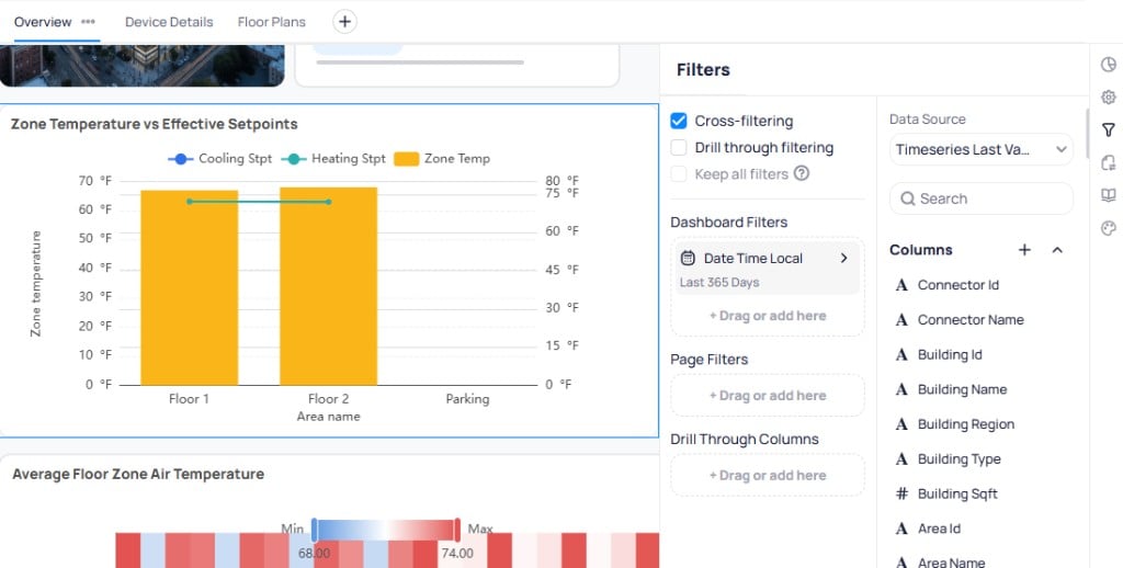 Pin frequently used filters to keep them visible at the top of the dashboard. Pinned filters remain accessible outside of edit mode so viewers can adjust them.
**Graphics** widgets on the same dashboard respond to slicers, dashboard filters, page filters, and cross-filter selections from other widgets. Marker visibility updates automatically; underlying data queries are unchanged. See [Enhanced graphic view](/products/building-bi/widget-customization#enhanced-graphic-view).
Pinned filters are not included in PDF exports. If you export a dashboard to PDF, the exported data reflects the current filter state but the filter controls themselves do not appear in the output.
## Dashboard options
Select the dashboard options icon in the edit mode sidebar to configure layout and display settings for the entire dashboard.
Pin frequently used filters to keep them visible at the top of the dashboard. Pinned filters remain accessible outside of edit mode so viewers can adjust them.
**Graphics** widgets on the same dashboard respond to slicers, dashboard filters, page filters, and cross-filter selections from other widgets. Marker visibility updates automatically; underlying data queries are unchanged. See [Enhanced graphic view](/products/building-bi/widget-customization#enhanced-graphic-view).
Pinned filters are not included in PDF exports. If you export a dashboard to PDF, the exported data reflects the current filter state but the filter controls themselves do not appear in the output.
## Dashboard options
Select the dashboard options icon in the edit mode sidebar to configure layout and display settings for the entire dashboard.
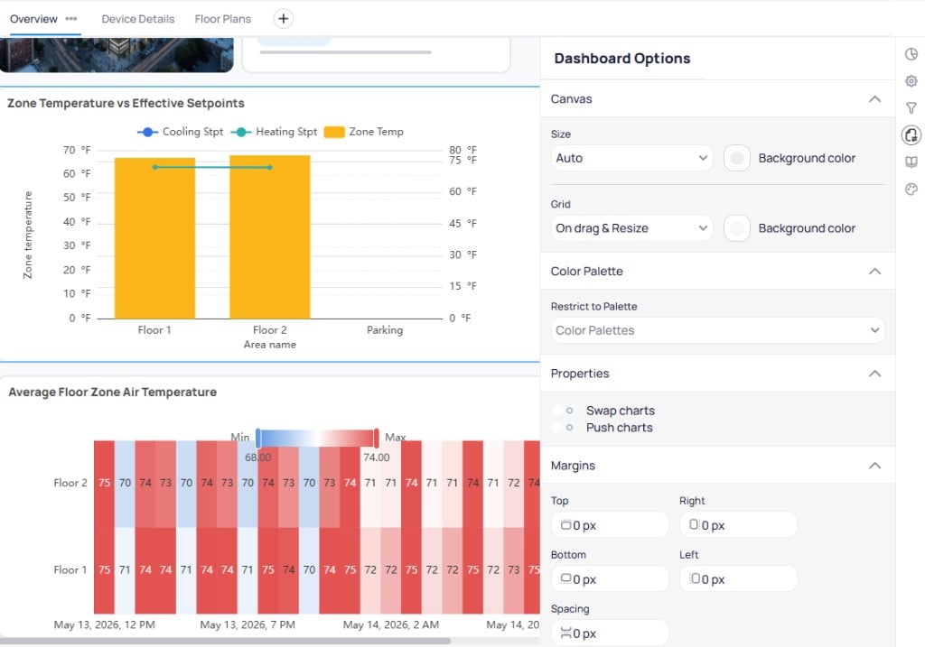 Set a refresh interval for the dashboard. Choose shorter intervals (such as every minute) for live operational data, or longer intervals (hourly or daily) for historical trends.
Show or hide grid lines on the dashboard canvas to help align widgets.
Set the background color for the dashboard canvas.
When enabled, dragging a widget pushes or swaps adjacent widgets instead of overlapping them. This keeps the layout organized as you rearrange widgets.
Choose between `Auto Size`, `Fixed`, or `Max Width`. `Auto Size` adjusts the canvas to the viewer's screen. `Fixed` sets a specific pixel width and adds a horizontal scroll bar on smaller screens. `Max Width` limits the canvas to a maximum pixel width.
Controls the spacing around the edges of the dashboard canvas.
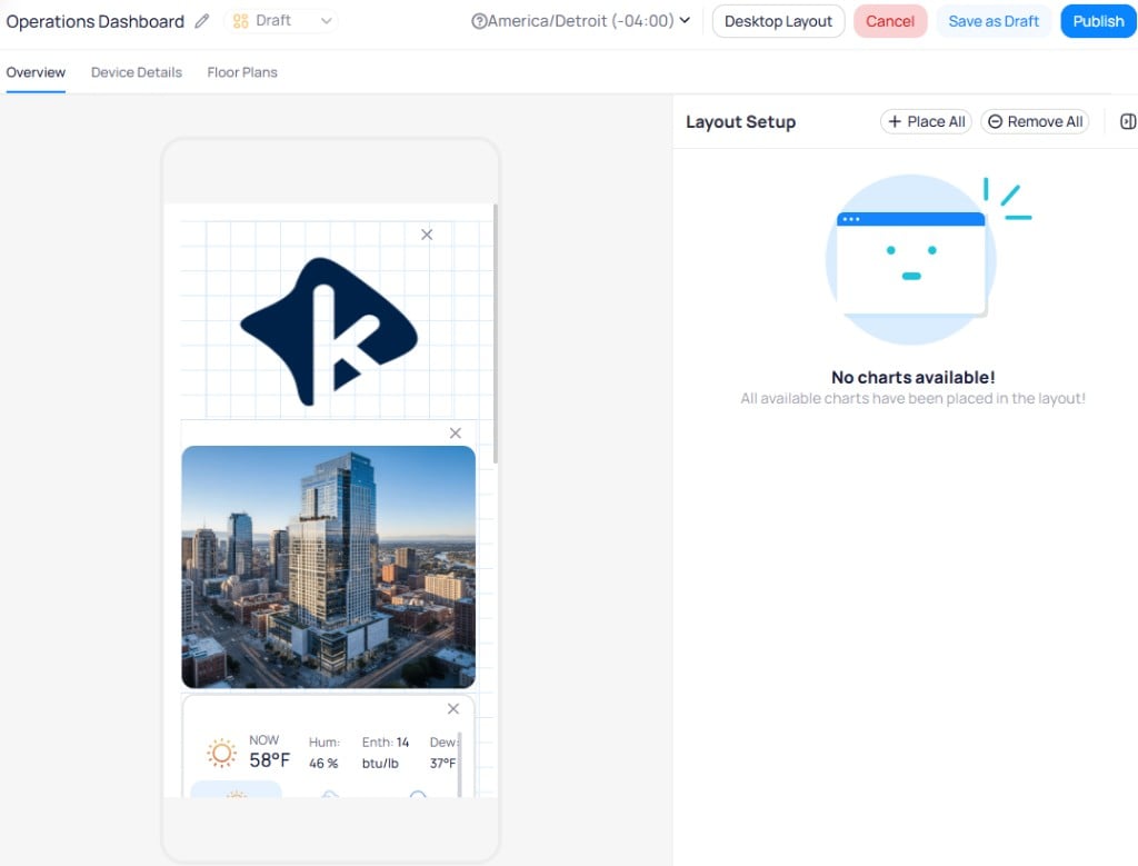
Toggle the mobile layout icon to reorganize and resize widgets for smaller screens. The mobile editor shows a phone-shaped canvas with a `Layout Setup` panel. Use `Place All` to auto-arrange widgets, or drag them manually. Remove individual widgets with the `X` button on each card.
Set a refresh interval for the dashboard. Choose shorter intervals (such as every minute) for live operational data, or longer intervals (hourly or daily) for historical trends.
Show or hide grid lines on the dashboard canvas to help align widgets.
Set the background color for the dashboard canvas.
When enabled, dragging a widget pushes or swaps adjacent widgets instead of overlapping them. This keeps the layout organized as you rearrange widgets.
Choose between `Auto Size`, `Fixed`, or `Max Width`. `Auto Size` adjusts the canvas to the viewer's screen. `Fixed` sets a specific pixel width and adds a horizontal scroll bar on smaller screens. `Max Width` limits the canvas to a maximum pixel width.
Controls the spacing around the edges of the dashboard canvas.
Toggle the mobile layout icon to reorganize and resize widgets for smaller screens. The mobile editor shows a phone-shaped canvas with a `Layout Setup` panel. Use `Place All` to auto-arrange widgets, or drag them manually. Remove individual widgets with the `X` button on each card.
 ## Default widget style
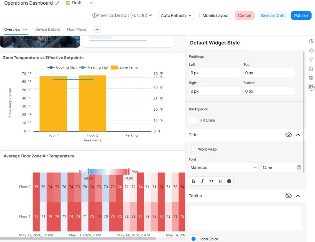
The `Default Widget Style` panel sets baseline styling for all new widgets you add to the dashboard. Select the default widget style icon in the edit mode sidebar to configure paddings, background color, title font, and tooltip settings. Any widget you create after setting these defaults inherits these values automatically.
## Default widget style
The `Default Widget Style` panel sets baseline styling for all new widgets you add to the dashboard. Select the default widget style icon in the edit mode sidebar to configure paddings, background color, title font, and tooltip settings. Any widget you create after setting these defaults inherits these values automatically.
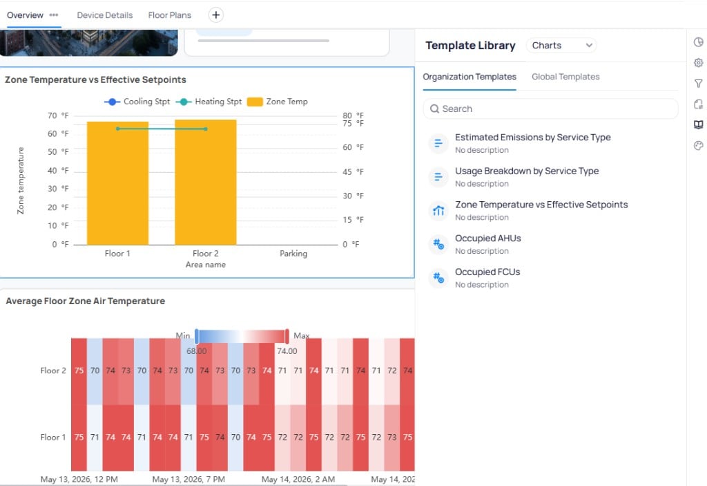
 ## Template Library
The `Template Library` panel in the edit mode sidebar lets you browse and add chart and page templates directly to the dashboard you are editing. See [Templates](/products/building-bi/templates) for full documentation.
## Template Library
The `Template Library` panel in the edit mode sidebar lets you browse and add chart and page templates directly to the dashboard you are editing. See [Templates](/products/building-bi/templates) for full documentation.
 ## Manage dashboards
The `My Dashboards` section lists all dashboards you have created or have access to.
Click the star icon next to a dashboard name to mark it as a favorite. Favorited dashboards appear in the left navigation pane for quick access.
Select the three-dot menu on any dashboard row for additional options.
## Manage dashboards
The `My Dashboards` section lists all dashboards you have created or have access to.
Click the star icon next to a dashboard name to mark it as a favorite. Favorited dashboards appear in the left navigation pane for quick access.
Select the three-dot menu on any dashboard row for additional options.
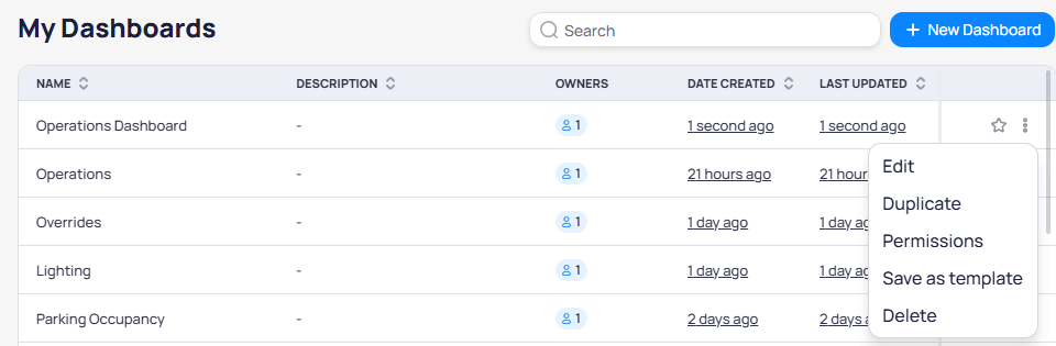 | Action | Description |
| ------------------ | --------------------------------------------------- |
| `Edit` | Update the dashboard name, timezone, or description |
| `Duplicate` | Create a copy of the dashboard with all its widgets |
| `Permissions` | Add collaborators to the dashboard |
| `Save as template` | Save the dashboard layout as a reusable template |
| `Delete` | Permanently remove the dashboard |
### Dashboard permissions
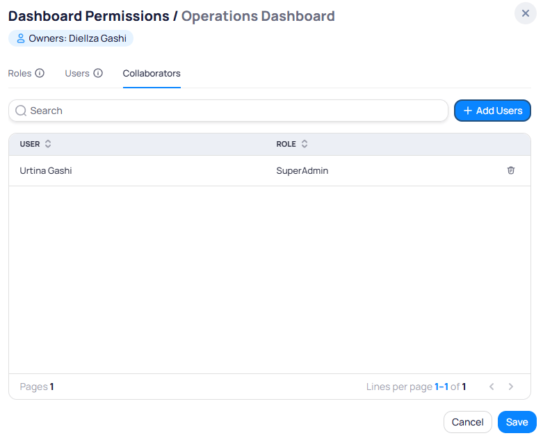
Select `Permissions` to manage who can edit the dashboard. Use the `Collaborators` tab to add individual users. Collaborators receive read and edit access, including the ability to manage other collaborators. The dashboard owner is displayed at the top and cannot be removed or reassigned.
The `Roles` and `Users` tabs are legacy. Use [collections](/products/building-bi/collections) to grant view access by role. See [How Building BI permissions work](/products/building-bi/concepts/how-permissions-work).
| Action | Description |
| ------------------ | --------------------------------------------------- |
| `Edit` | Update the dashboard name, timezone, or description |
| `Duplicate` | Create a copy of the dashboard with all its widgets |
| `Permissions` | Add collaborators to the dashboard |
| `Save as template` | Save the dashboard layout as a reusable template |
| `Delete` | Permanently remove the dashboard |
### Dashboard permissions
Select `Permissions` to manage who can edit the dashboard. Use the `Collaborators` tab to add individual users. Collaborators receive read and edit access, including the ability to manage other collaborators. The dashboard owner is displayed at the top and cannot be removed or reassigned.
The `Roles` and `Users` tabs are legacy. Use [collections](/products/building-bi/collections) to grant view access by role. See [How Building BI permissions work](/products/building-bi/concepts/how-permissions-work).
 ## Dashboard actions menu
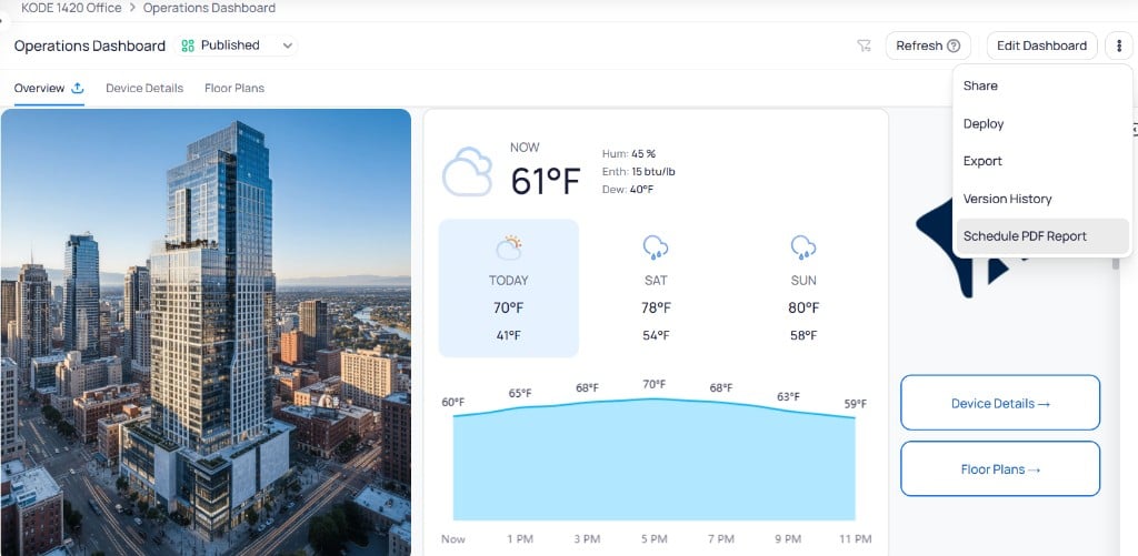
Select the three-dot menu in the top-right corner of a published dashboard to access sharing, export, and scheduling options.
## Dashboard actions menu
Select the three-dot menu in the top-right corner of a published dashboard to access sharing, export, and scheduling options.
 ## Share dashboards and widgets
You can share entire dashboards or individual widgets through shareable links.
### Share a dashboard
Select the three-dot menu on the dashboard and choose `Share`.
Set the pages to share, access expiration period, link title, refresh rate, and allowed IPs. The dialog also shows `Active` and `Expired` shared links.
## Share dashboards and widgets
You can share entire dashboards or individual widgets through shareable links.
### Share a dashboard
Select the three-dot menu on the dashboard and choose `Share`.
Set the pages to share, access expiration period, link title, refresh rate, and allowed IPs. The dialog also shows `Active` and `Expired` shared links.
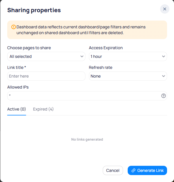 Select `Generate Link`, then select the link icon to copy the URL to your clipboard.
### Share an individual widget
Select the three-dot menu on any widget and choose `Share`. The widget share dialog provides the same options as the dashboard share dialog.
### Manage shared links
The `Active` and `Expired` tabs at the bottom of the Sharing properties dialog list all generated links. To revoke access, delete the link from the Active list. For portfolio-wide link management, see [Building BI settings](/products/building-bi/settings#shared-links).
## Export and schedule PDF reports
Use the dashboard three-dot menu to export a one-time PDF or create a recurring scheduled report. Full steps, fields, and schedule management are in [PDF exports and scheduled reports](/products/building-bi/pdf-exports).
Create one-time exports and schedules in [PDF exports and scheduled reports](/products/building-bi/pdf-exports). Manage active links and schedules in [Building BI settings](/products/building-bi/settings). For who can share or schedule, see [How Building BI permissions work](/products/building-bi/concepts/how-permissions-work).
## Publish a dashboard
Select `Publish` in the top-right corner of the dashboard while in edit mode.
Review the confirmation window and confirm to publish the dashboard. The status changes from `Draft` to `Published`.
Publishing makes the dashboard available to all users with access to Building BI. Verify your dashboard content before publishing.
## Version history
Version history tracks every save, publish, and restore action on a dashboard. Every saved version is stored with its date, author, and an optional name. You can preview any past version, restore it as a draft, and maintain a complete audit trail of all published changes.
### Access version history
You can open version history in two ways:
* **From the three-dot menu** -- select the three-dot menu on the dashboard and choose `Version history`. History opens in a new tab.
* **From the status chip** -- select the `Published` or `Draft` chip at the top of the dashboard, then choose `Version History`.
The version timeline opens alongside the dashboard preview.
Select `Generate Link`, then select the link icon to copy the URL to your clipboard.
### Share an individual widget
Select the three-dot menu on any widget and choose `Share`. The widget share dialog provides the same options as the dashboard share dialog.
### Manage shared links
The `Active` and `Expired` tabs at the bottom of the Sharing properties dialog list all generated links. To revoke access, delete the link from the Active list. For portfolio-wide link management, see [Building BI settings](/products/building-bi/settings#shared-links).
## Export and schedule PDF reports
Use the dashboard three-dot menu to export a one-time PDF or create a recurring scheduled report. Full steps, fields, and schedule management are in [PDF exports and scheduled reports](/products/building-bi/pdf-exports).
Create one-time exports and schedules in [PDF exports and scheduled reports](/products/building-bi/pdf-exports). Manage active links and schedules in [Building BI settings](/products/building-bi/settings). For who can share or schedule, see [How Building BI permissions work](/products/building-bi/concepts/how-permissions-work).
## Publish a dashboard
Select `Publish` in the top-right corner of the dashboard while in edit mode.
Review the confirmation window and confirm to publish the dashboard. The status changes from `Draft` to `Published`.
Publishing makes the dashboard available to all users with access to Building BI. Verify your dashboard content before publishing.
## Version history
Version history tracks every save, publish, and restore action on a dashboard. Every saved version is stored with its date, author, and an optional name. You can preview any past version, restore it as a draft, and maintain a complete audit trail of all published changes.
### Access version history
You can open version history in two ways:
* **From the three-dot menu** -- select the three-dot menu on the dashboard and choose `Version history`. History opens in a new tab.
* **From the status chip** -- select the `Published` or `Draft` chip at the top of the dashboard, then choose `Version History`.
The version timeline opens alongside the dashboard preview.
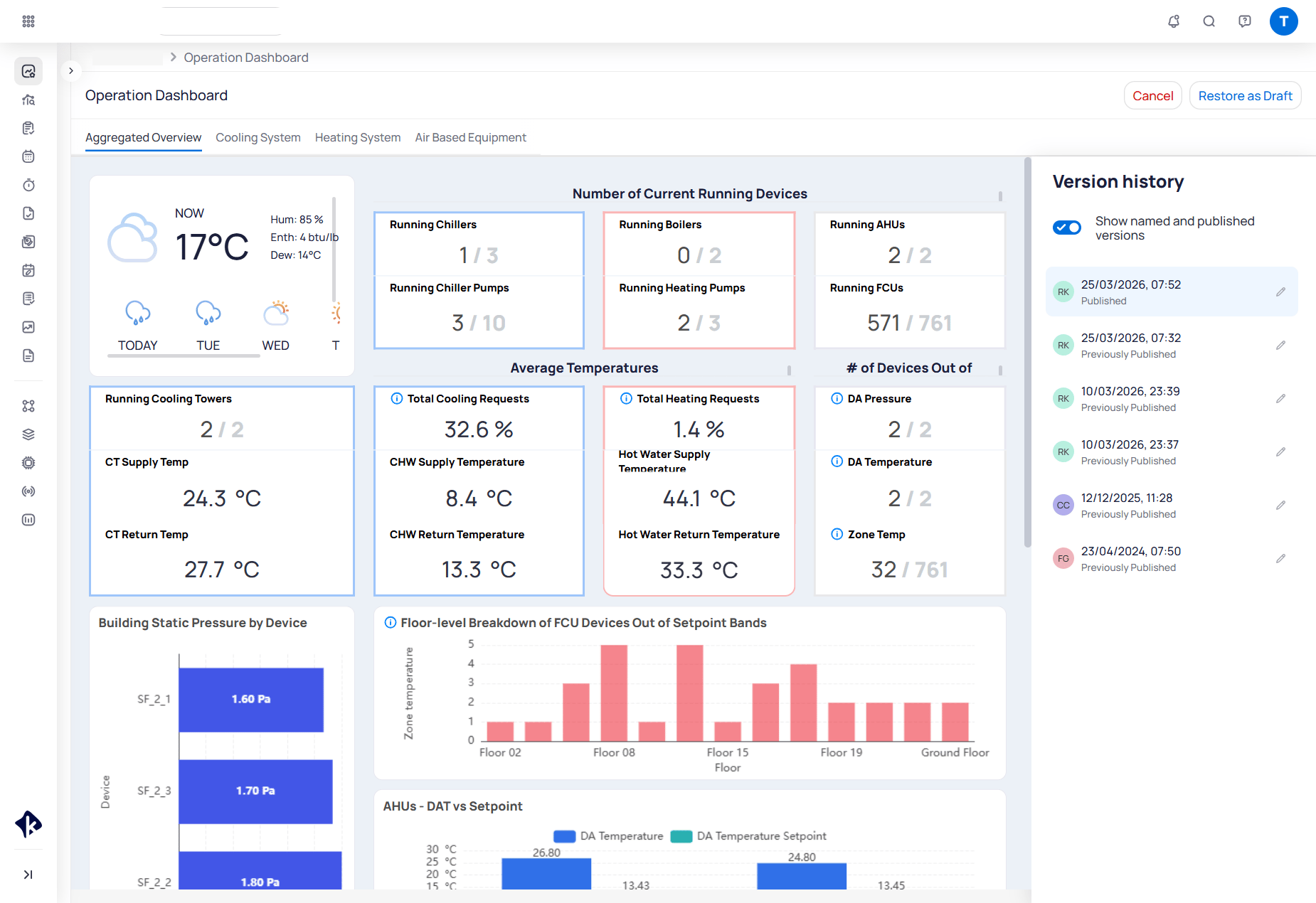 Each entry shows the timestamp, author initial, and status label:
* **Published** -- the currently live version.
* **Previously Published** -- a past version that was live at the time.
* **Previous Version** -- a saved draft that was never published.
* **Restored** -- a version that was restored from history.
Each entry shows the timestamp, author initial, and status label:
* **Published** -- the currently live version.
* **Previously Published** -- a past version that was live at the time.
* **Previous Version** -- a saved draft that was never published.
* **Restored** -- a version that was restored from history.
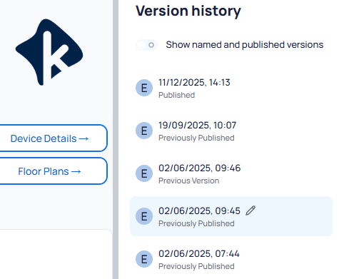 Select the pencil icon on any version entry to give it a descriptive name. Clearing the name reverts the label to the original timestamp.
### Work with drafts
Draft mode lets you make changes to a dashboard without affecting what other users see in the published version.
Select `Edit Dashboard` to open the active draft. If no draft exists, one is created automatically.
Edit the dashboard as needed. Select `Save Draft` to save your progress. Draft changes remain private and do not affect the live dashboard.
When your changes are ready, select `Publish` to make the draft the new live version.
Use the `Published`/`Draft` chip dropdown to switch between the read-only published version and your active draft at any time.
### Restore an older version
Access `Version History` using either method described above.
Select any version in the list to preview its contents on the dashboard canvas. Select the pencil icon on an entry to rename it.
Choose one of the available actions:
* **Restore as Draft** -- available for all versions. Creates a new draft with the selected version's contents without affecting the currently published dashboard.
* **Publish** -- available when a previous version is selected. Makes the selected version the live dashboard immediately.
Select the pencil icon on any version entry to give it a descriptive name. Clearing the name reverts the label to the original timestamp.
### Work with drafts
Draft mode lets you make changes to a dashboard without affecting what other users see in the published version.
Select `Edit Dashboard` to open the active draft. If no draft exists, one is created automatically.
Edit the dashboard as needed. Select `Save Draft` to save your progress. Draft changes remain private and do not affect the live dashboard.
When your changes are ready, select `Publish` to make the draft the new live version.
Use the `Published`/`Draft` chip dropdown to switch between the read-only published version and your active draft at any time.
### Restore an older version
Access `Version History` using either method described above.
Select any version in the list to preview its contents on the dashboard canvas. Select the pencil icon on an entry to rename it.
Choose one of the available actions:
* **Restore as Draft** -- available for all versions. Creates a new draft with the selected version's contents without affecting the currently published dashboard.
* **Publish** -- available when a previous version is selected. Makes the selected version the live dashboard immediately.
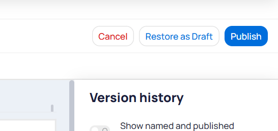 Restoring a version as a draft does not overwrite the current published dashboard. A new version history entry is added automatically when you publish the restored draft.
## Templates
Templates let you save and reuse dashboard layouts, individual tabs, or chart configurations across dashboards and sites. See [Templates](/products/building-bi/templates) for full documentation on saving, importing, exporting, and applying templates.
## Role access
Access to Building BI is controlled through roles in Launchpad.
Go to `Launchpad` > `Apps` > `Cloud BMS` > `Roles`.
Locate the BBI module and enable `Read` or `Read/Write` permissions for the appropriate role.
You need admin access to modify role permissions. Contact KODE Support if you do not have the required access level.
## Sensor health and data quality dashboards
Platform **point bounds** flag readings outside expected ranges with an **Out of Range** state. Building BI does not surface a default sensor health view automatically. Data analysts should build dashboards that make out-of-range points visible to operators.
### Recommended dashboard views
| View | Purpose |
| ----------------------------- | -------------------------------------------------------------------------------------- |
| **Out-of-range point list** | Table of points currently outside configured bounds, with device, area, and last value |
| **Counts by area or device** | Bar or KPI widgets that prioritize calibration work by floor, system, or equipment |
| **Trend with bounds context** | Time-series charts filtered to out-of-range events for investigation |
### Build a sensor health dashboard
Build from a Point Time Series data source. Run **Sync Datasource** after bounds are enabled so the latest status fields are available. See [Point bounds and unit conversion](/products/building-bi/data-sources#point-bounds-and-unit-conversion).
Add filters or calculated columns that exclude or highlight readings where `cur_state` includes **Out of Range**. Use platform bounds logic instead of static ontology thresholds where possible.
In metrics that power portfolio rollups, exclude out-of-range values so failing sensors do not skew averages or totals.
Save the dashboard as a [template](/products/building-bi/templates) or deploy through [Deployment Manager](/products/building-bi/deployment-manager). Use unit conversion in metrics when the same ontology field reports in different units across buildings.
Start from the **Data Quality** global template in [Templates](/products/building-bi/templates#global-templates), then extend it with bounds-aware filters and prioritization views.
## Related reading
Match chart types to the question you need to answer.
Learn how filters interact across widgets and pages.
Look up Setup requirements for every widget type.
Review operators, scopes, and filter configuration fields.
## Next steps
Customize chart styles, colors, and layouts for your dashboard widgets.
Organize dashboards into collections for easier navigation.
Connect and manage the data sources that power your dashboards.
Deploy dashboards across multiple sites from a single template.
Restoring a version as a draft does not overwrite the current published dashboard. A new version history entry is added automatically when you publish the restored draft.
## Templates
Templates let you save and reuse dashboard layouts, individual tabs, or chart configurations across dashboards and sites. See [Templates](/products/building-bi/templates) for full documentation on saving, importing, exporting, and applying templates.
## Role access
Access to Building BI is controlled through roles in Launchpad.
Go to `Launchpad` > `Apps` > `Cloud BMS` > `Roles`.
Locate the BBI module and enable `Read` or `Read/Write` permissions for the appropriate role.
You need admin access to modify role permissions. Contact KODE Support if you do not have the required access level.
## Sensor health and data quality dashboards
Platform **point bounds** flag readings outside expected ranges with an **Out of Range** state. Building BI does not surface a default sensor health view automatically. Data analysts should build dashboards that make out-of-range points visible to operators.
### Recommended dashboard views
| View | Purpose |
| ----------------------------- | -------------------------------------------------------------------------------------- |
| **Out-of-range point list** | Table of points currently outside configured bounds, with device, area, and last value |
| **Counts by area or device** | Bar or KPI widgets that prioritize calibration work by floor, system, or equipment |
| **Trend with bounds context** | Time-series charts filtered to out-of-range events for investigation |
### Build a sensor health dashboard
Build from a Point Time Series data source. Run **Sync Datasource** after bounds are enabled so the latest status fields are available. See [Point bounds and unit conversion](/products/building-bi/data-sources#point-bounds-and-unit-conversion).
Add filters or calculated columns that exclude or highlight readings where `cur_state` includes **Out of Range**. Use platform bounds logic instead of static ontology thresholds where possible.
In metrics that power portfolio rollups, exclude out-of-range values so failing sensors do not skew averages or totals.
Save the dashboard as a [template](/products/building-bi/templates) or deploy through [Deployment Manager](/products/building-bi/deployment-manager). Use unit conversion in metrics when the same ontology field reports in different units across buildings.
Start from the **Data Quality** global template in [Templates](/products/building-bi/templates#global-templates), then extend it with bounds-aware filters and prioritization views.
## Related reading
Match chart types to the question you need to answer.
Learn how filters interact across widgets and pages.
Look up Setup requirements for every widget type.
Review operators, scopes, and filter configuration fields.
## Next steps
Customize chart styles, colors, and layouts for your dashboard widgets.
Organize dashboards into collections for easier navigation.
Connect and manage the data sources that power your dashboards.
Deploy dashboards across multiple sites from a single template.